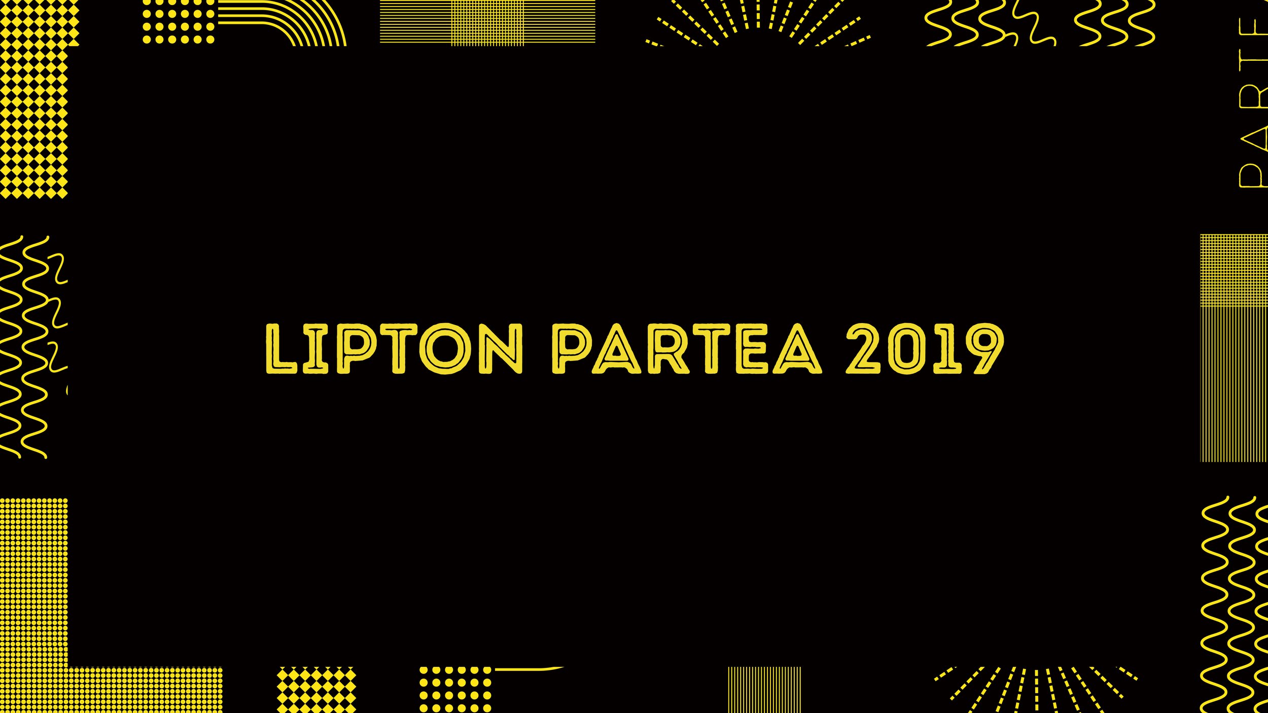
2019 立頓玩茶鋪 Lipton PARTEA
Brand Identity & Strategy
2019 Lipton Partea 快閃玩出視覺社群
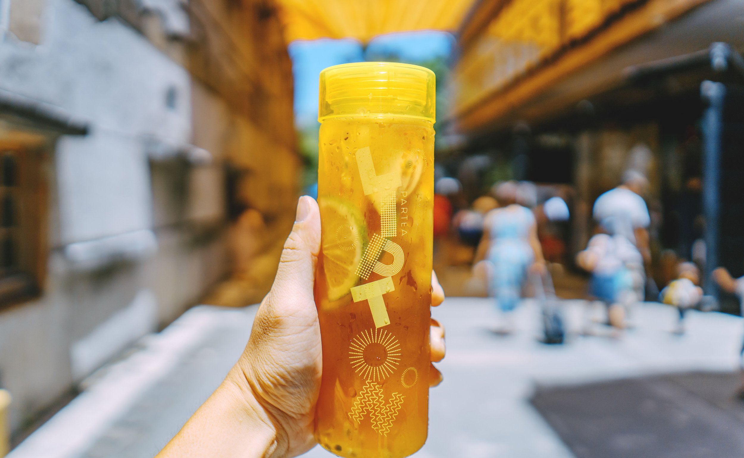
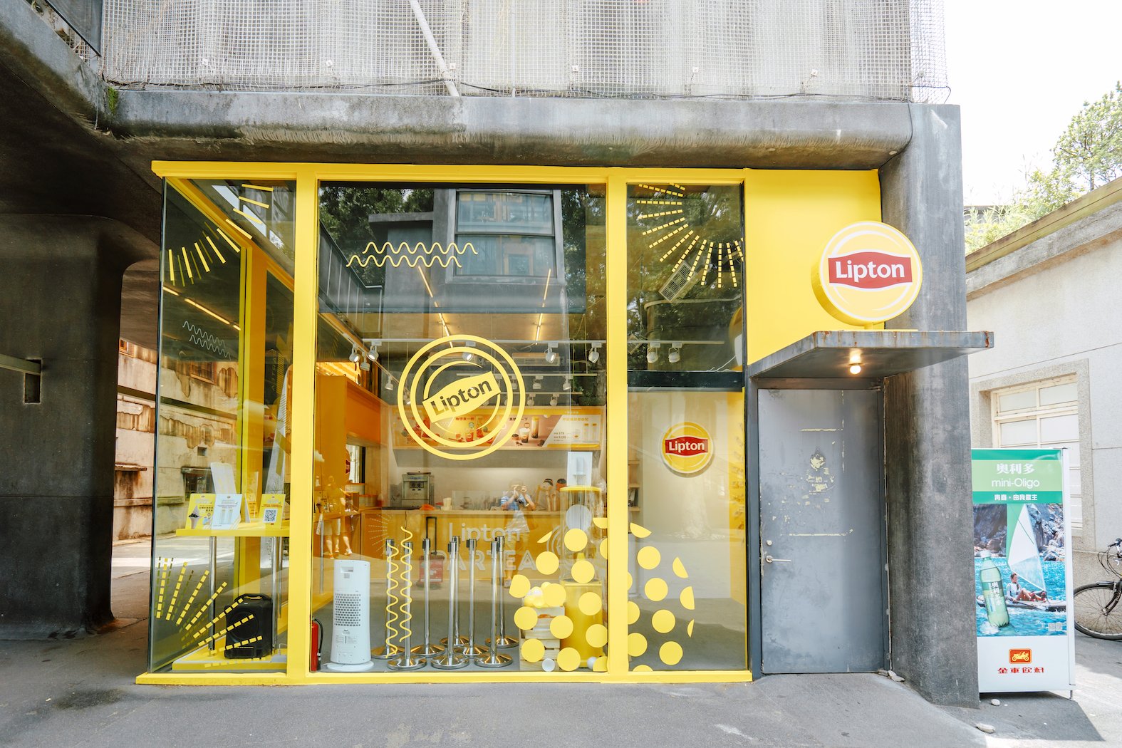
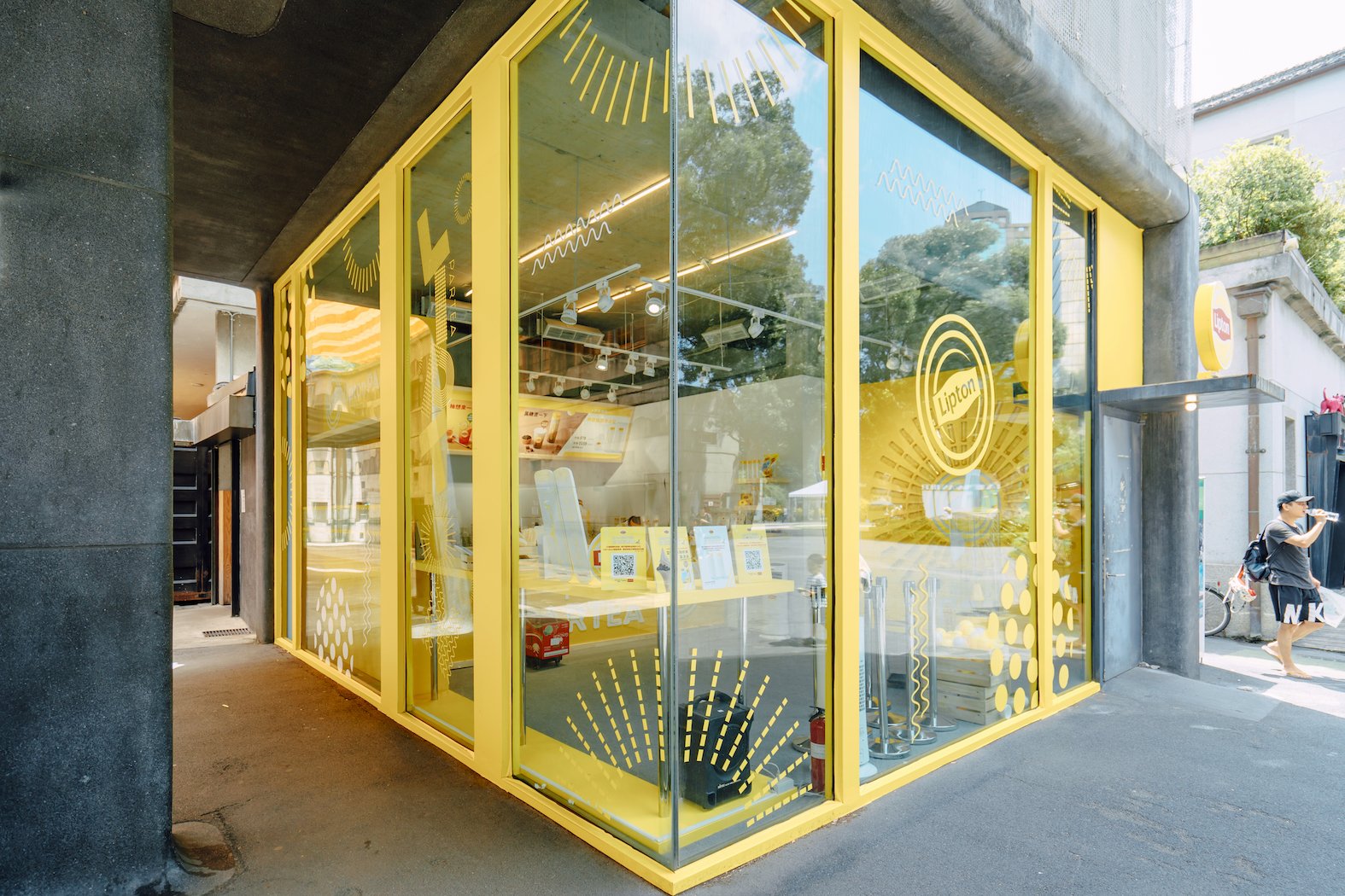
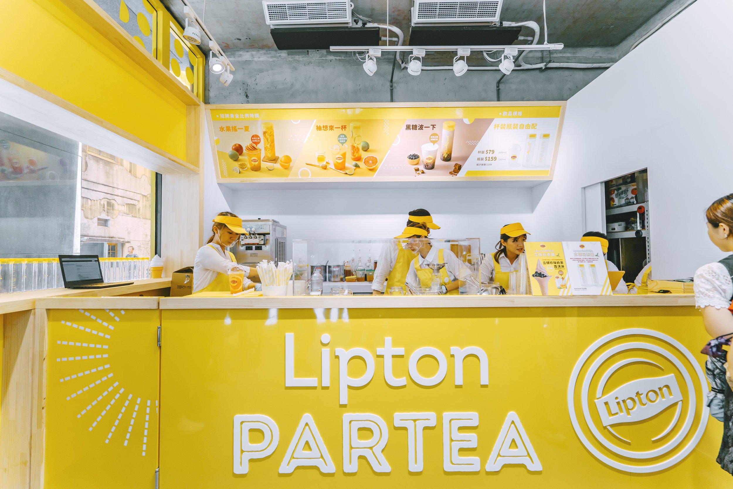
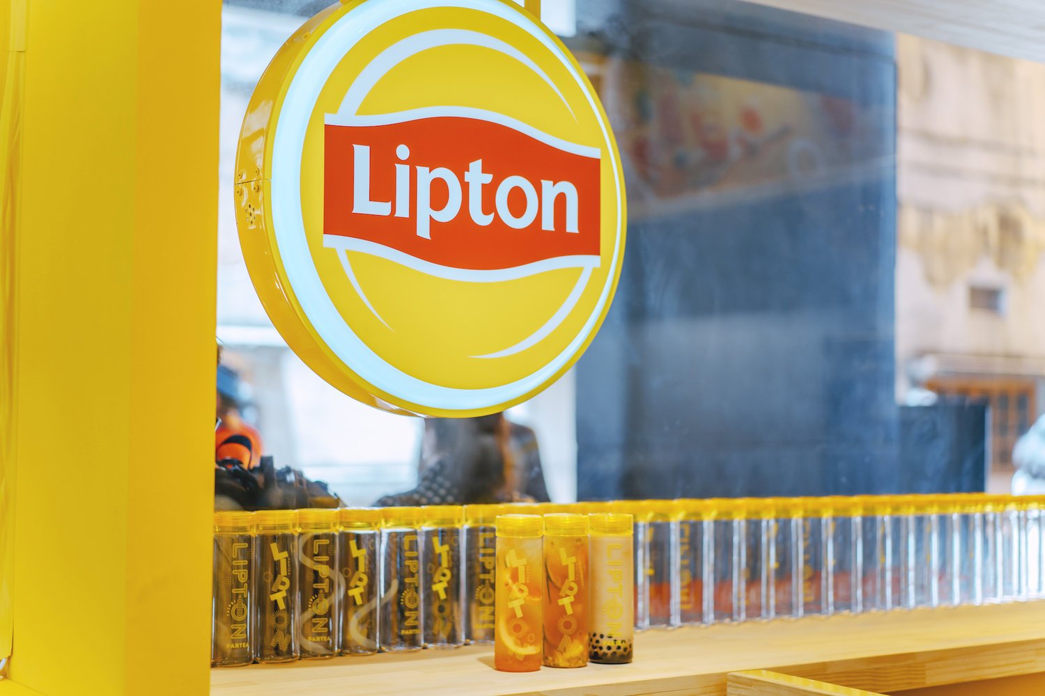
「立頓」是全球最大的茶葉品牌。它既代表茶葉的專家,又象徵一種國際的、時尚的、都市化的生活。一百多年來,立頓始終保持著歷代相傳的優良品質和芳香美味。2019年夏天,立頓在台灣打造了「Lipton PARTEA立頓玩茶舖」,以立頓特調水果茶為概念,規劃均一價自選式飲料單,讓消費者選擇自己喜歡的茶種、水果、配料、糖漿,搭配出專屬自己的立頓特調茶。
Services
體驗策略 UX Strategy
活動視覺概念 Visual Campaign
活動主視覺 Key Visual Design
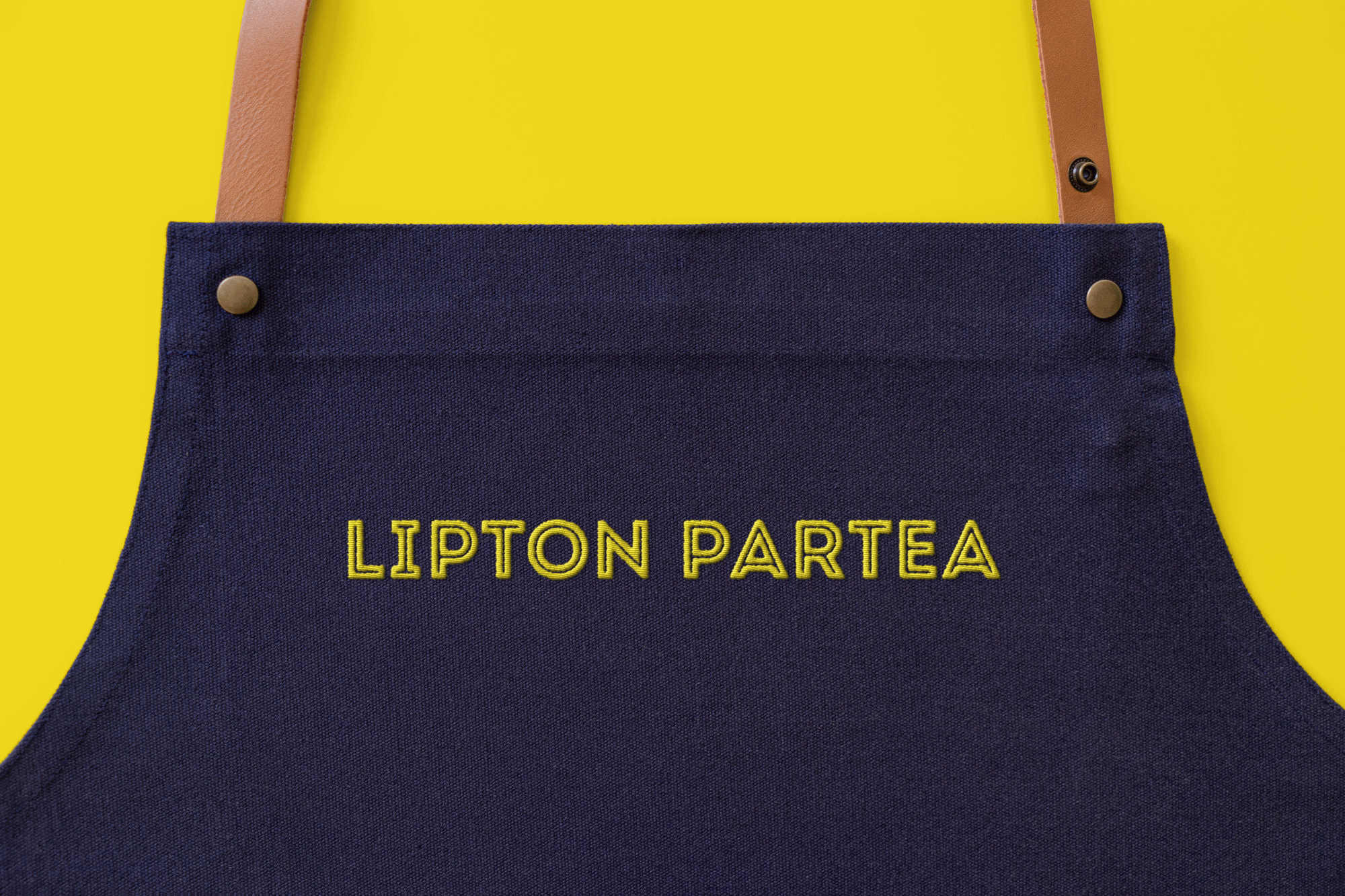
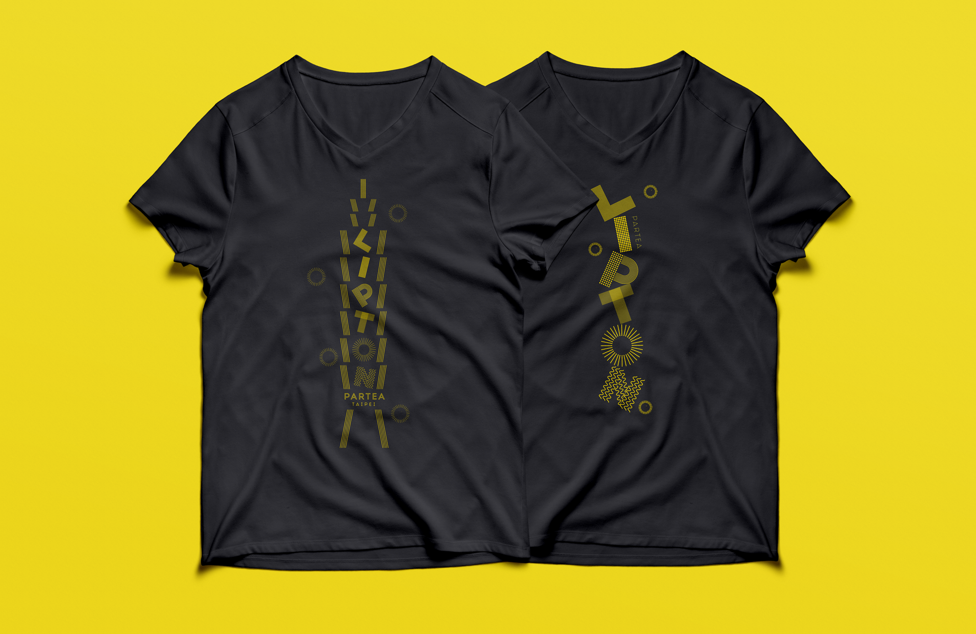
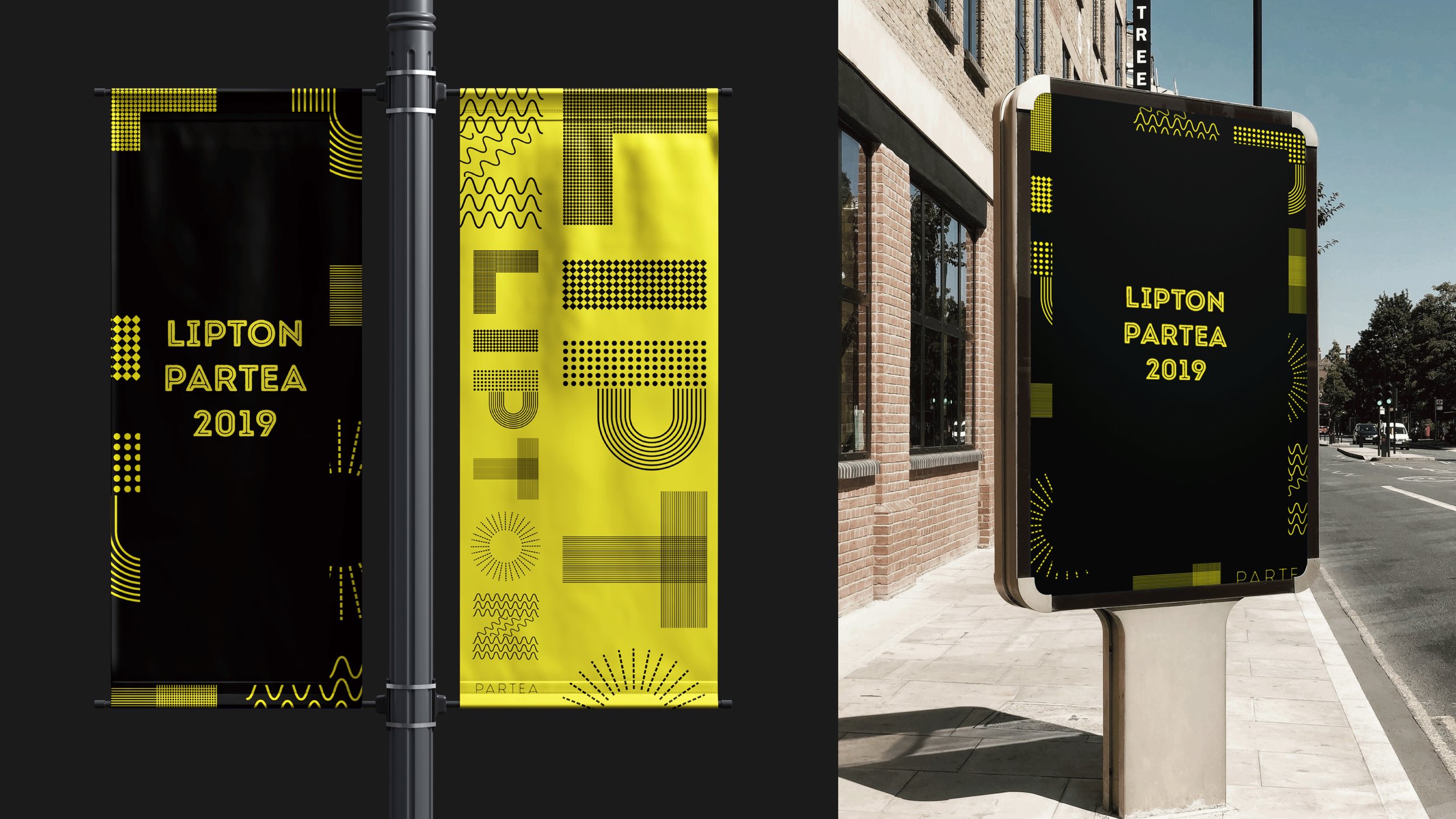
活動延伸物 Extension Design

Context
讓更多消費者喝到跟體驗到立頓特調茶飲,並在網路大量分享,以此讓品牌更貼近年輕族群。
Strategy
專案目標著重於實體活動的視覺應用,以符合當代潮流的設計使整體品牌年輕化,改變消費者原先對立頓的形象認知,並增強話題的創造。
Solution
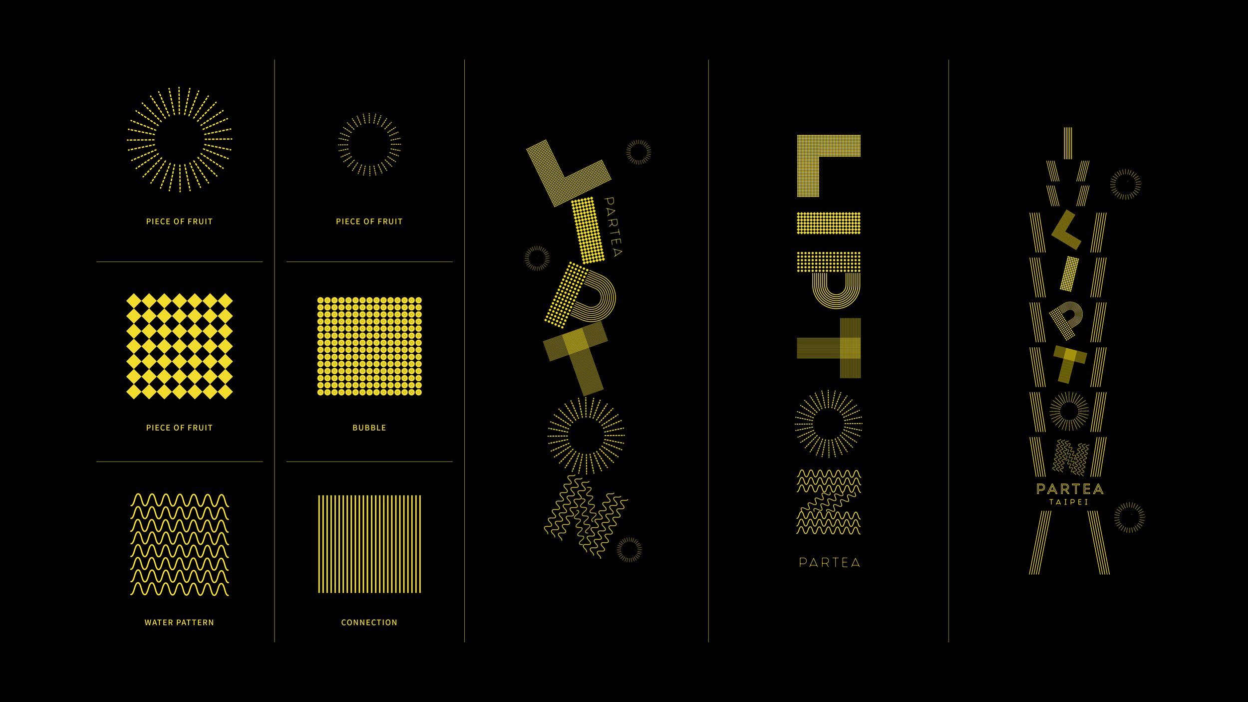
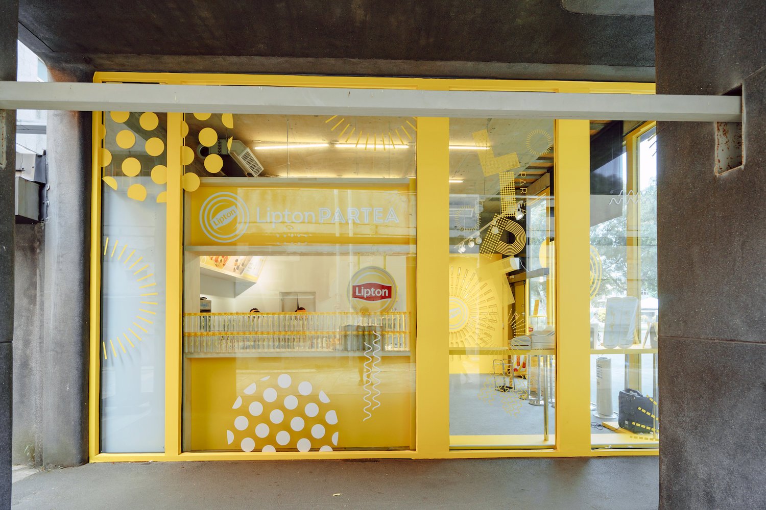
設計以「多采多姿的立頓」為主軸,針對活動受眾重塑為簡約、現代的年輕意象,並在系列應用上,以高度自由的模組創造出可應用於各式平面、店鋪展售的圖騰系統,讓線上到線下的快閃店都能展現一致陽光亮眼的風格,提升社群傳播成效。


Establish Project Core Value
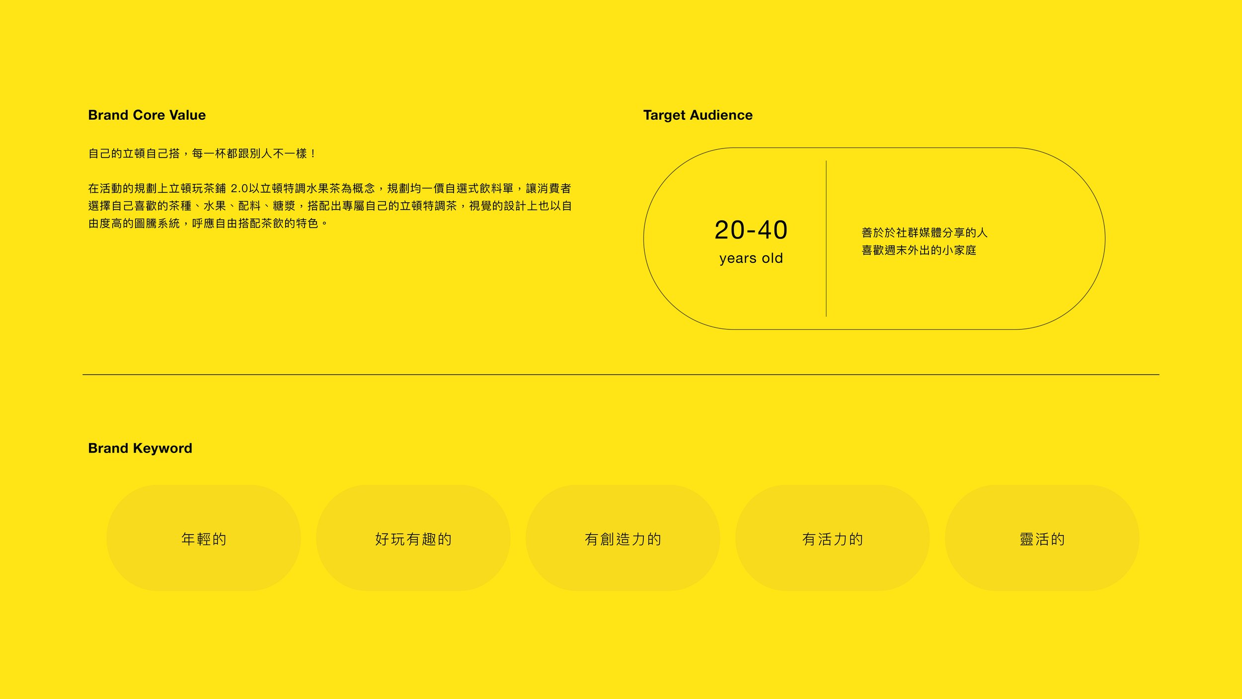
自己的立頓自己搭,每一杯都跟別人不一樣!
Make your own Lipton by yourself, every cup is different from others!
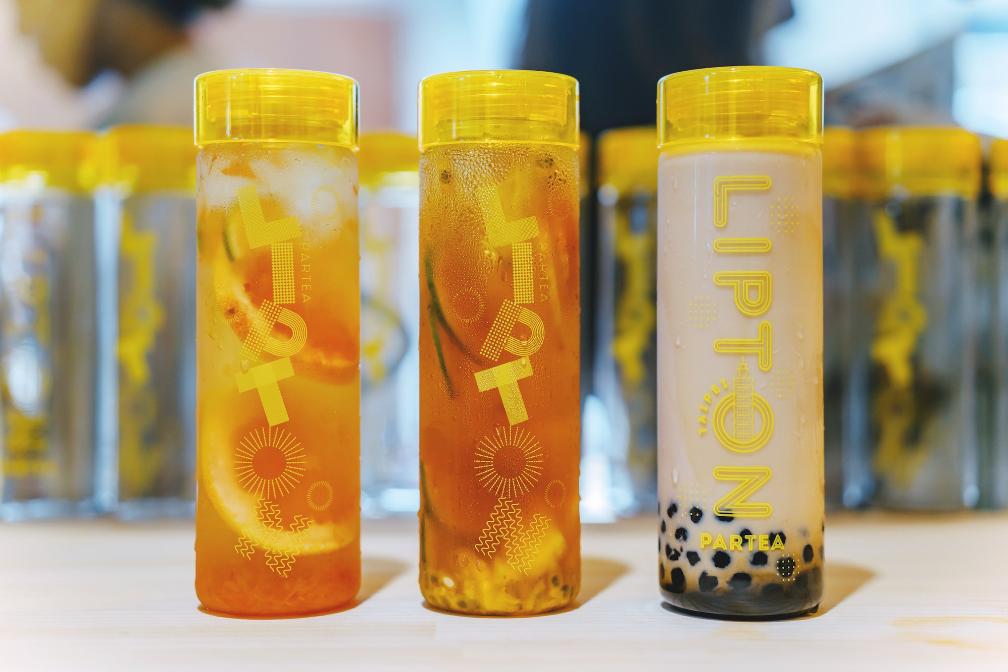
在活動的規劃上立頓玩茶鋪 2.0以立頓特調水果茶為概念,規劃均一價自選式飲料單,讓消費者選擇自己喜歡的茶種、水果、配料、糖漿,搭配出專屬自己的立頓特調茶,視覺的設計上也以自由度高的圖騰系統,呼應自由搭配茶飲的特色。
In the planning of the event, Lipton Play Tea Shop 2.0 takes Lipton's special fruit tea as the concept, and plans a uniform price self-selection beverage list, allowing consumers to choose their favorite tea types, fruits, ingredients, and syrups to match their own Lipton specials. For tea, the visual design also uses a totem system with high degree of freedom, echoing the characteristics of freely matching tea.
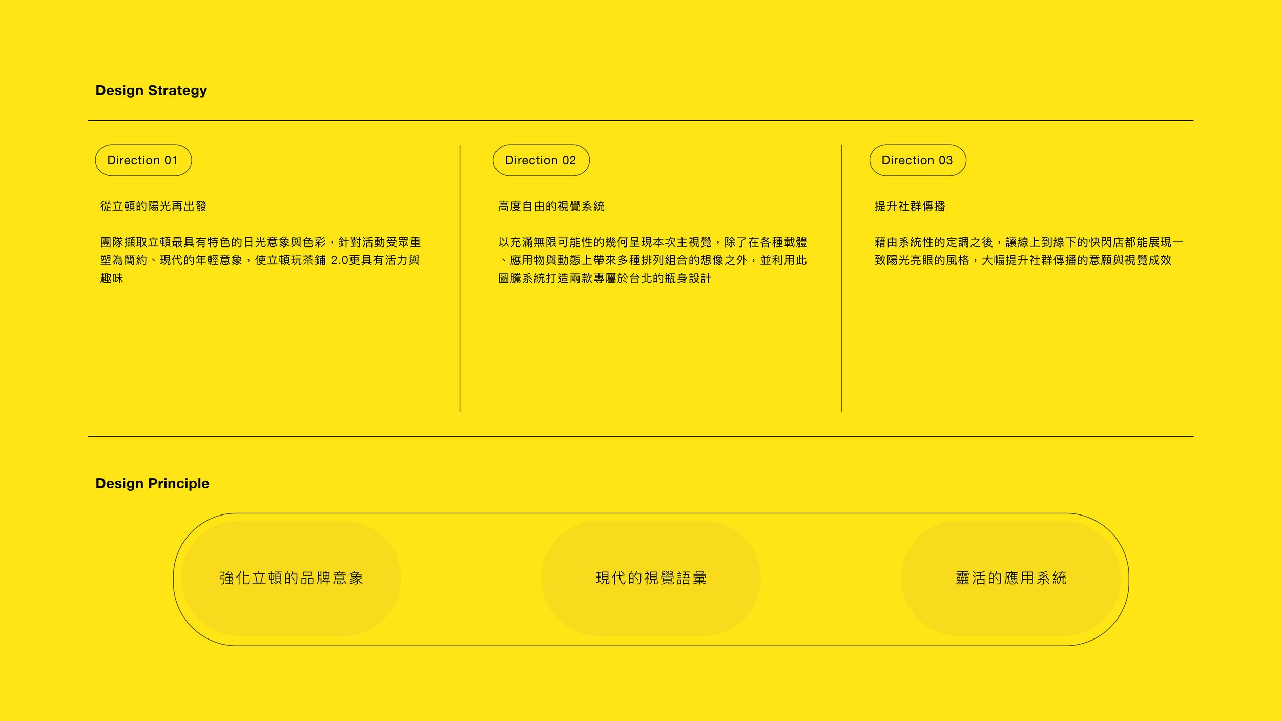
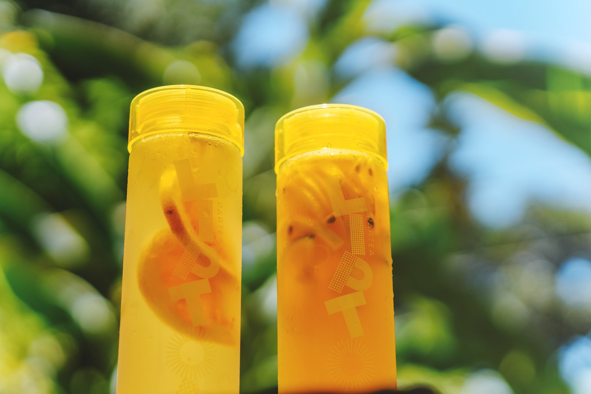
從立頓的陽光再出發
團隊擷取立頓最具有特色的日光意象與色彩,針對活動受眾重塑為簡約、現代的年輕意象,使立頓玩茶鋪 2.0更具有活力與趣味。
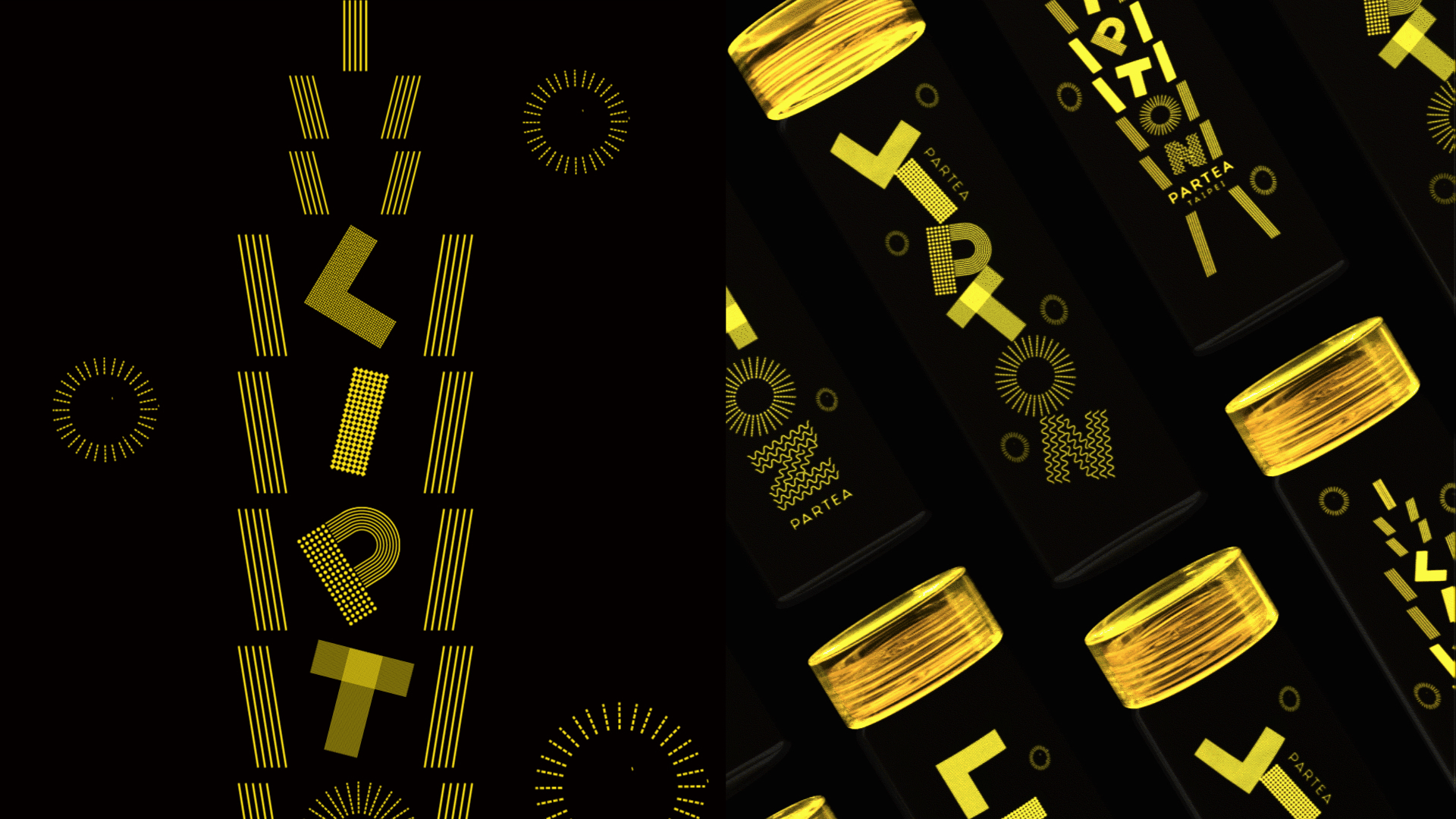
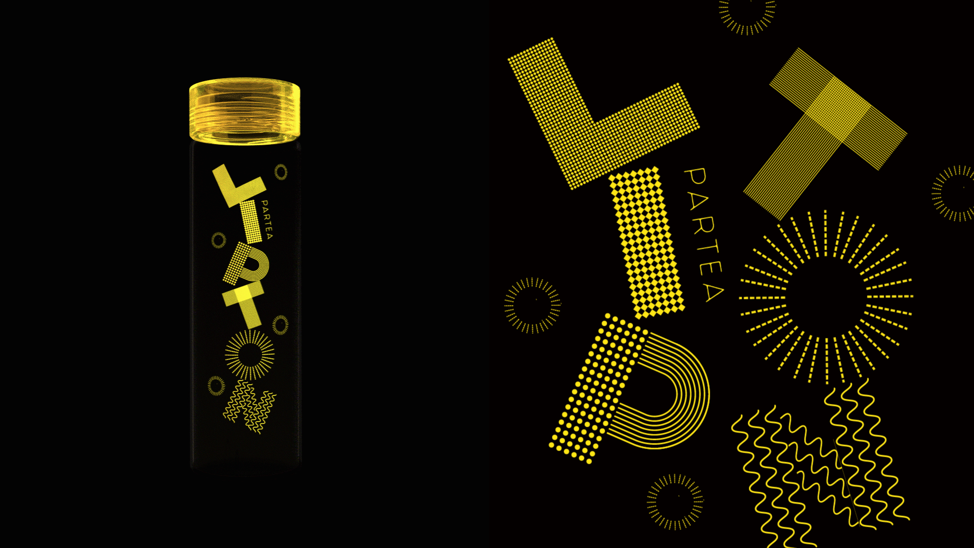
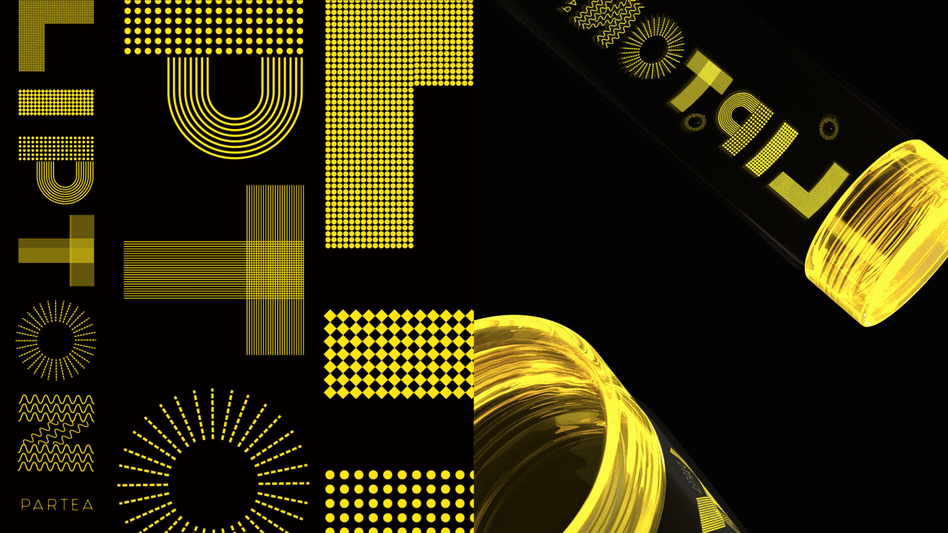
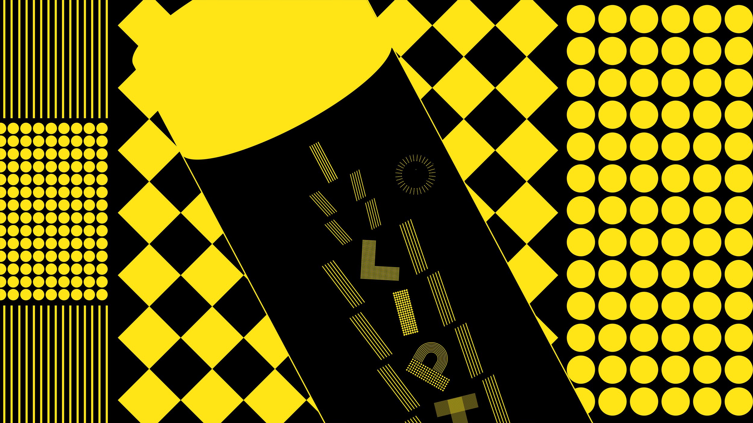
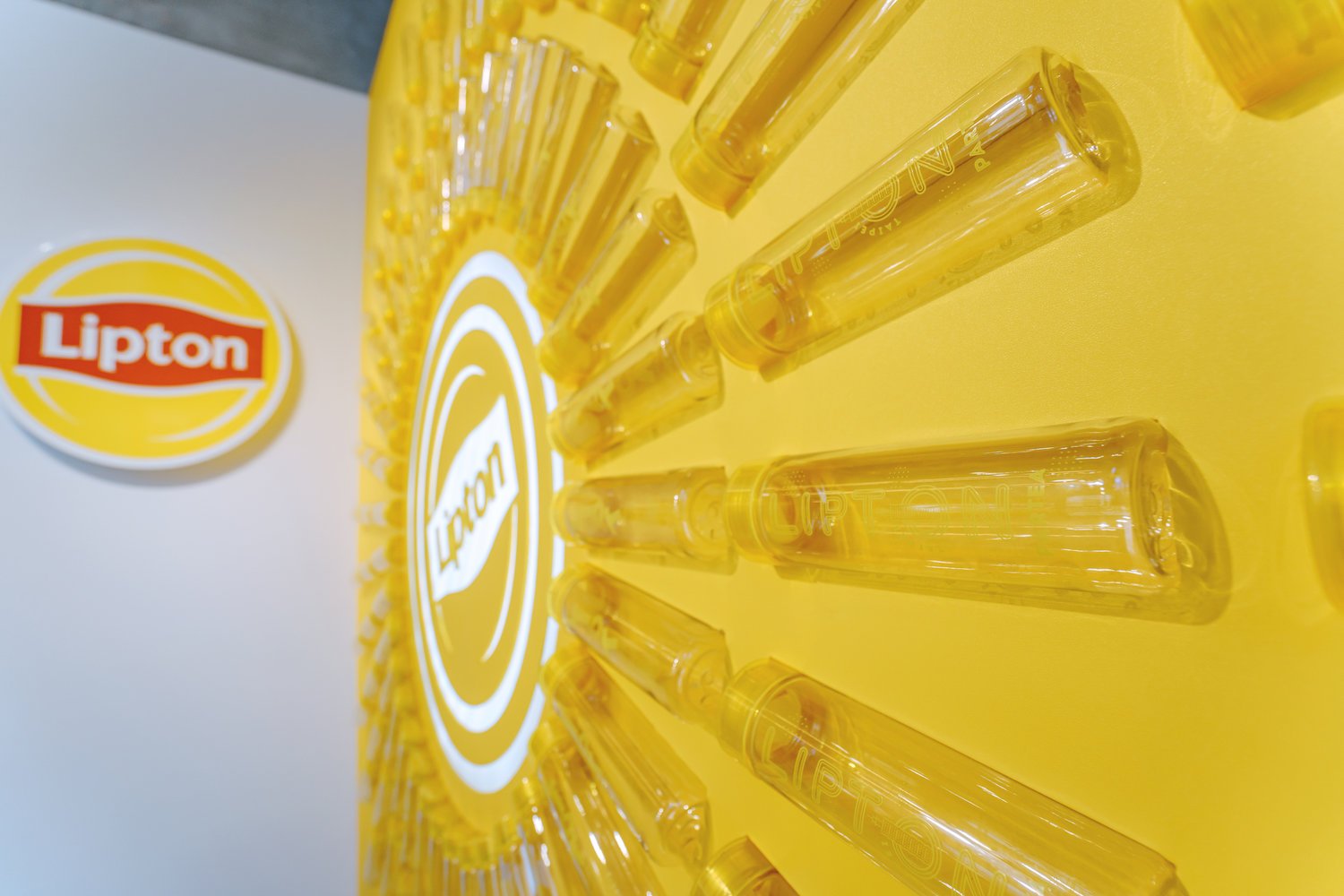
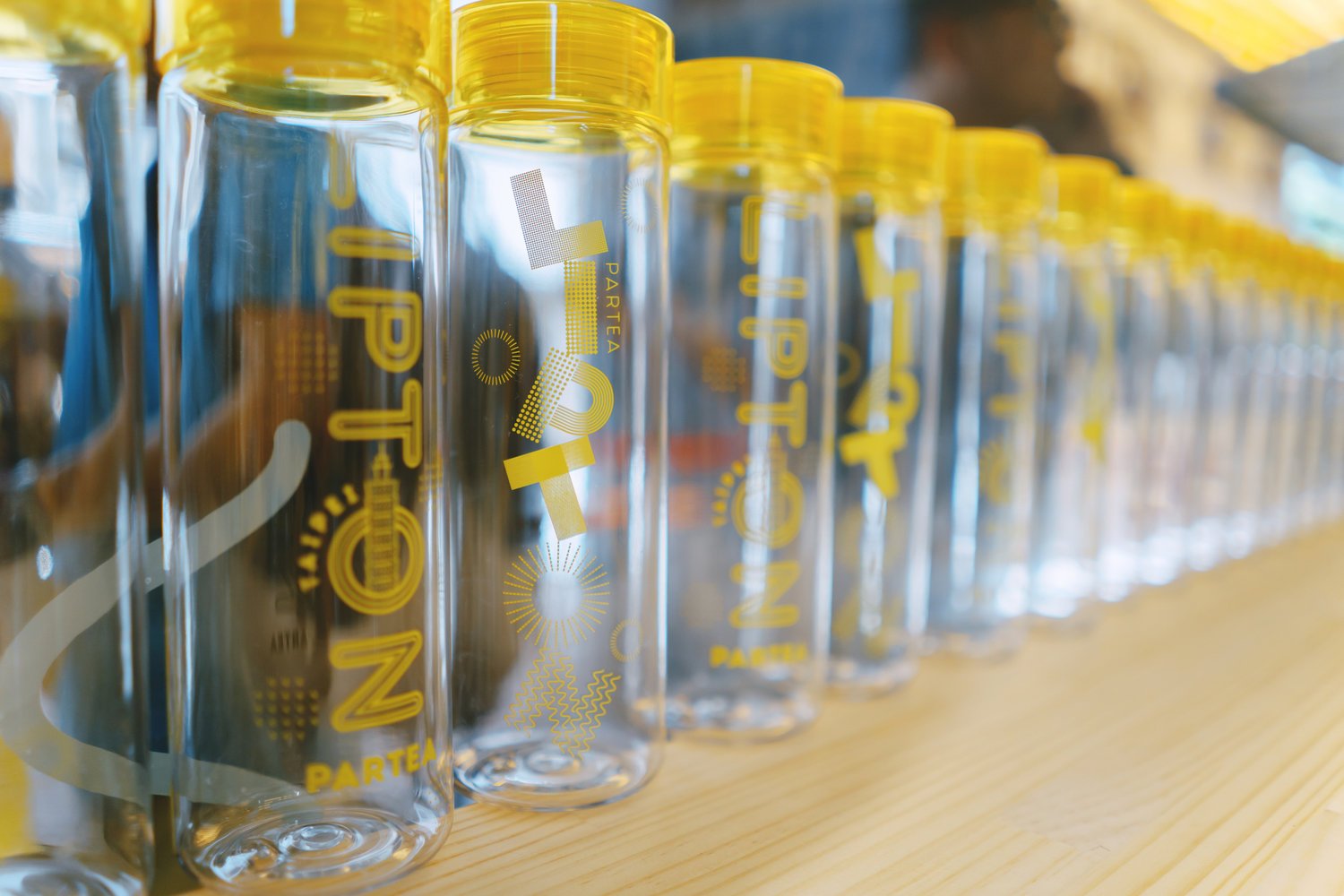
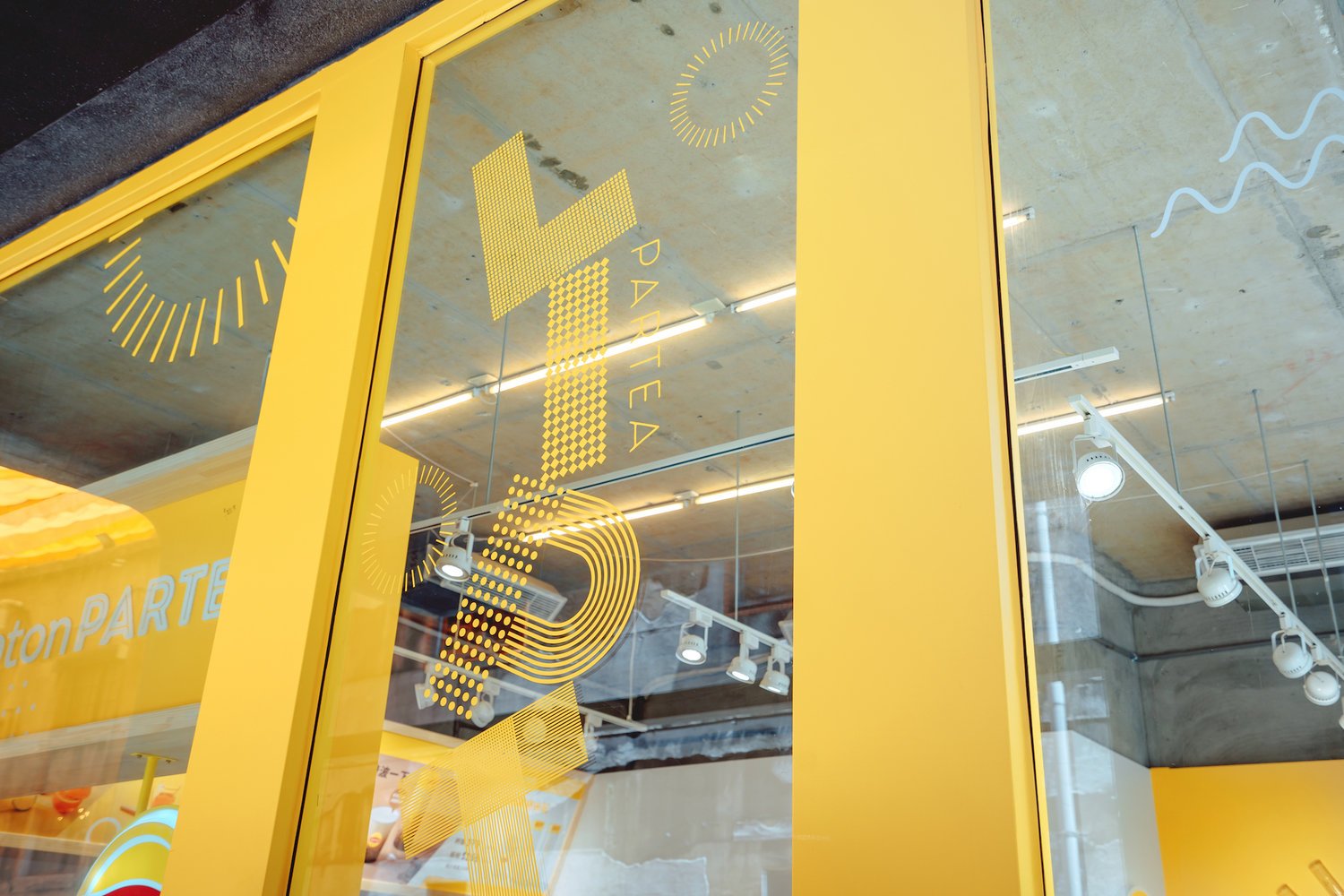
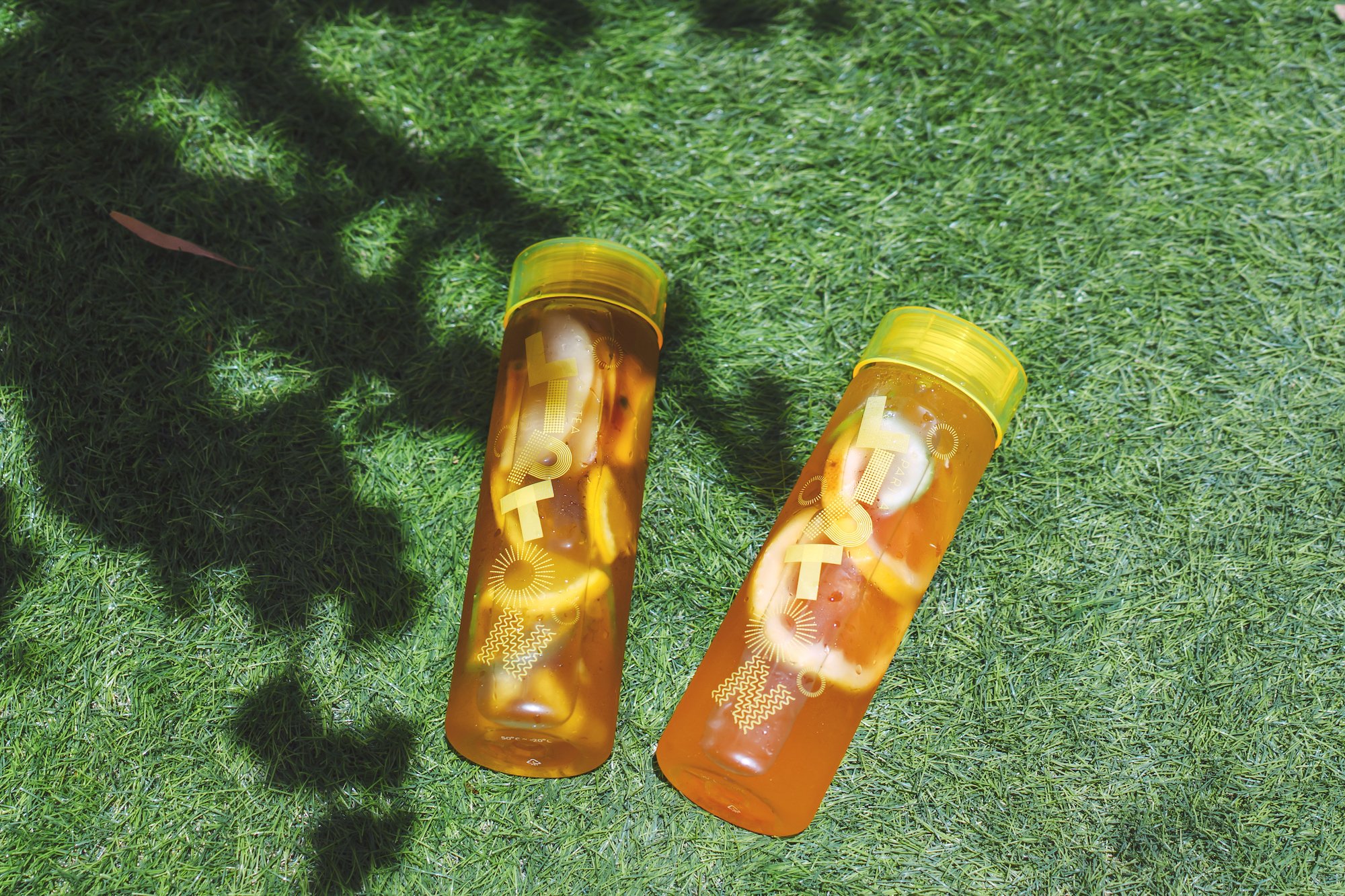
高度自由的視覺系統
以充滿無限可能性的幾何呈現本次主視覺,除了在各種載體、應用物與動態上帶來多種排列組合的想像之外,並利用此圖騰系統打造兩款專屬於台北的瓶身設計。
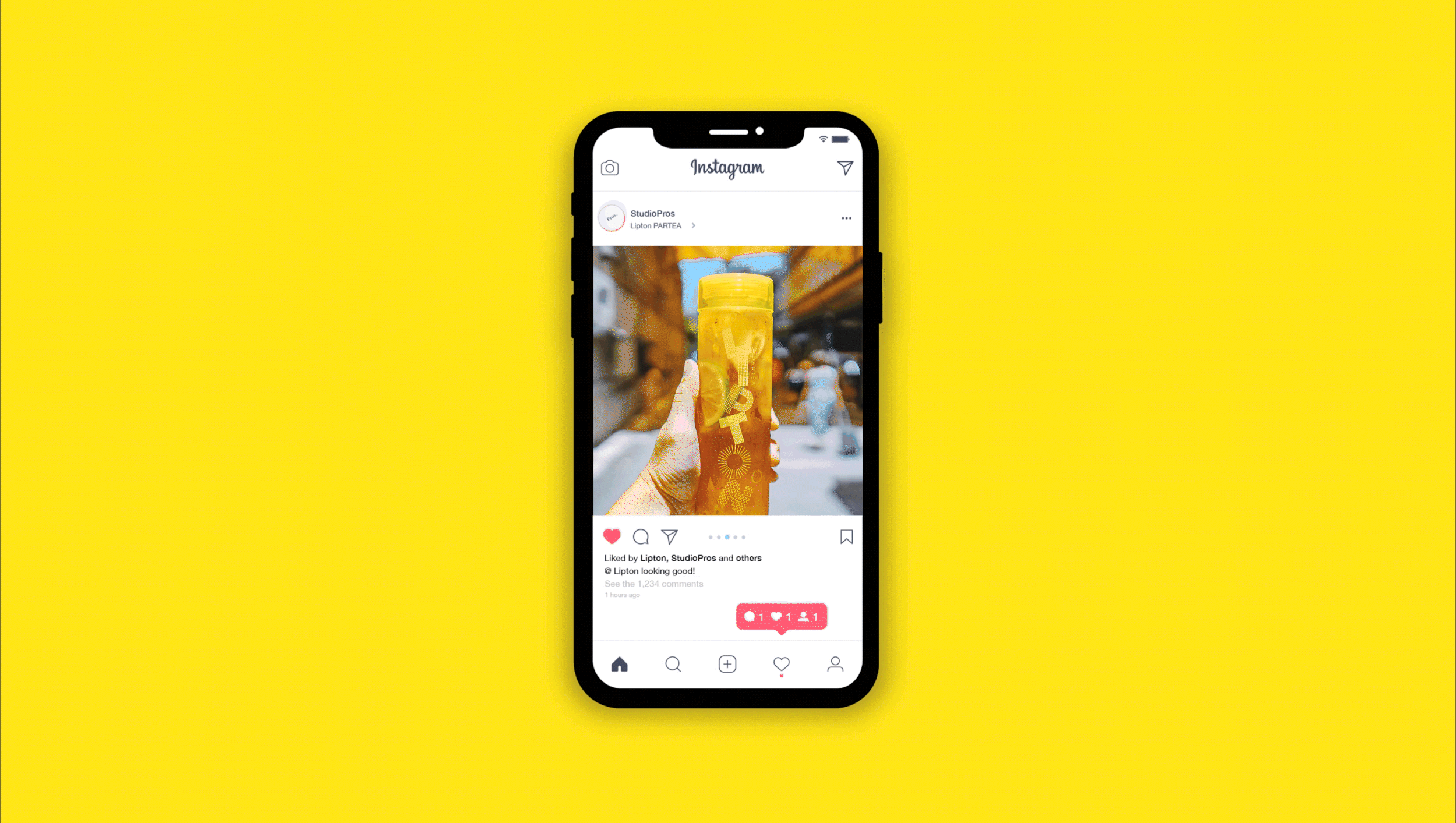
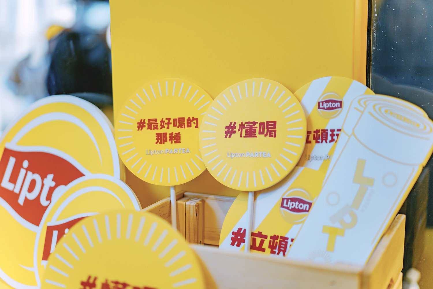
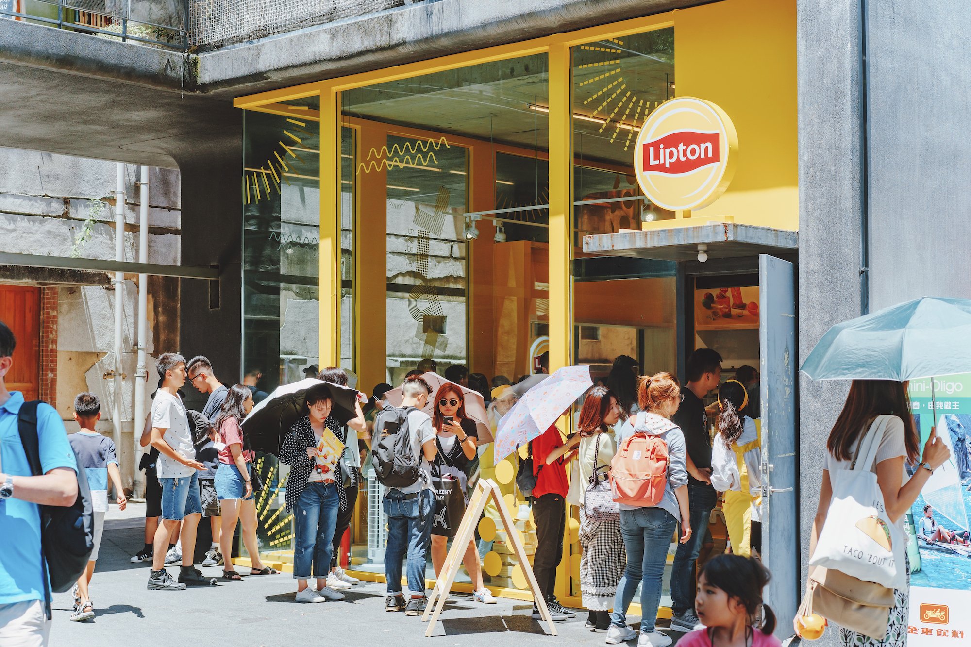
提升社群傳播(搭配打卡牆與Hashtag)
藉由系統性的定調之後,讓線上到線下的快閃店都能展現一致陽光亮眼的風格,大幅提升社群傳播的意願與視覺成效。
Start again from Lipton's sunshine
The team captures Lipton’s most distinctive daylight imagery and colors, and reshapes it into a simple and modern youthful image for the event audience, making Lipton Play Tea Shop 2.0 more dynamic and interesting.
Highly flexibility system
Presenting the main vision with a geometry full of infinite possibilities, in addition to the imagination of various permutations and combinations in various carriers, applications and dynamics, and using this totem system to create two bottle designs exclusively dedicated to Taipei.
Social Media propagation
After systematically setting the tone, online to offline pop-up stores can display a consistent and bright style, which greatly enhances the willingness and visual effect of community communication.


2019 立頓玩茶鋪 Lipton PARTEA
Branding&Key Visual Design
Design Agency | StudioPros Design
Art Direction | 李宜軒 Yi-Hsuan Li
Integrated marketing | 傳揚行銷廣告 TRENDYOUNG
Visual Design | 李宜軒 Yi-Hsuan Li
Logo Animation Director | 林思翰 Hans Lin ( Group. G )
3D Model | 曾郁庭 Yu-Ting Tseng
Interior Design | 傳揚行銷廣告 TRENDYOUNG
Client | 立頓 Lipton (聯合利華 Unilever)
Photography | 高慶和 Penguin Kao
Date | 2019