綠岩能源品牌重塑
GreenRock Energy Brand Renewal
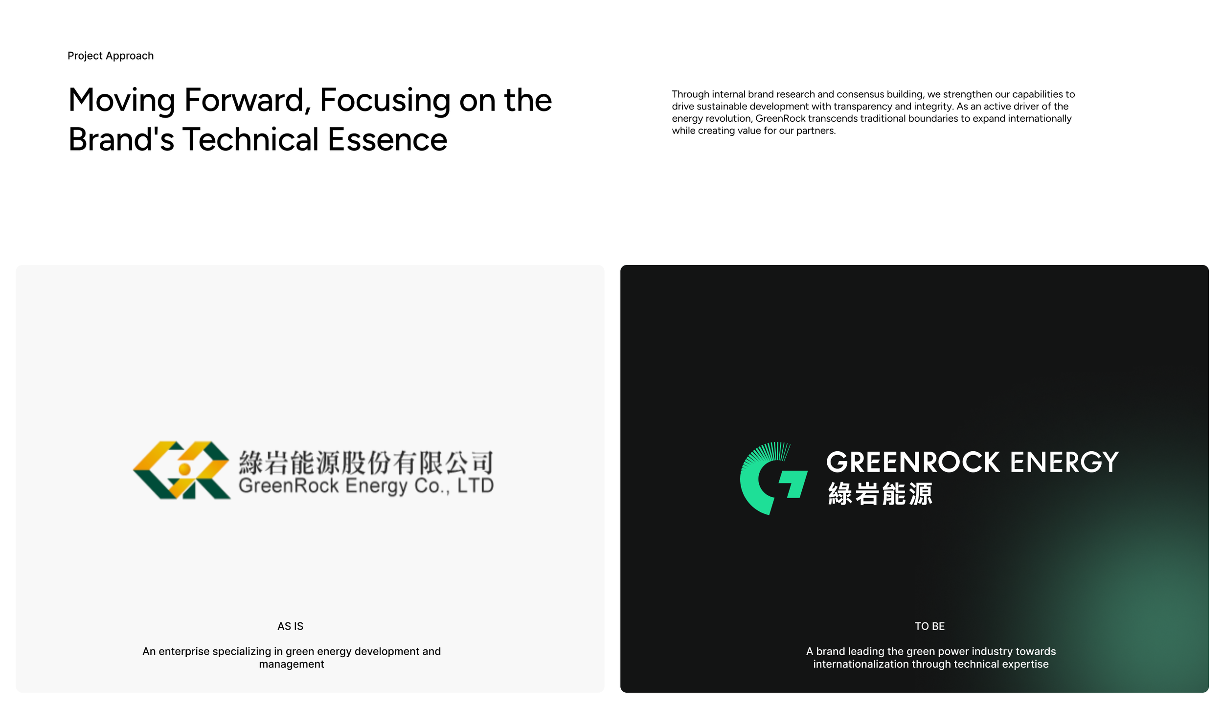
綠岩能源(GreenRock Energy)是一家致力於提供可持續能源解決方案的公司,專注於開發與推廣環保型能源技術,特別是在再生能源領域,與多家國際知名企業建立了戰略夥伴關係,如日本、越南、澳洲儲能市場與智慧社區,並在全球市場取得顯著進展。
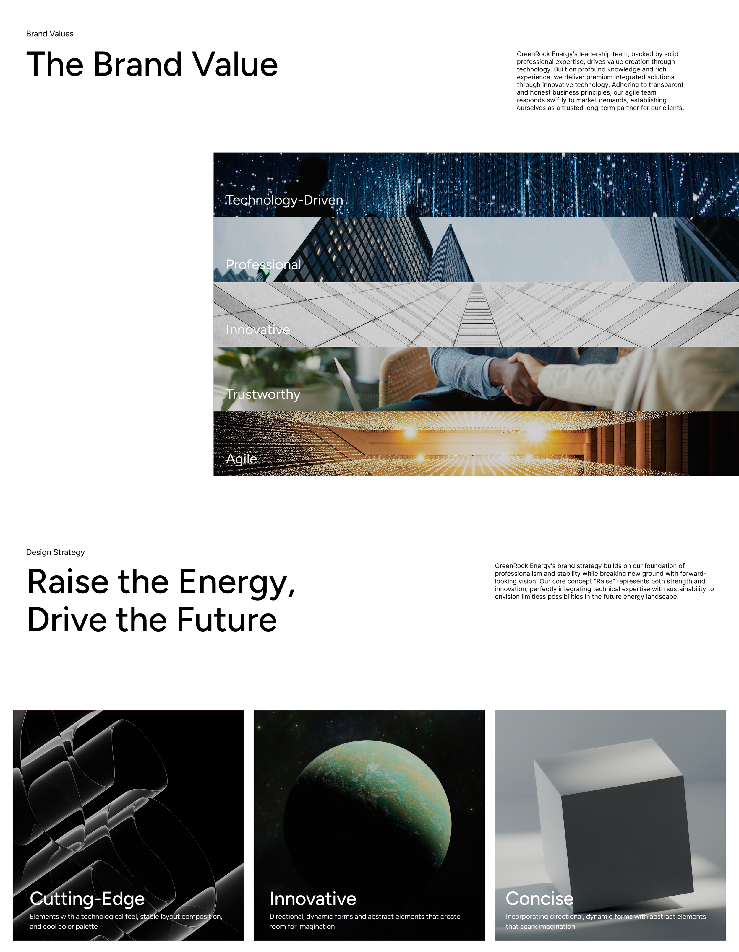
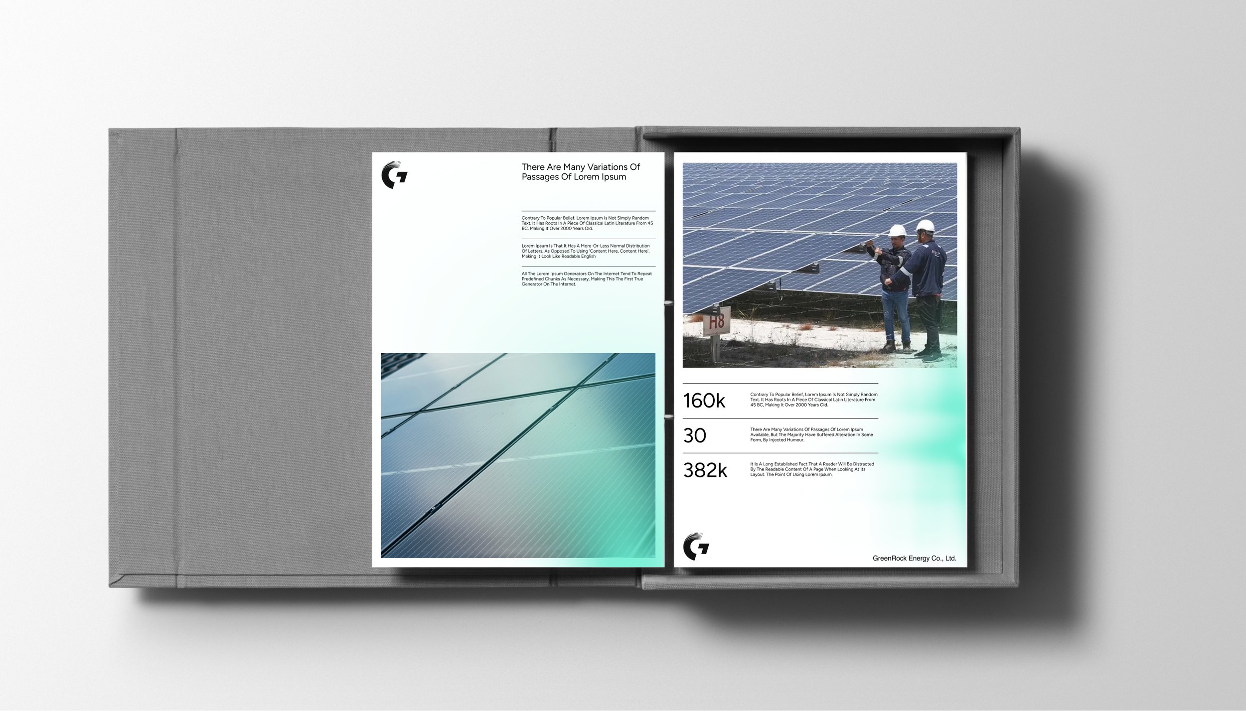
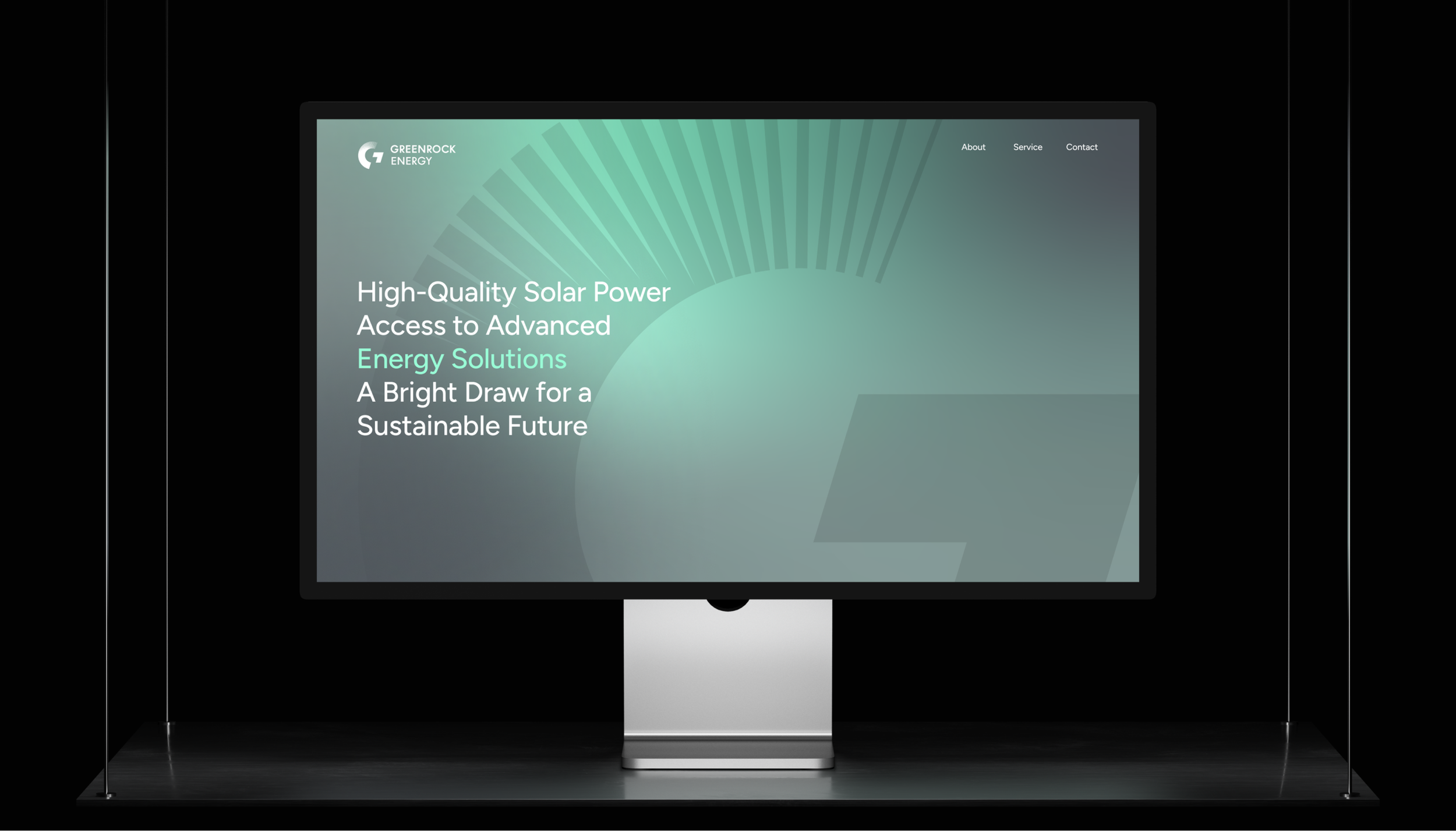
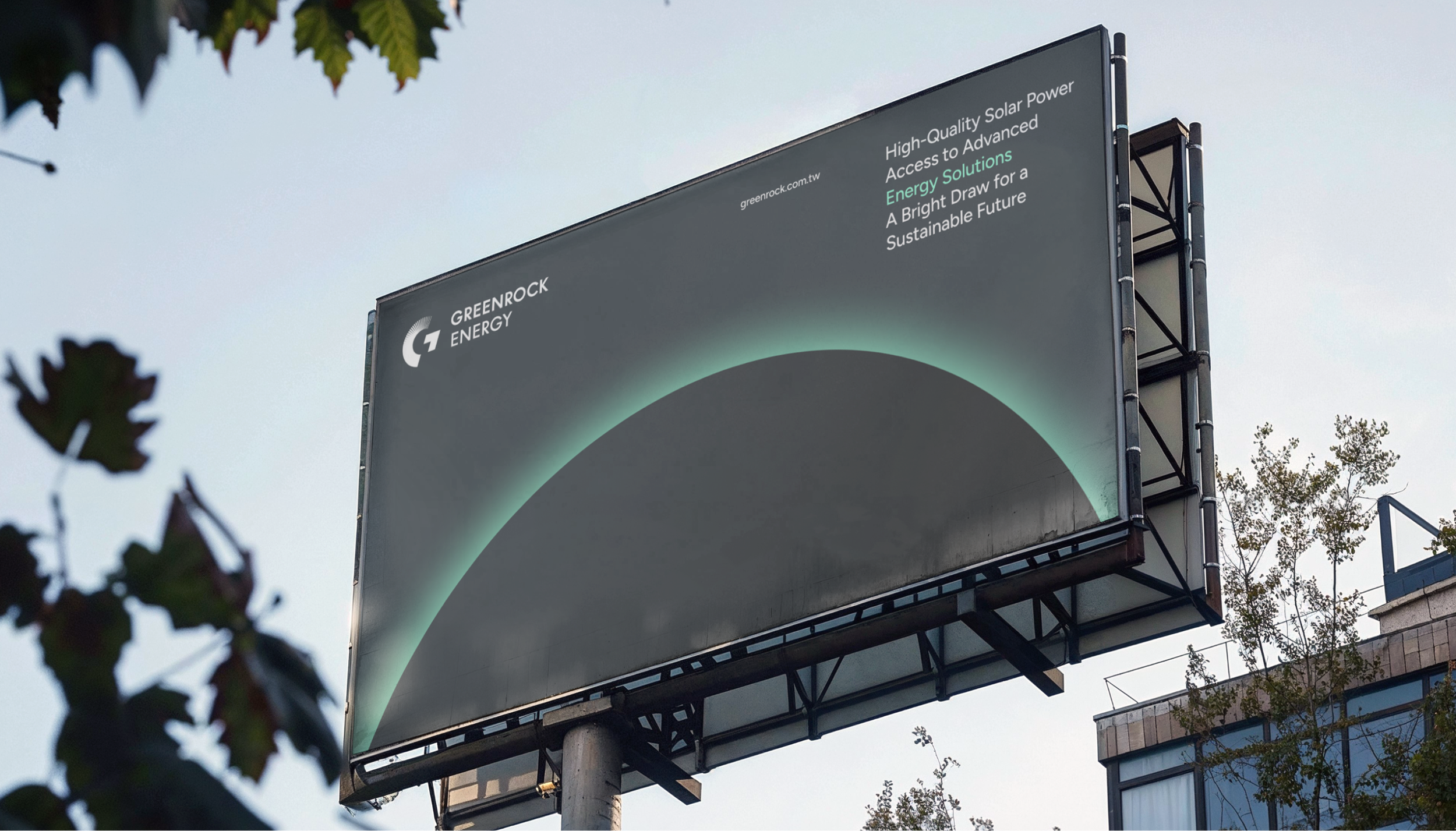
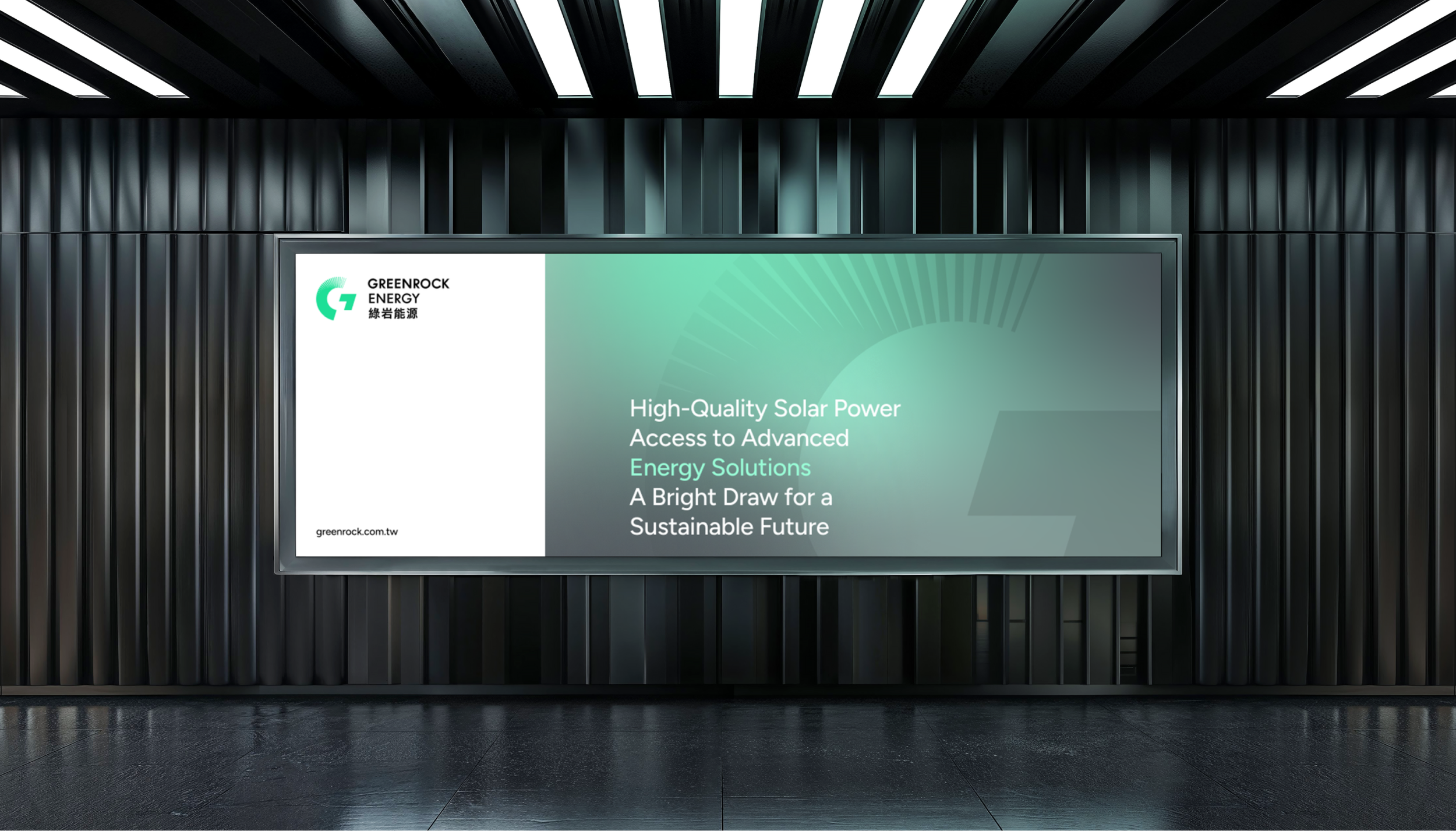
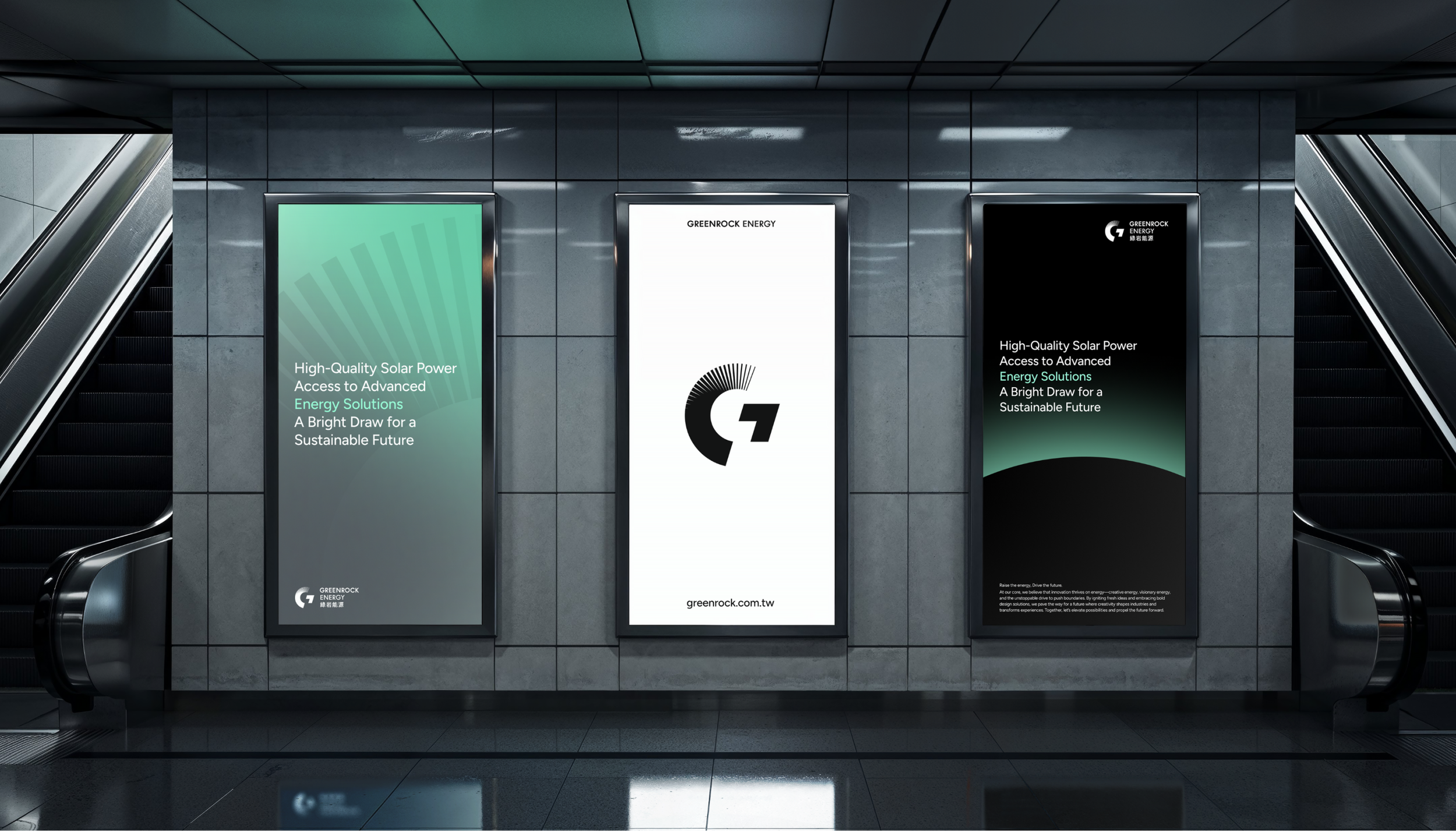
隨著綠岩能源邁向國際化,品牌設計面臨雙重挑戰:既要在全球範圍內統一傳達企業在永續發展的專業實力與願景,又要能因地制宜,靈活回應各地市場文化差異與在地需求,在品牌設計上展現更高的包容性與創新性。設計透過內部聚焦問卷,將品牌定位聚焦於「Raise」概念,結合太陽能技術實力與永續理念,展現綠岩對環境的承諾。這個核心策略不只象徵力量,更代表創新動能,勾勒未來能源的無限可能。此外,為全新的品牌識別系統建構彈性架構,能適應綠能發電與跨領域技術整合的多元發展。透過獨特的視覺語彙,提升市場影響力並強化與投資者、合作夥伴的溝通效益。
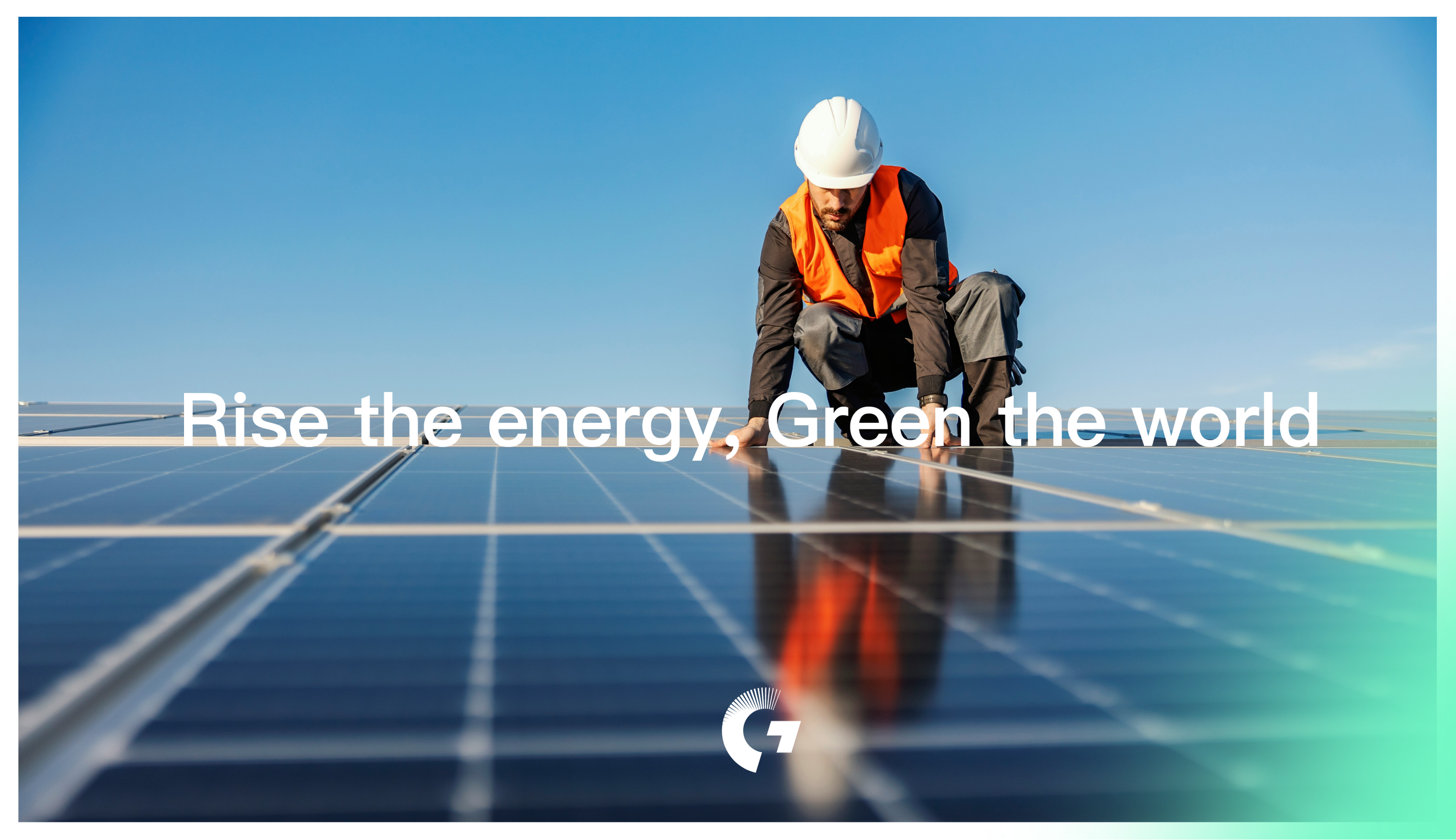
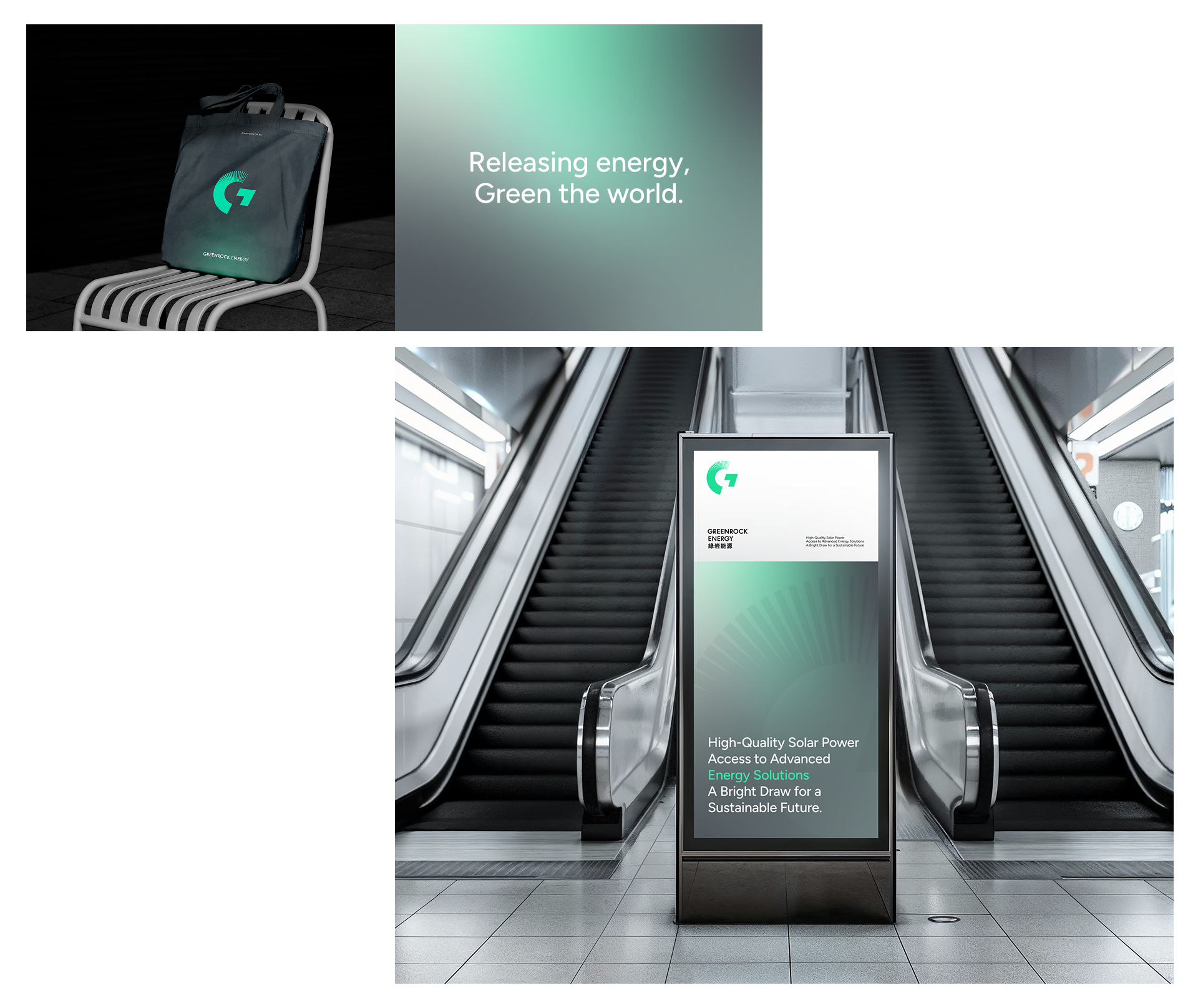
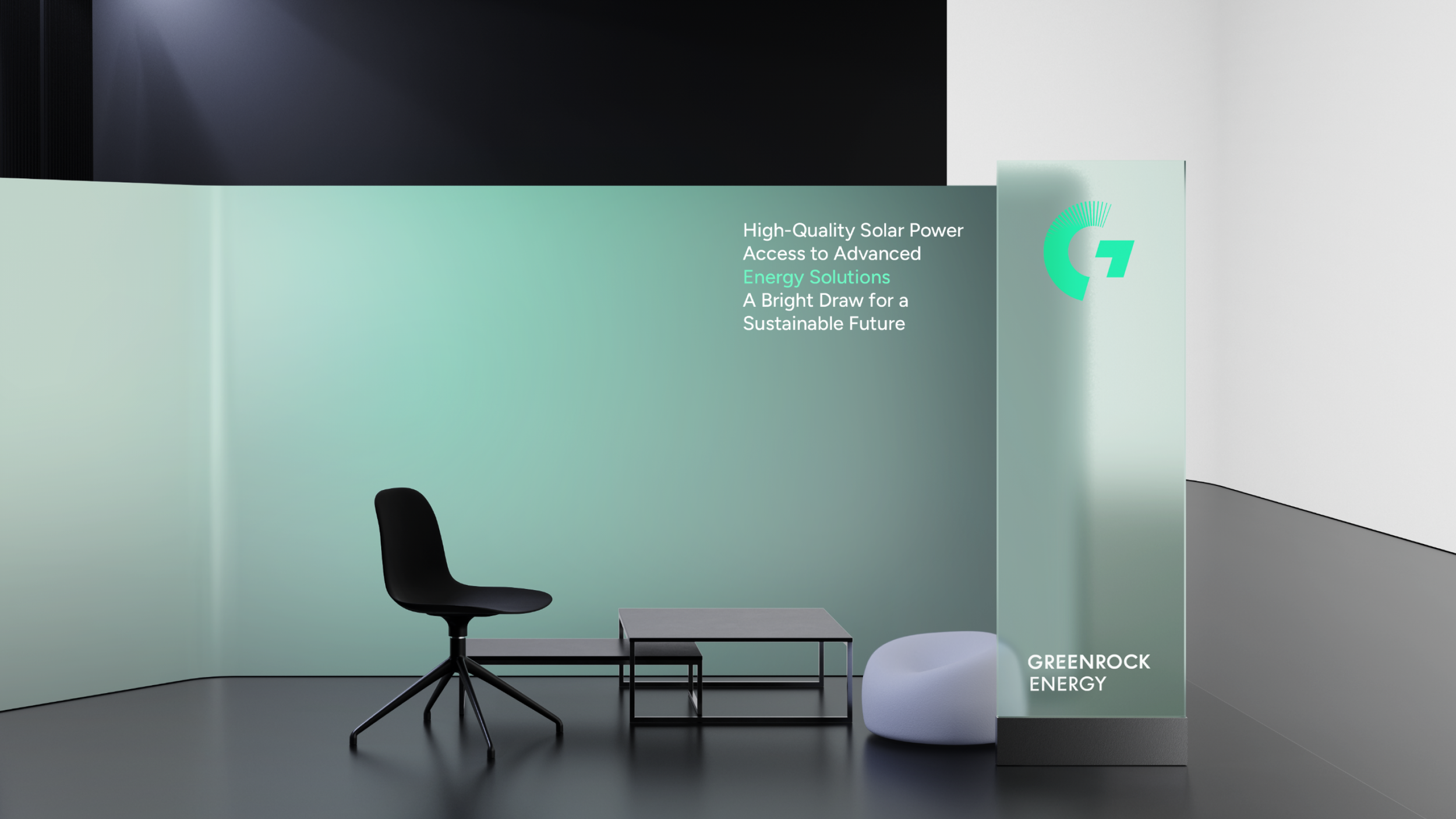
釋放能量,驅動未來:勾勒能源的無限可能
Raise the Energy, Drive the Future
GreenRock Energy is a company dedicated to providing sustainable energy solutions, focusing on eco-friendly energy technologies in the renewable energy sector. With strategic partnerships across Japan, Vietnam, and Australia, the company has achieved significant global progress. As it advances toward internationalization, brand design faces dual challenges: maintaining unified global communication of professional expertise and sustainability vision while remaining adaptable to local market cultures and needs. Through internal focus surveys, we centered brand positioning on "Raise," combining solar technology expertise with sustainability principles. This core strategy symbolizes power and innovation, sketching limitless possibilities for future energy. The flexible brand identity system accommodates diverse developments in renewable energy and cross-sector technology integration, enhancing market influence and strengthening communication with investors and partners through distinctive visual language.
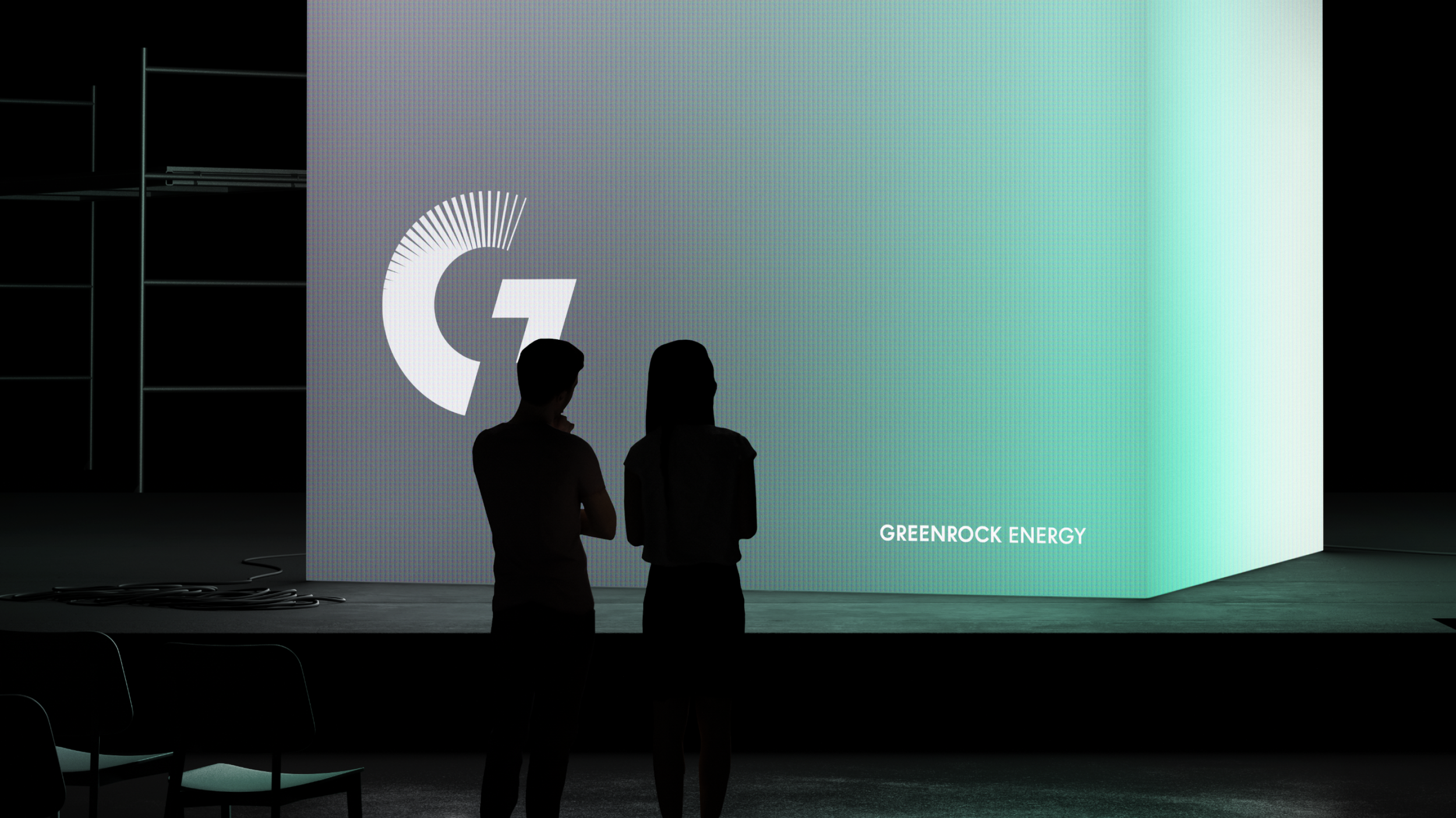
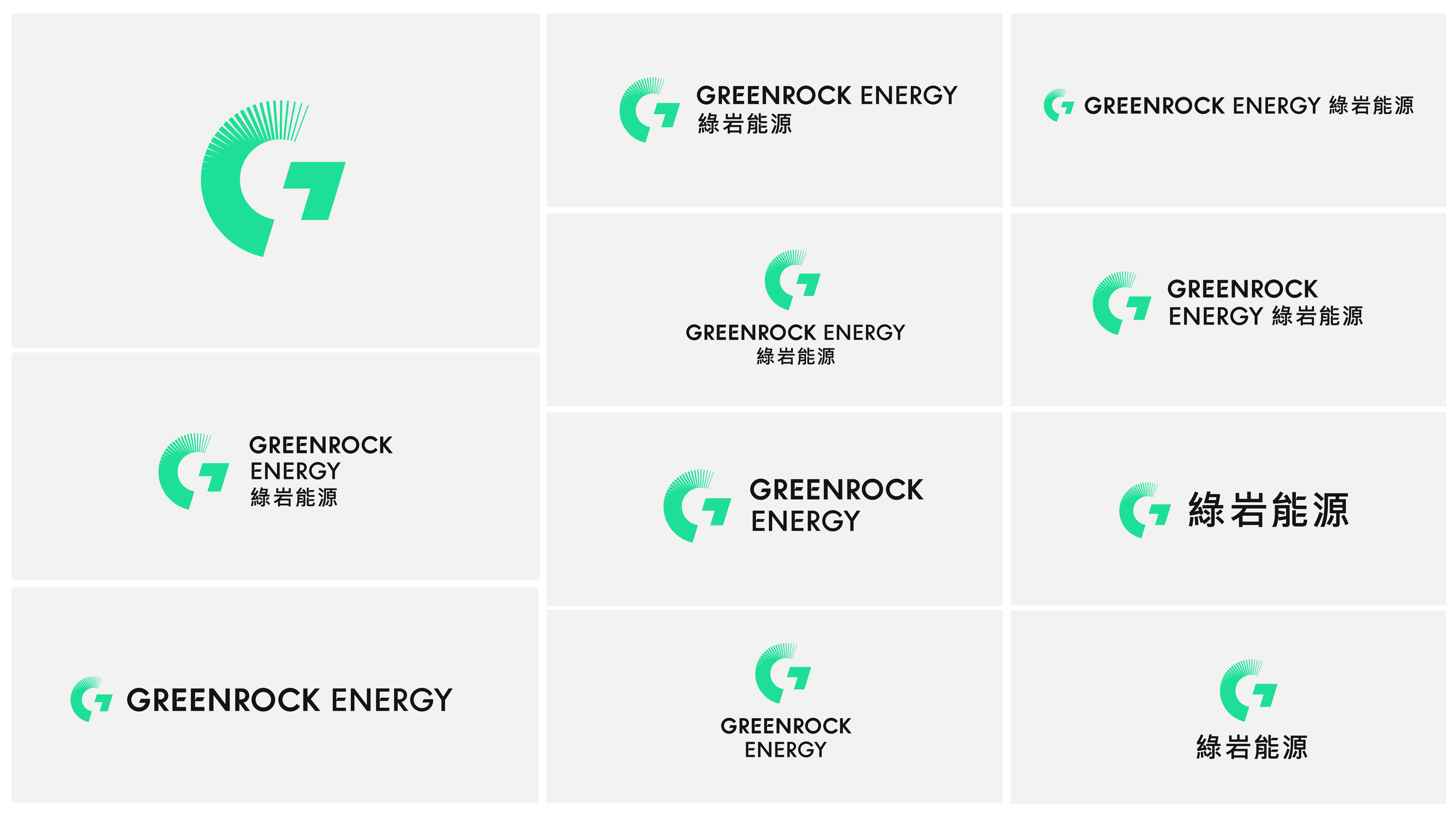
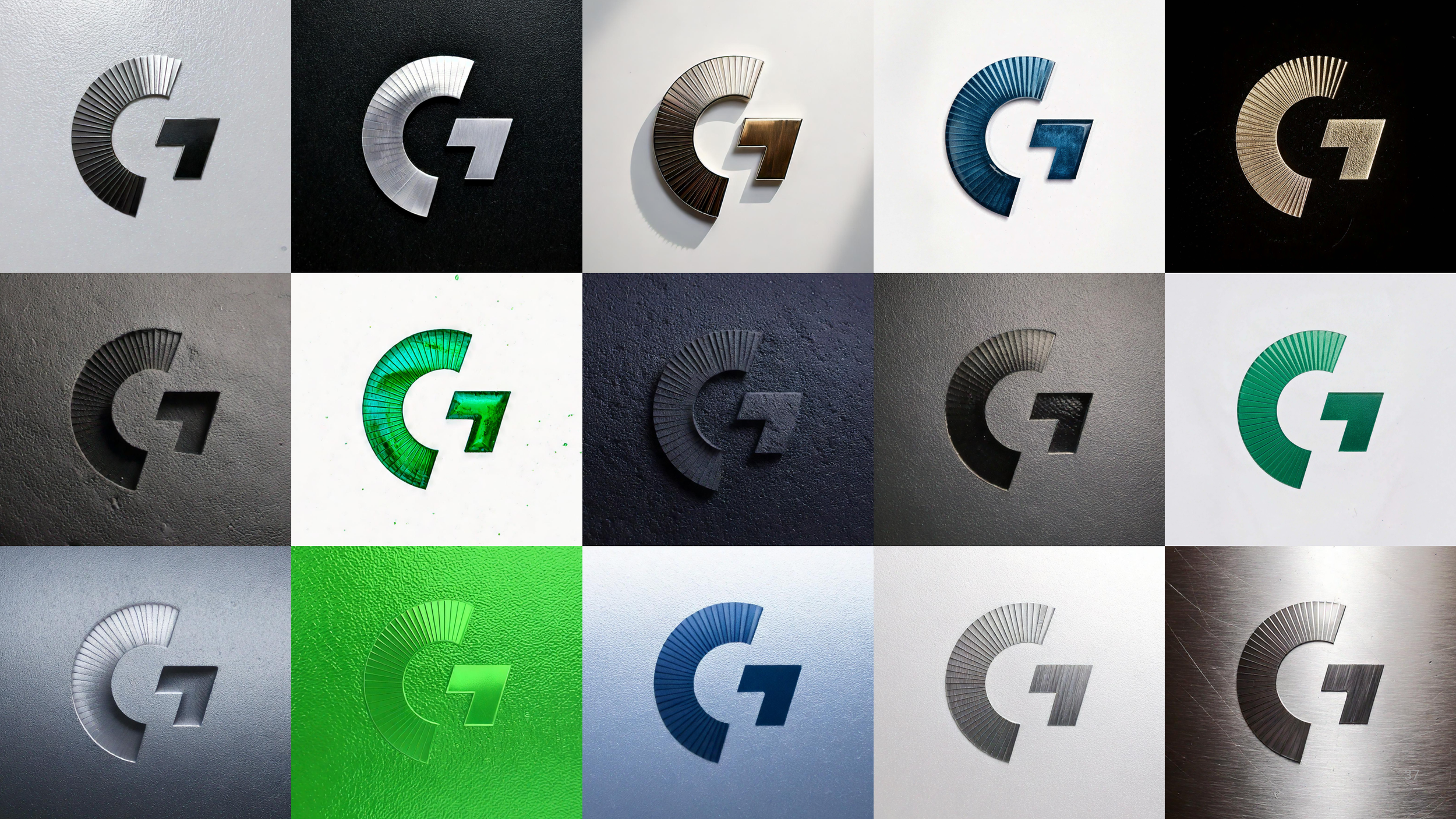
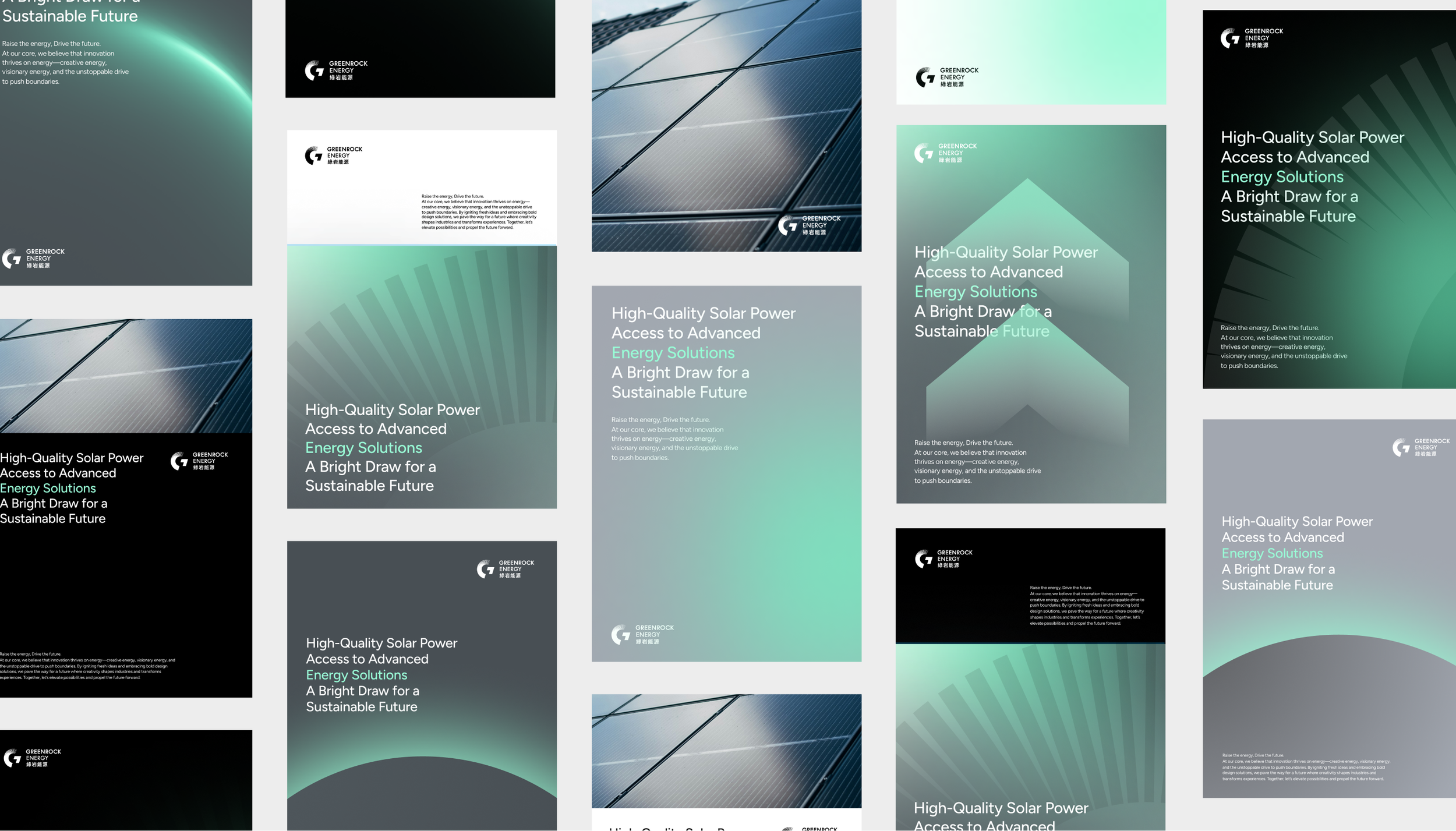
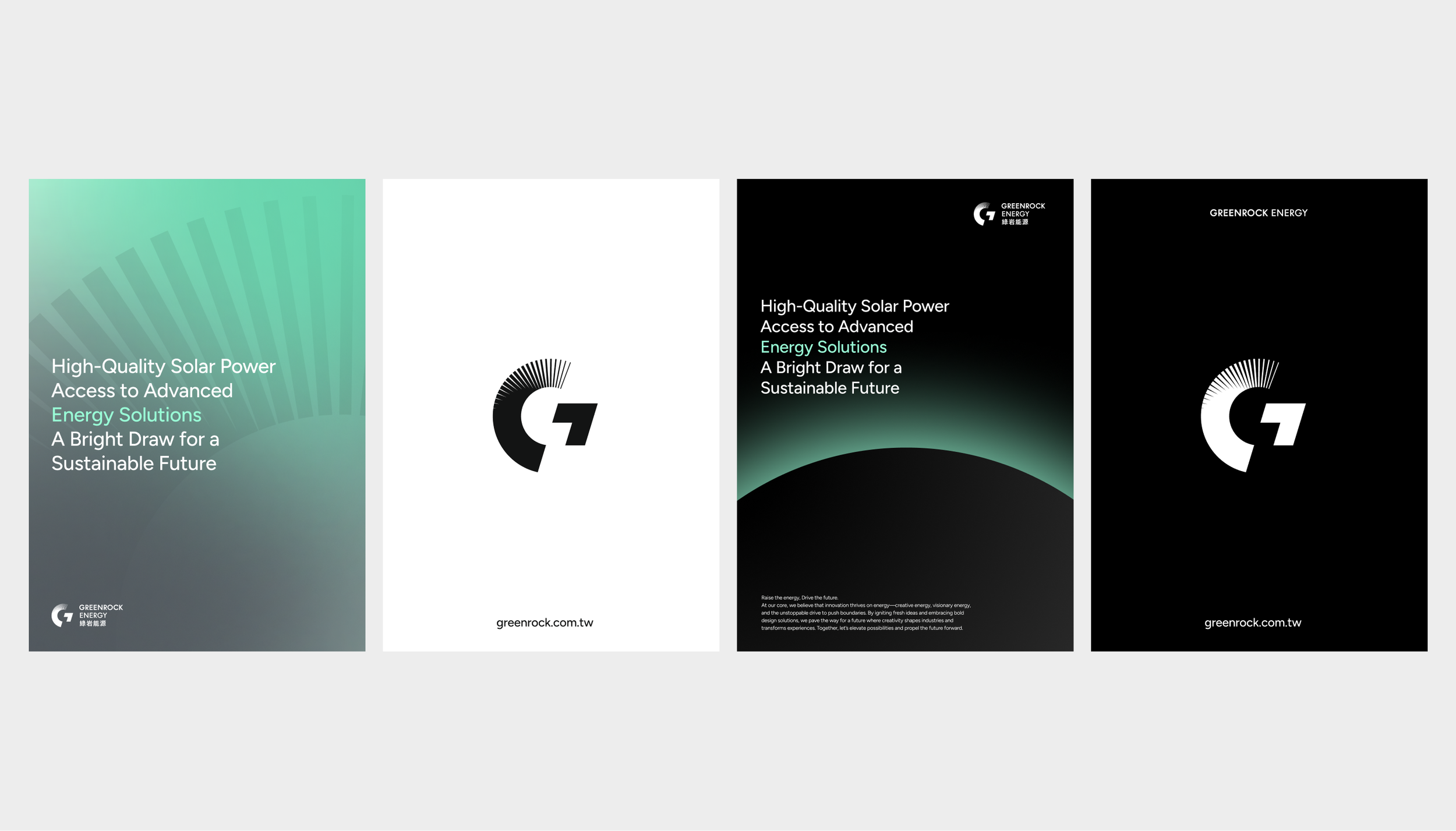
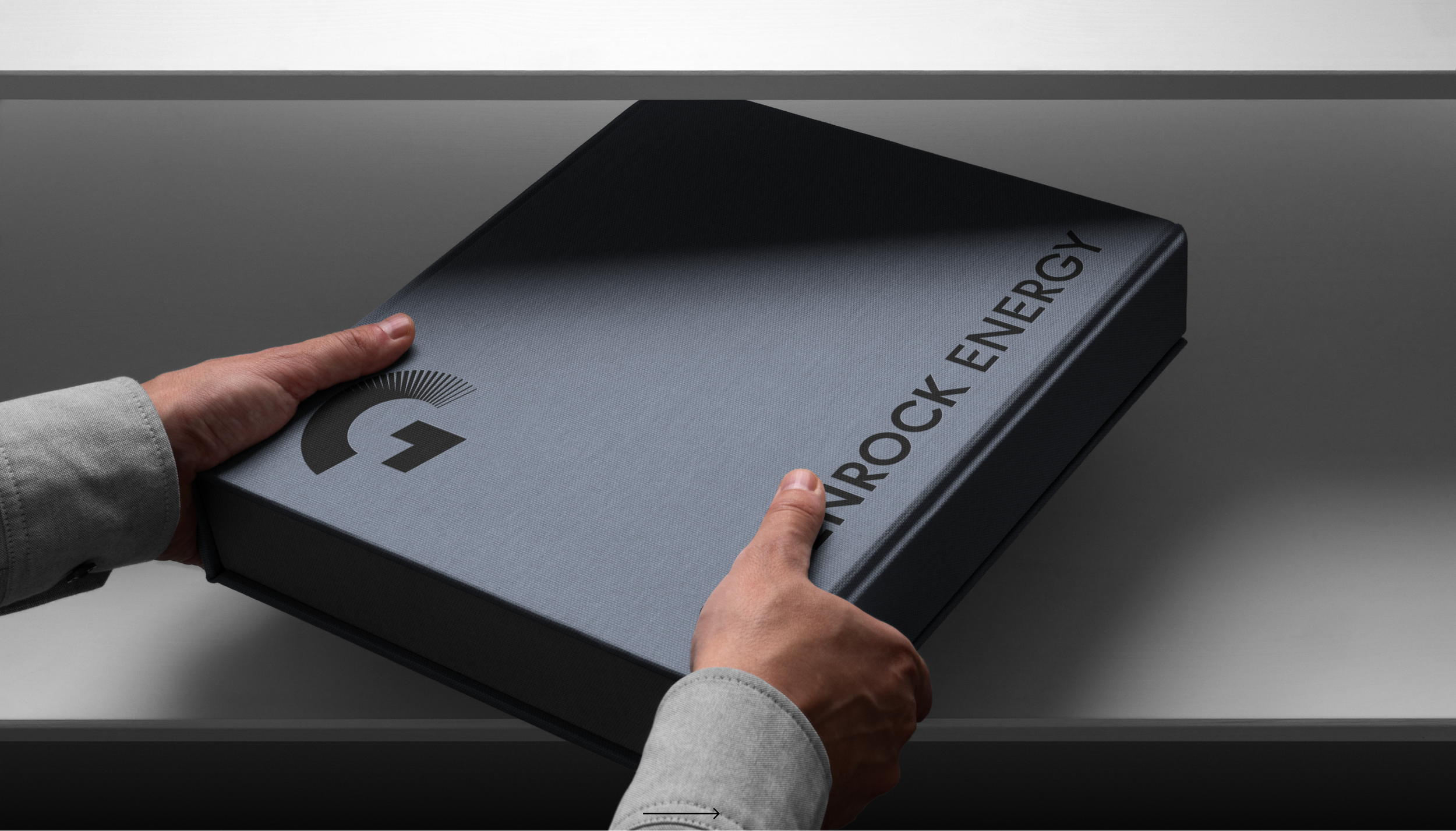
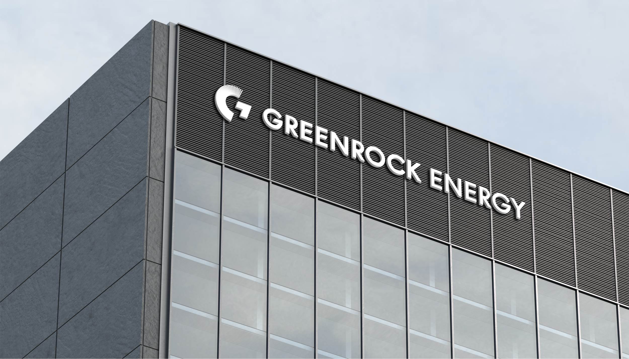
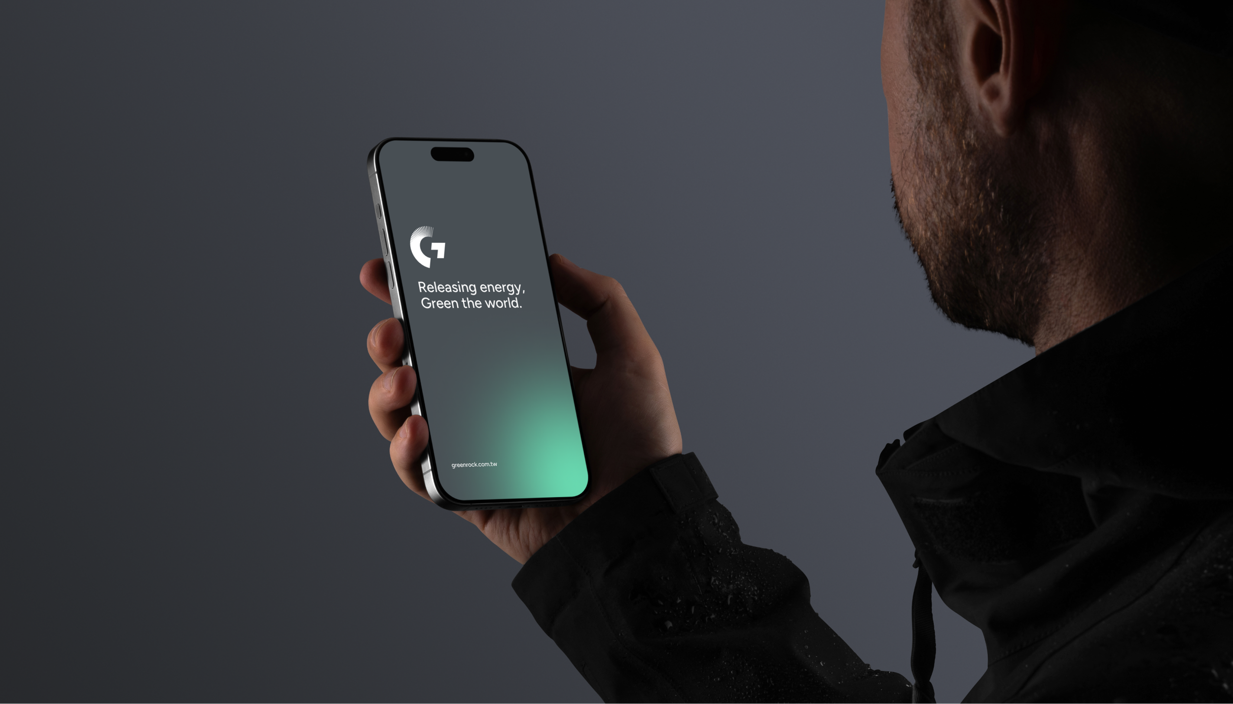
品牌標誌設計以躍升、前行象徵突破傳統能源的界限,以如箭頭般向上的設計語言,傳遞無限潛能與持續進化的動能。設計融入光芒與幾何動態元素,描繪出力量與方向感,展現品牌對未來的前瞻與創新。
設計策略
躍升前行
The logo design embodies transcendence of traditional energy limitations through upward-moving elements. Its arrow-like upward design language, combined with radiant and geometric elements, communicates unlimited potential and evolutionary momentum while expressing the brand's innovative vision.
Design Strategy
Raise the Energy, Drive the Future
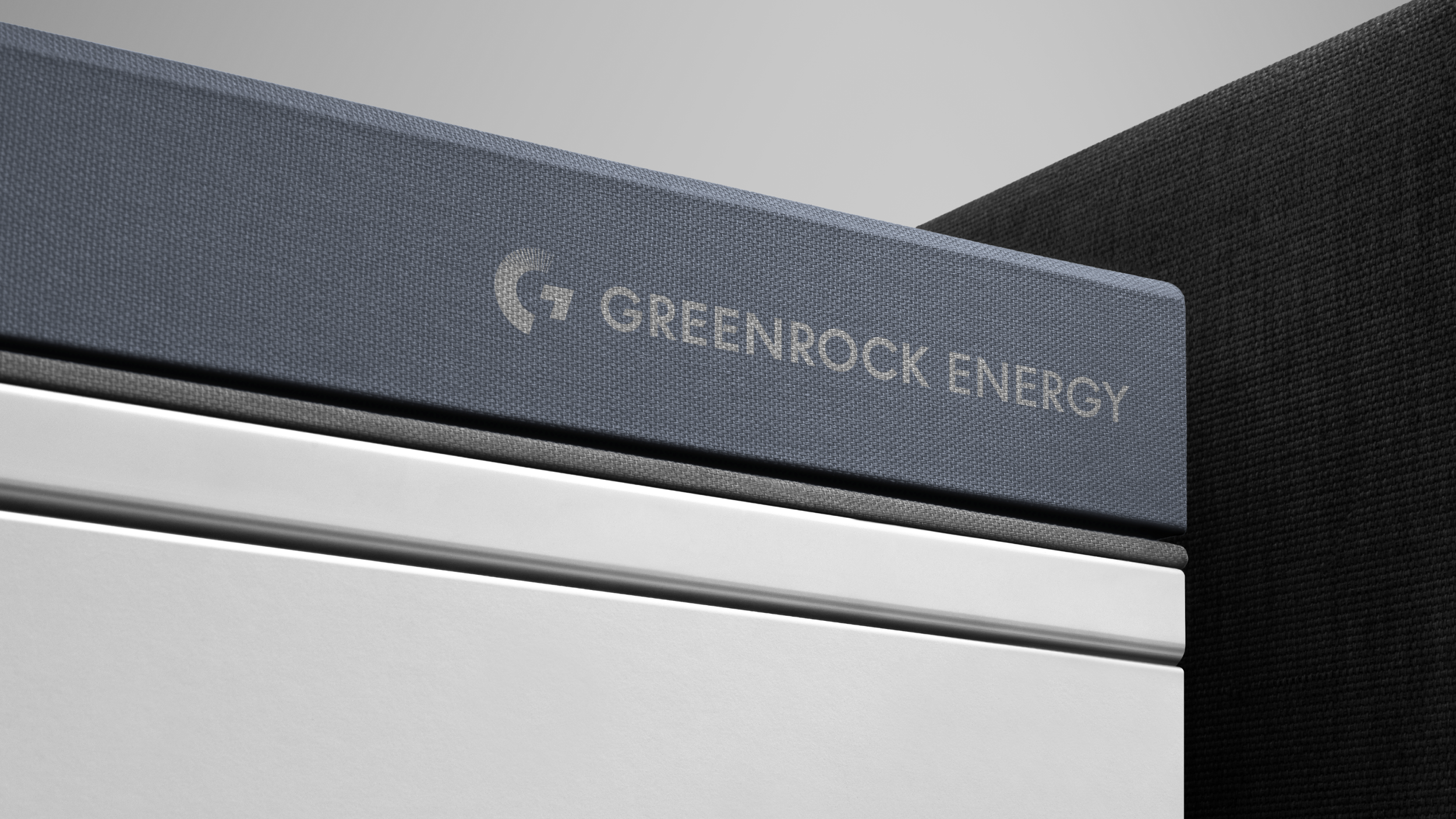
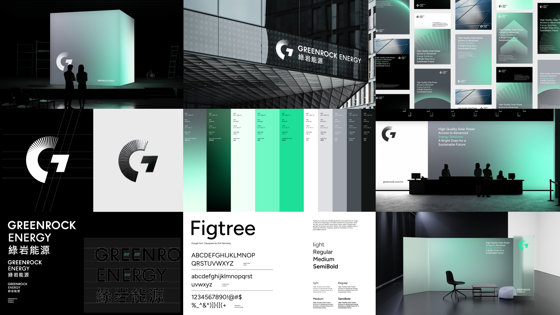
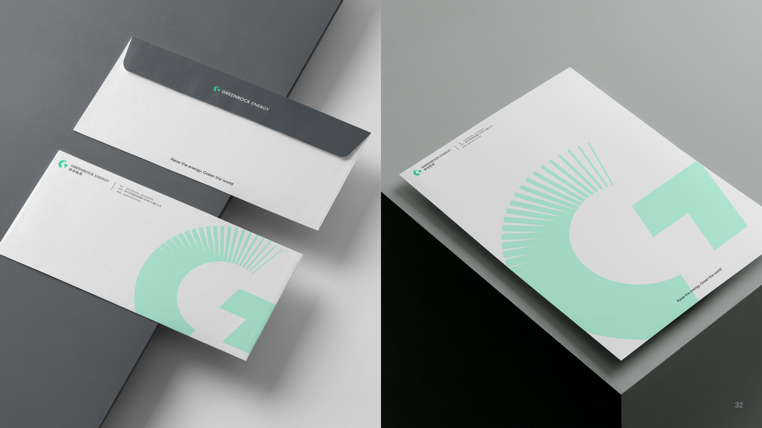
以綠為根基,向未來前行
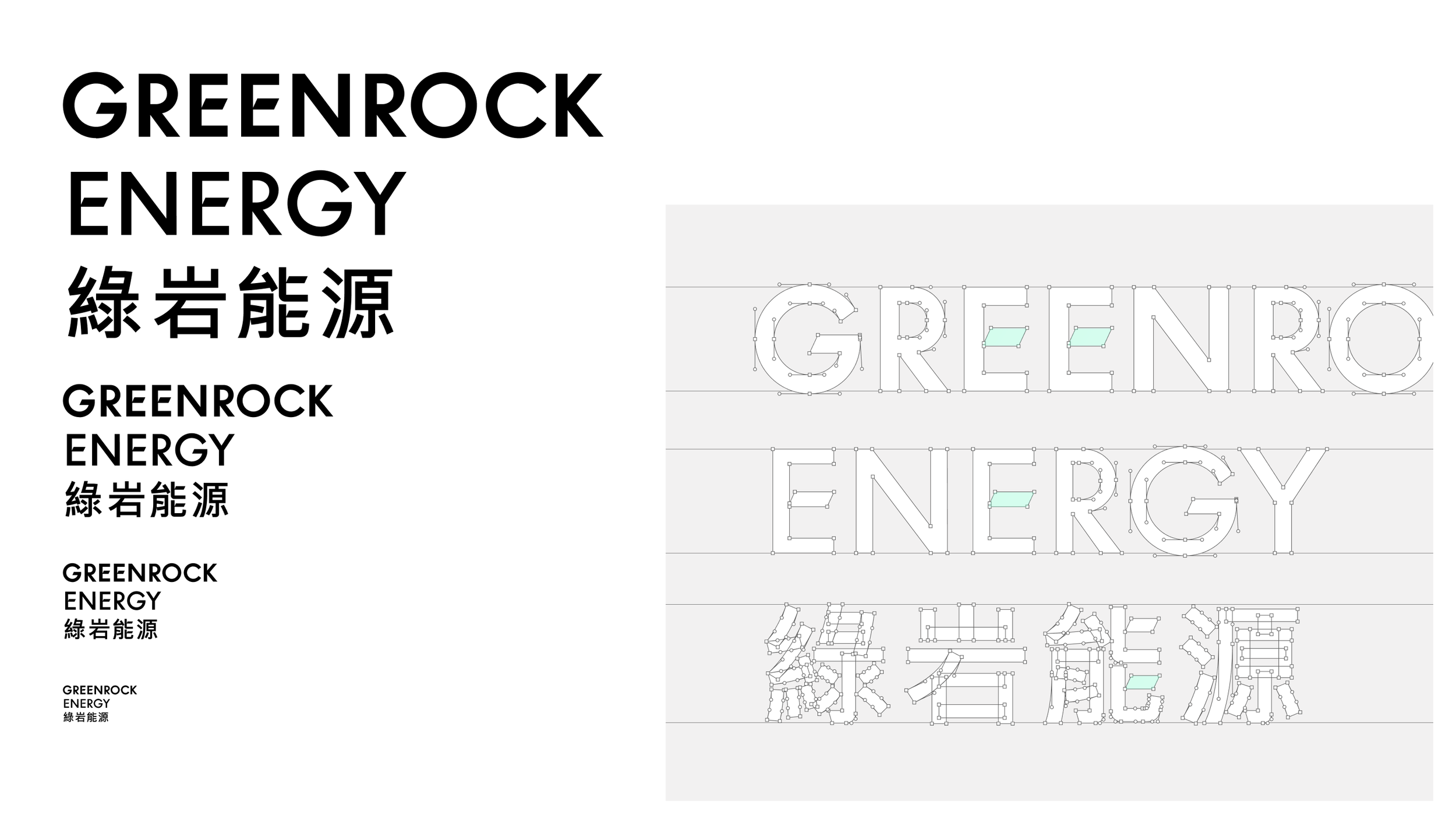
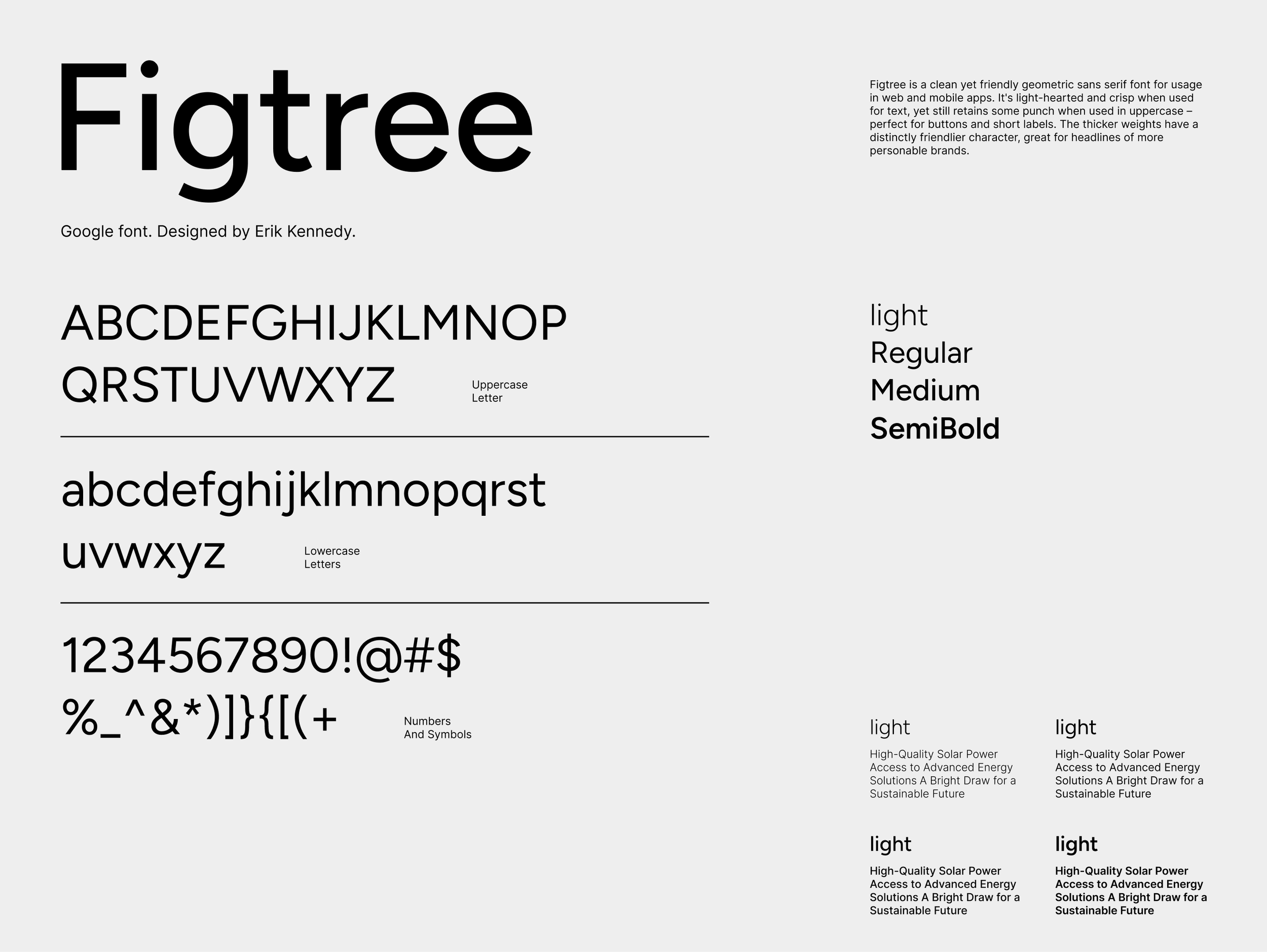
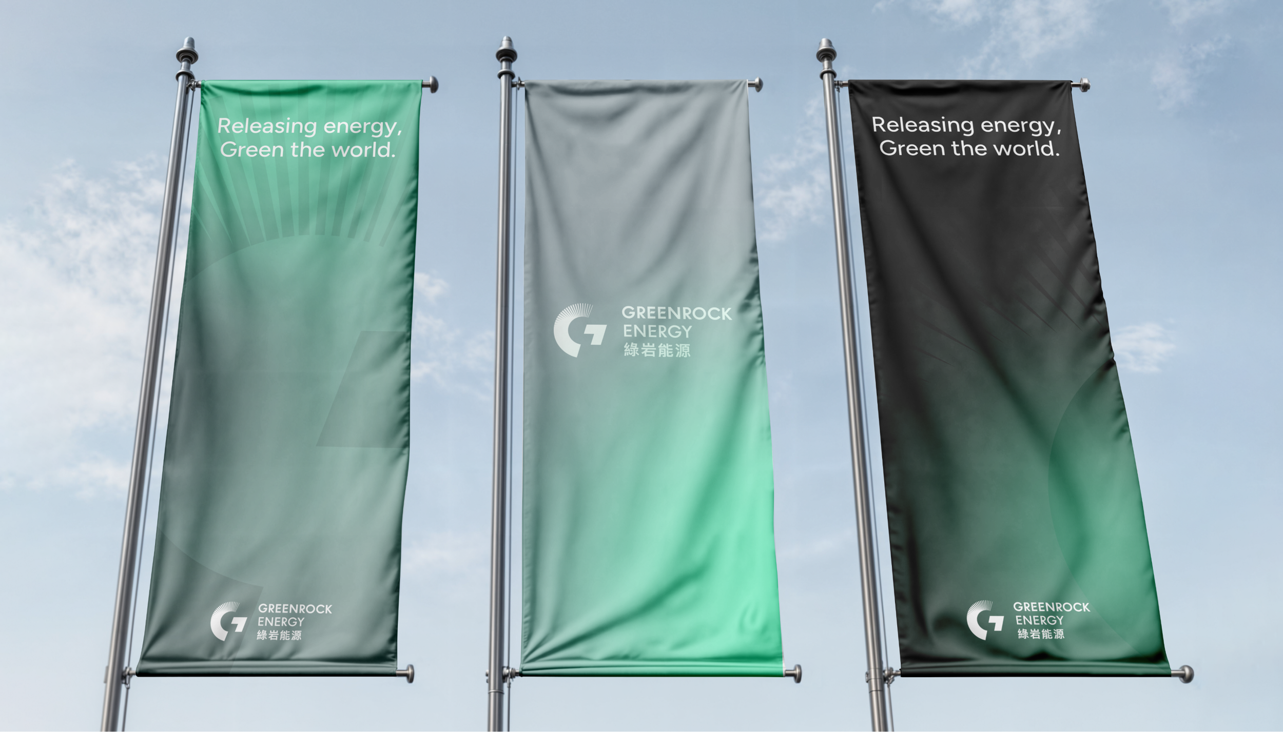
品牌標準字透過將部分筆畫轉為平行四邊形的設計,巧妙呼應太陽能板的幾何造型,並搭配Figtree作為企業字體。色彩運用綠色呼應品牌名稱「綠岩」,結合灰色調塑造出科技感與未來感,展現專業與創新的品牌形象。
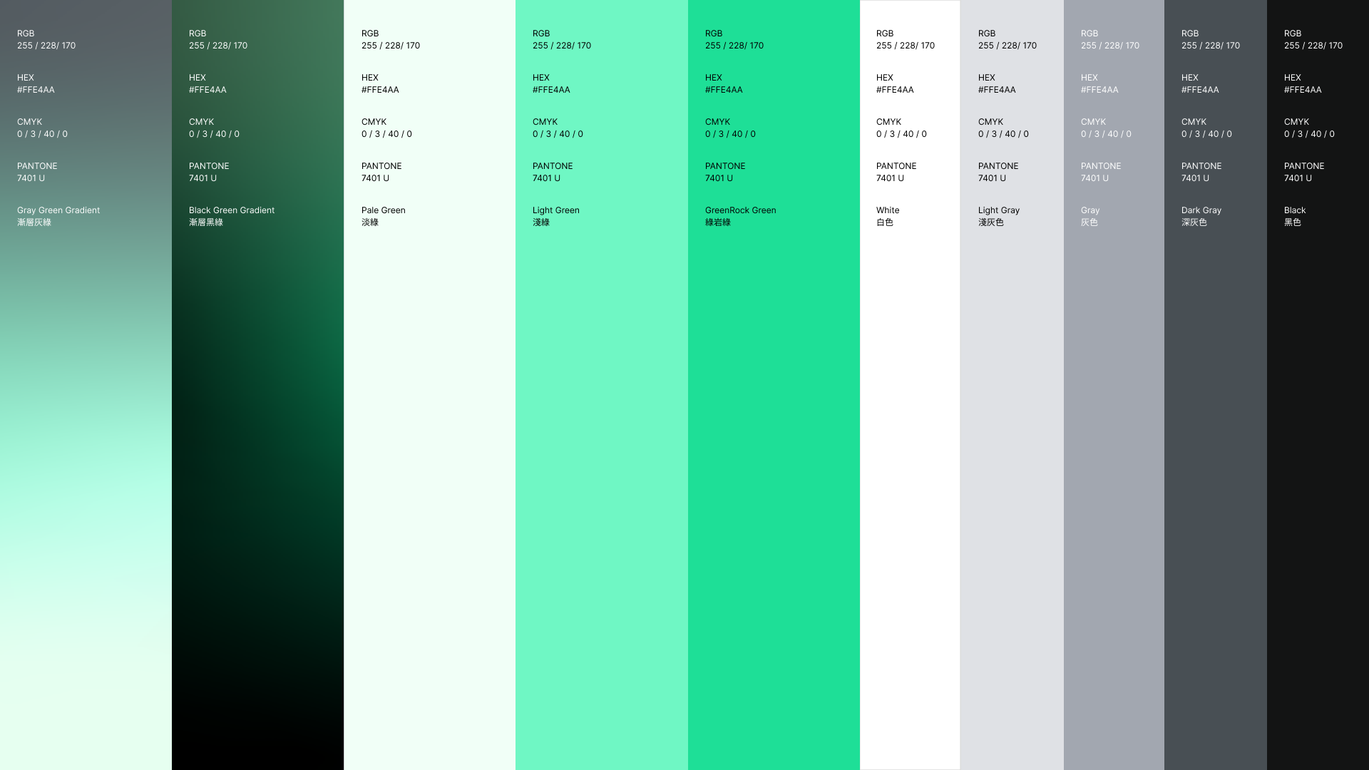
品牌色彩
Rooted in Green, Built for Tomorrow
The brand typography features modified strokes with parallelogram shapes that cleverly echo the geometry of solar panels, paired with Figtree as the corporate typeface. The color scheme combines green, reflecting the "Green" in GreenRock, with grey tones to create a technological and futuristic aesthetic, conveying a professional and innovative brand image.
Brand Color
以綠為根基,向未來前行
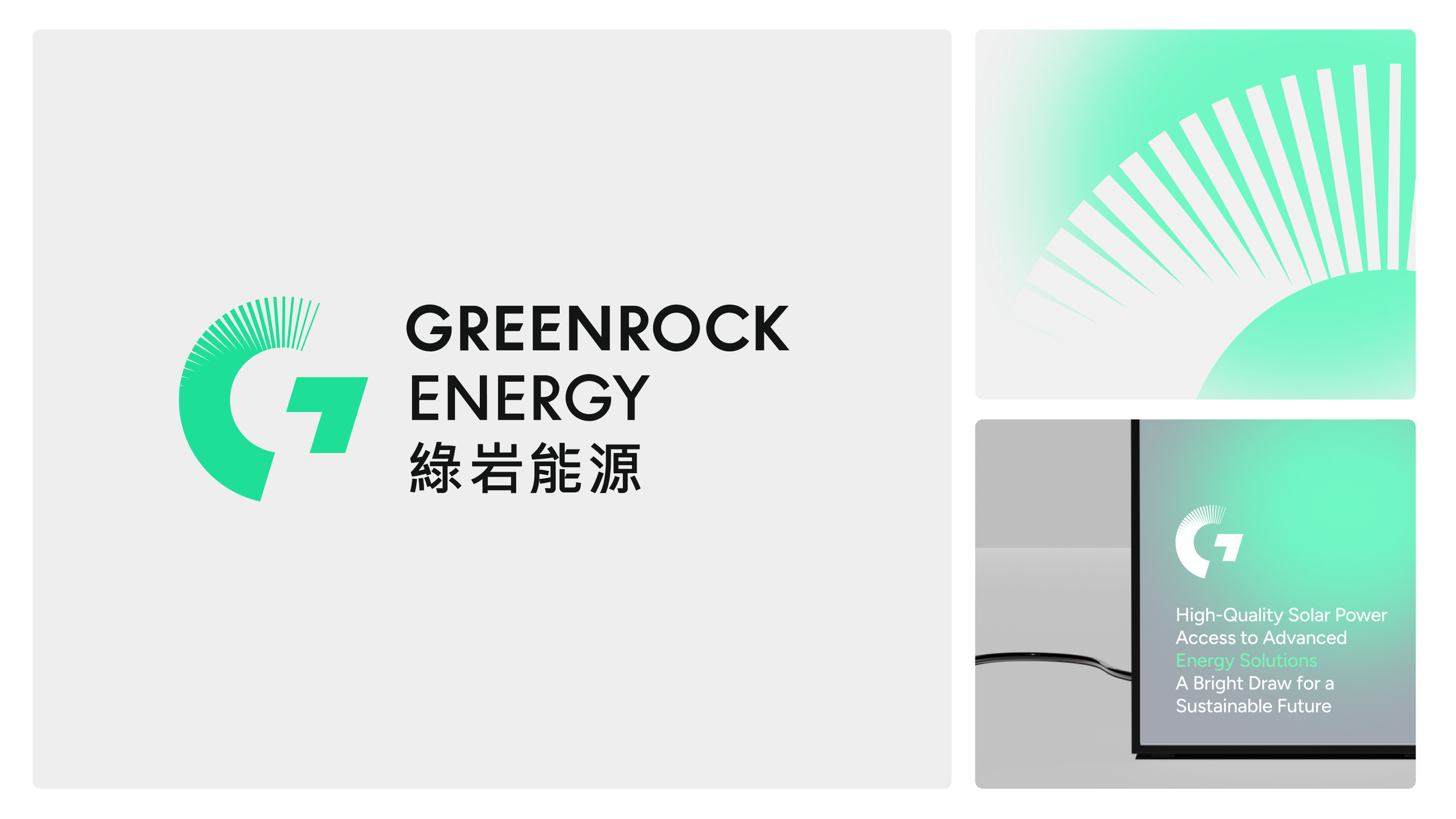
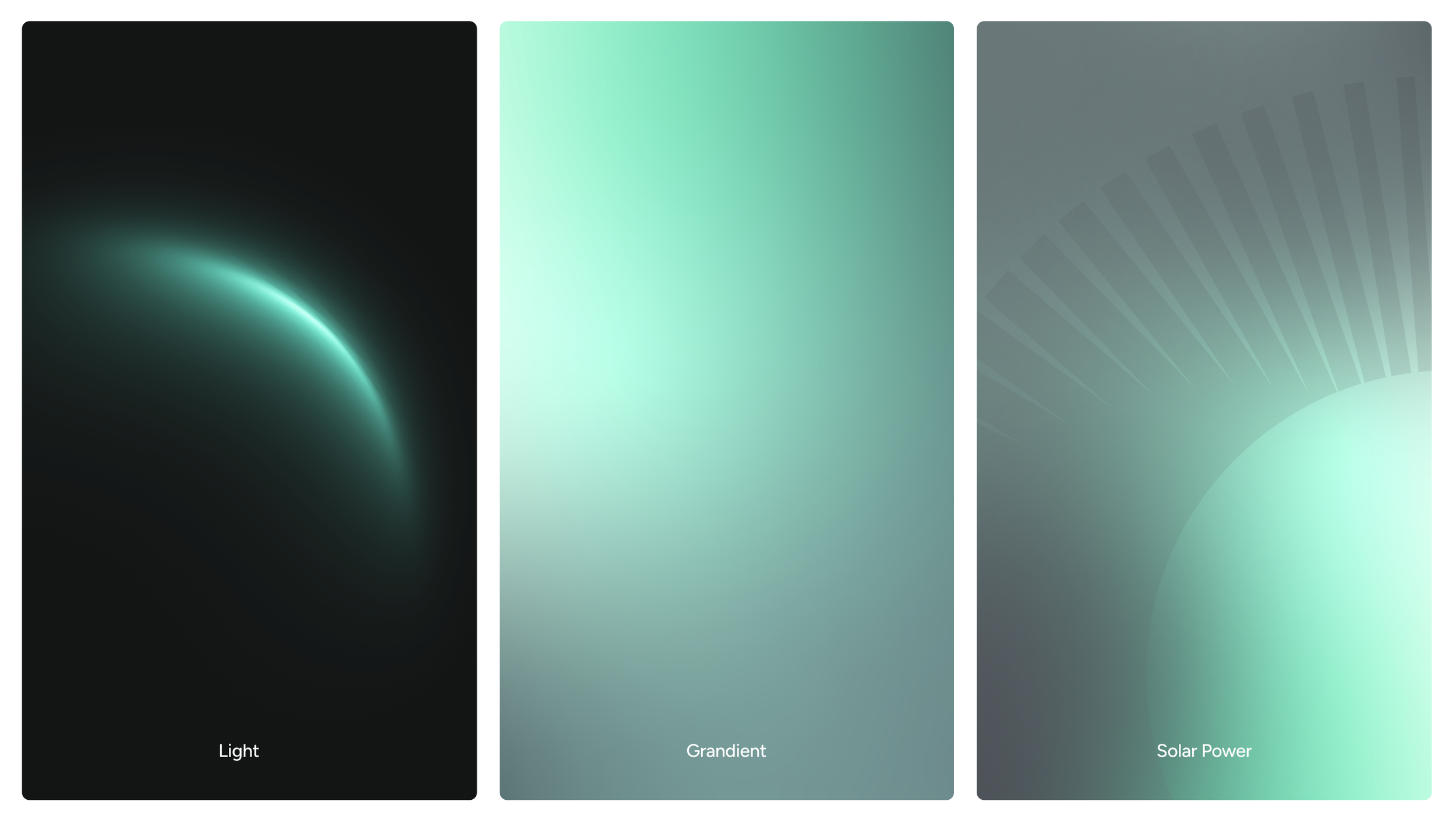
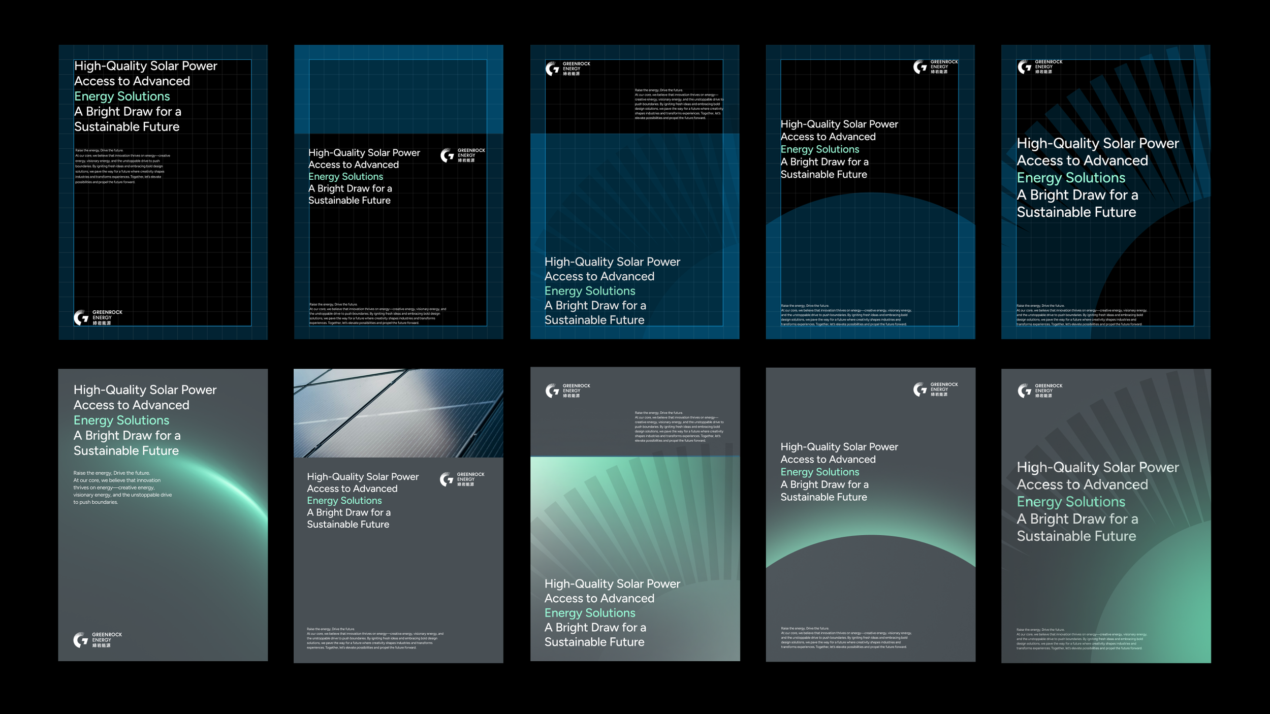
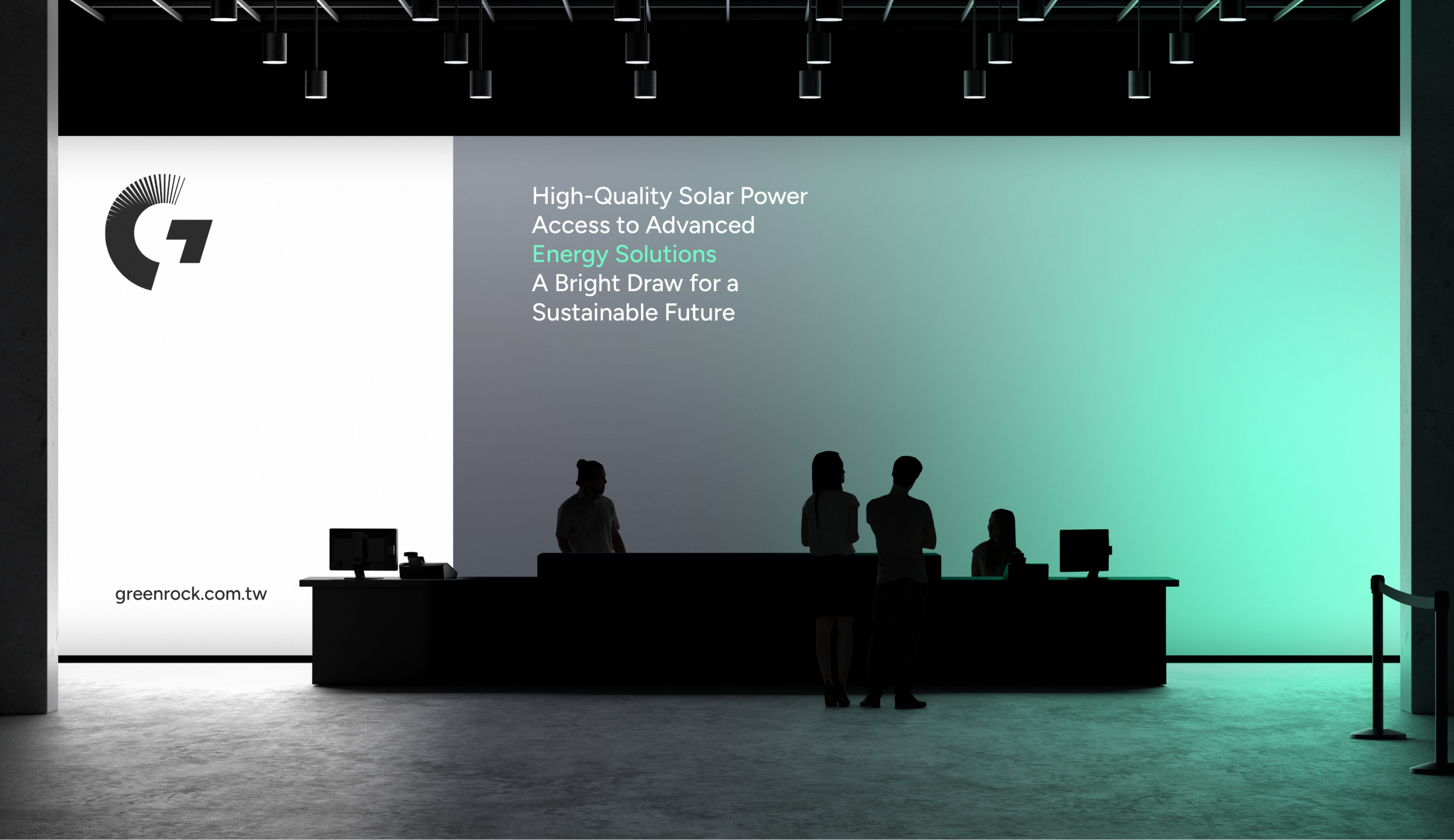
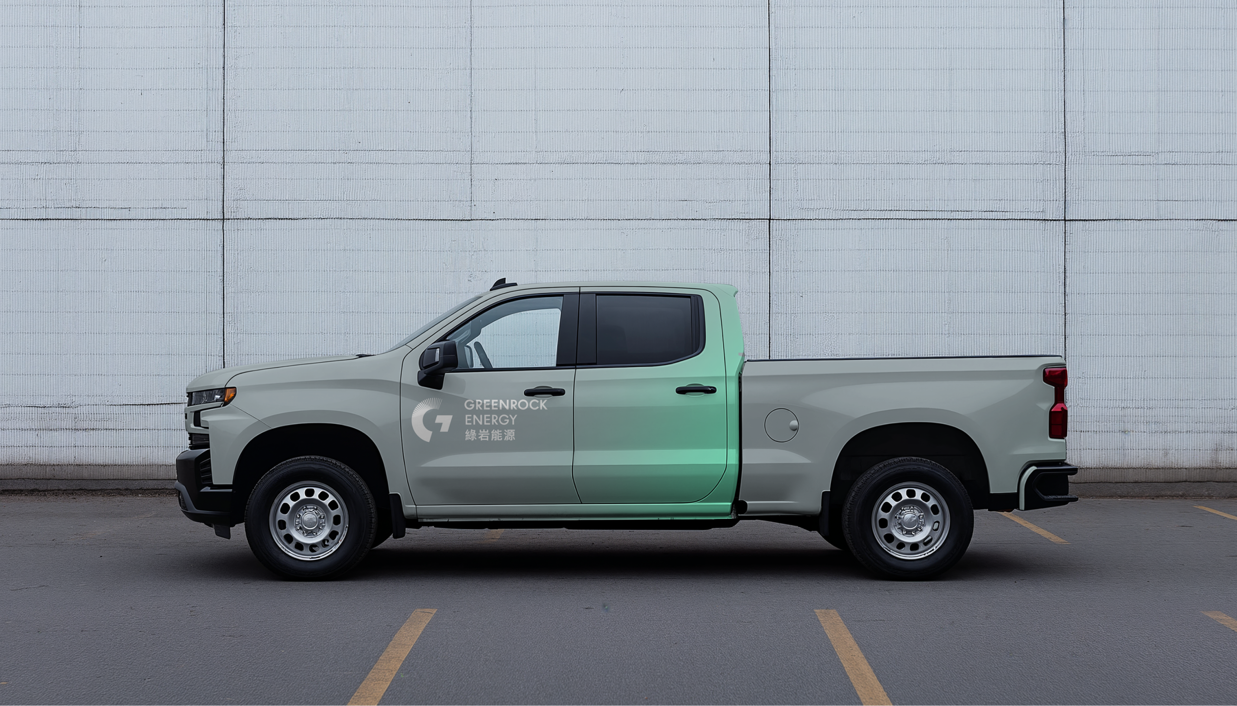
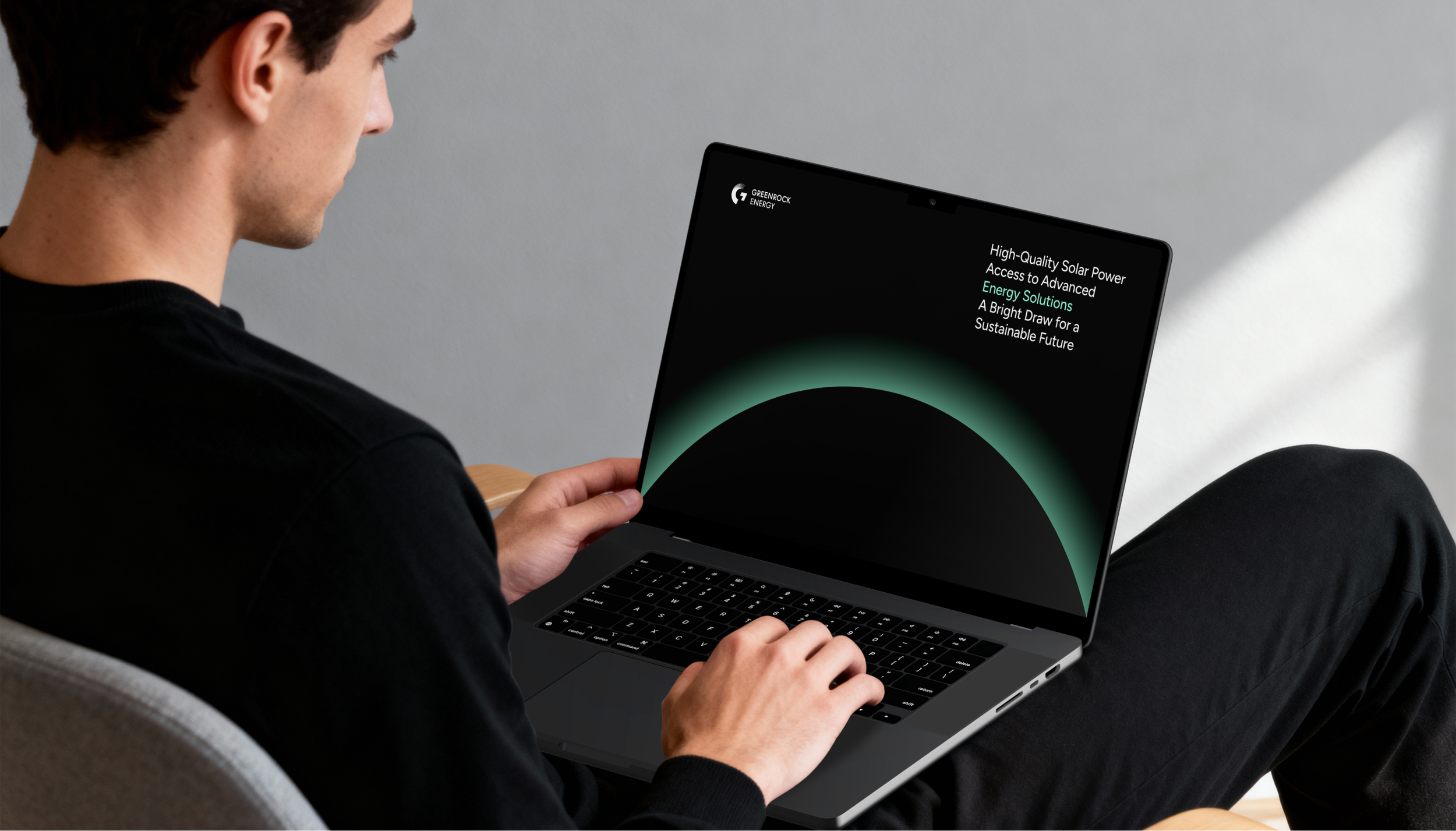
品牌輔助圖形系統源自標誌設計元素,透過漸層配色、光源渲染與抽象圖形的靈活運用,創造出層次豐富的視覺效果。在單色背景上,以不同色調比例與深淺變化展現流動感,並將設計元素延伸發展為多樣化的型態,形成一套完整且富有動態的視覺語彙,展現品牌的創新精神與活力。
品牌輔助圖型
Gradient in Motion, Depth in Vision
The brand's supporting graphic system, derived from logo design elements, creates rich visual layers through the flexible use of gradients, light rendering, and abstract forms. On monochromatic backgrounds, varying color proportions and tonal depths convey fluidity, while design elements extend into diverse patterns, forming a comprehensive and dynamic visual vocabulary that expresses the brand's innovative spirit and vitality.
Ancillary Graphic


綠岩能源品牌重塑
GreenRock Energy Brand Renewal
Design Agency | StudioPros Design
Art Director | 李宜軒 Yi-Hsuan Li
Brand Experience Director | 張文馨 Moon Chang
Visual Design | 李宜軒 Yi-Hsuan Li、鄭原傑 Yuan-Chieh Cheng
Logotype Designer | 鄭原傑 Yuan-Chieh Cheng
Logo Design Animation | 曾煜仁 Jin Zeng
Brand Guidelines System | 張文馨 Moon Chang、張宇宏 Tako Chang、鄭原傑 Yuan-Chieh Cheng
Client | 綠岩能源 GreenRock Energy
Year | 2025