台11-親不知子海上古道品牌重塑
Qinbuzhizi Cliffs Brand Identity Renewal
「從警告到邀請」—危險地景的品牌敘事重構
From Warning to Invitation — Brand Narrative Reframing of a Dangerous Landscape
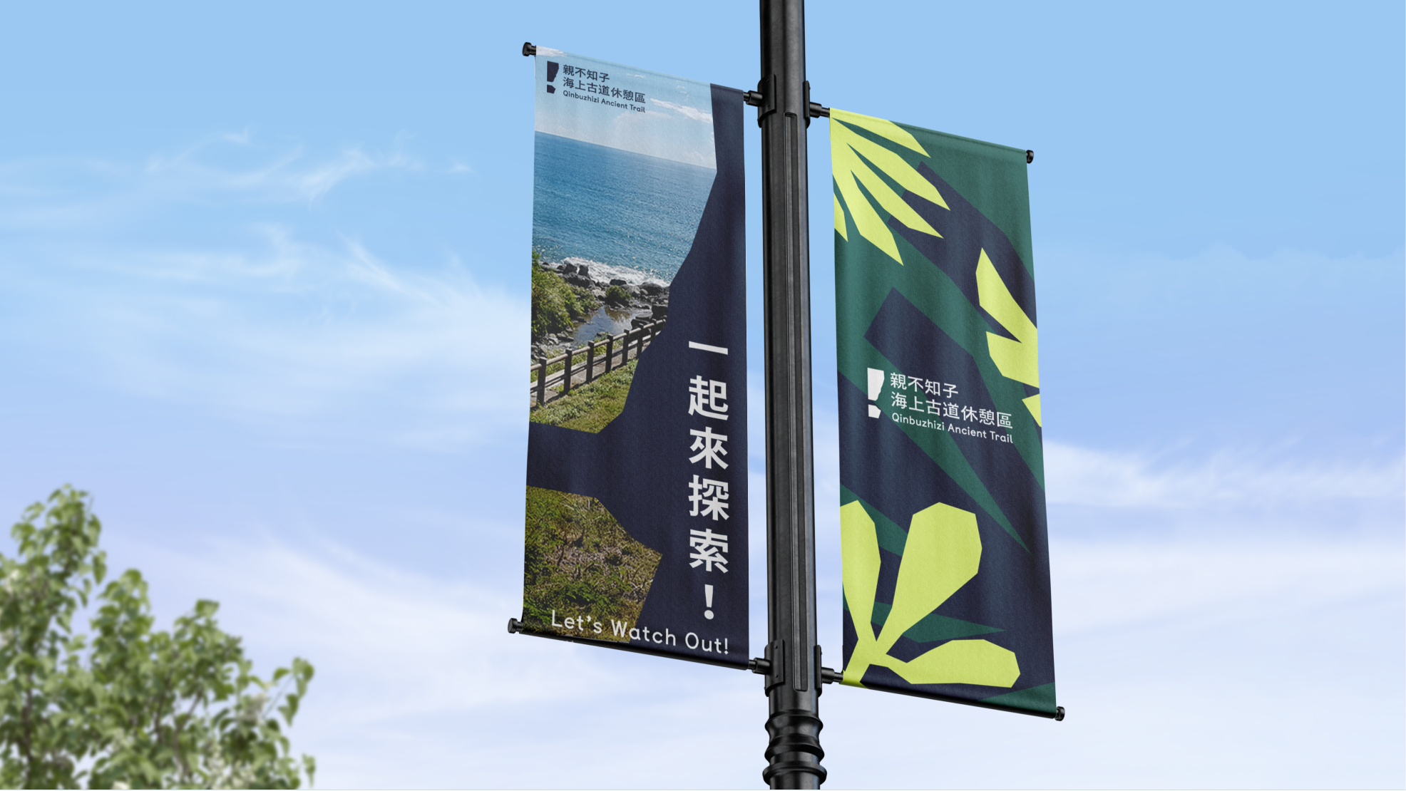
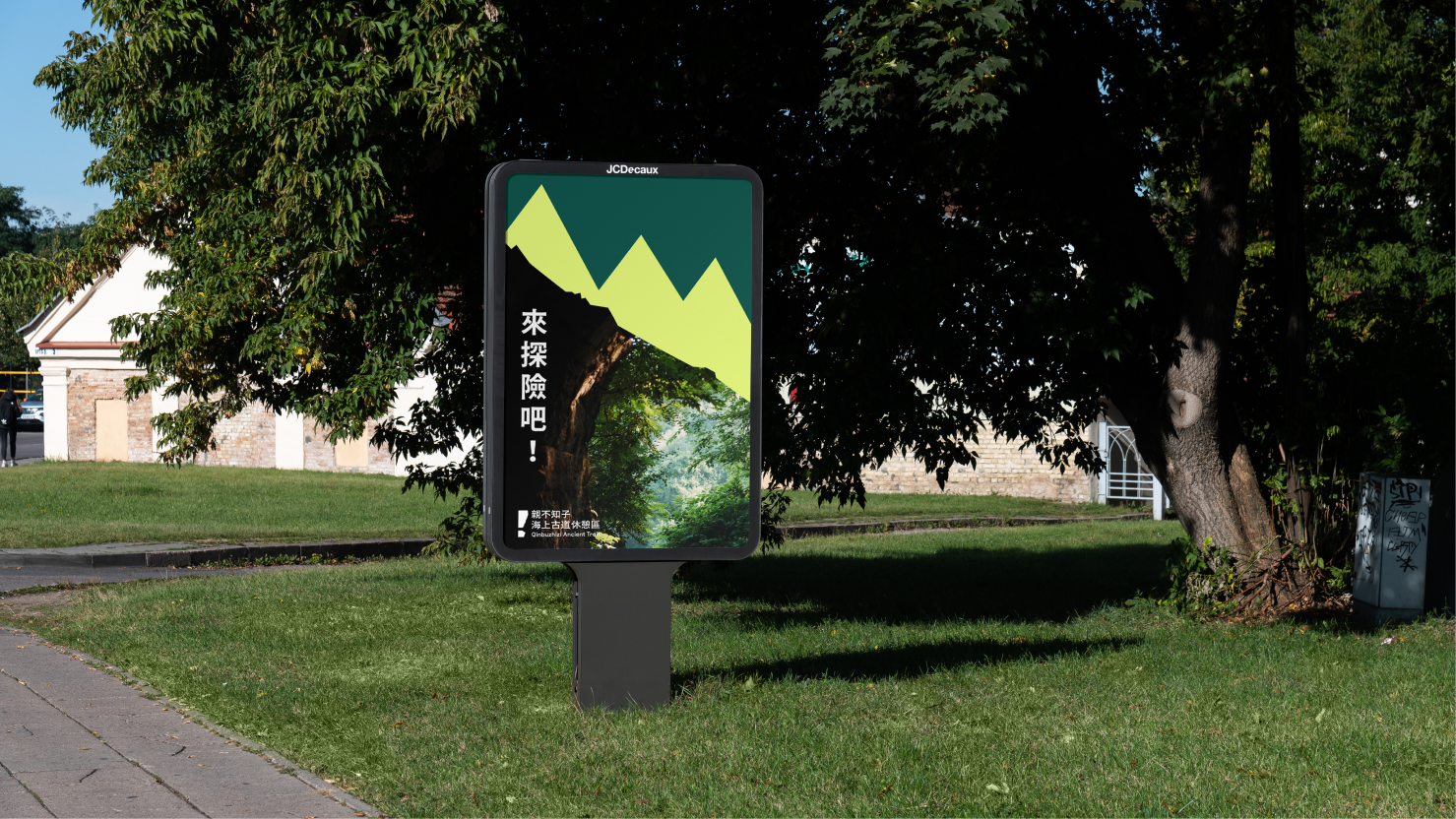
This project is a key collaboration under the Taiwan Design Research Institute's Urban Aesthetics Initiative, delivering a comprehensive experience design for the Qinbuzhizi Cliffs Ancient Trail Rest Area through landscape, spatial, and brand design strategies. The Design's Core Transformation lies in reframing the danger and sorrow inherent in the "Parent-Losing" legend into a contemporary call for mindfulness and invitation. We established the brand around an intuitive visual warning—"Watch Out! 注意!"—reinterpreting the treacherous landscape narrative as an awakening moment for visitors to engage with natural beauty, cultural diversity, and environmental awareness.
本專案為台灣設計研究院城市美學計畫的重點合作案例,夠透過景觀、空間與品牌設計為親不知子海上古道休憩區進行體驗塑造。品牌設計的關鍵轉化在於將親不知子「失親」傳說中蘊含的危險與悲傷轉化為當代意義的「提醒與邀請」。我們以簡潔直覺的視覺警語「Watch Out!注意!」為品牌核心,將危險的地景敘事重新詮釋為喚醒遊客對自然景觀、文化多樣性與環境安全的關注。

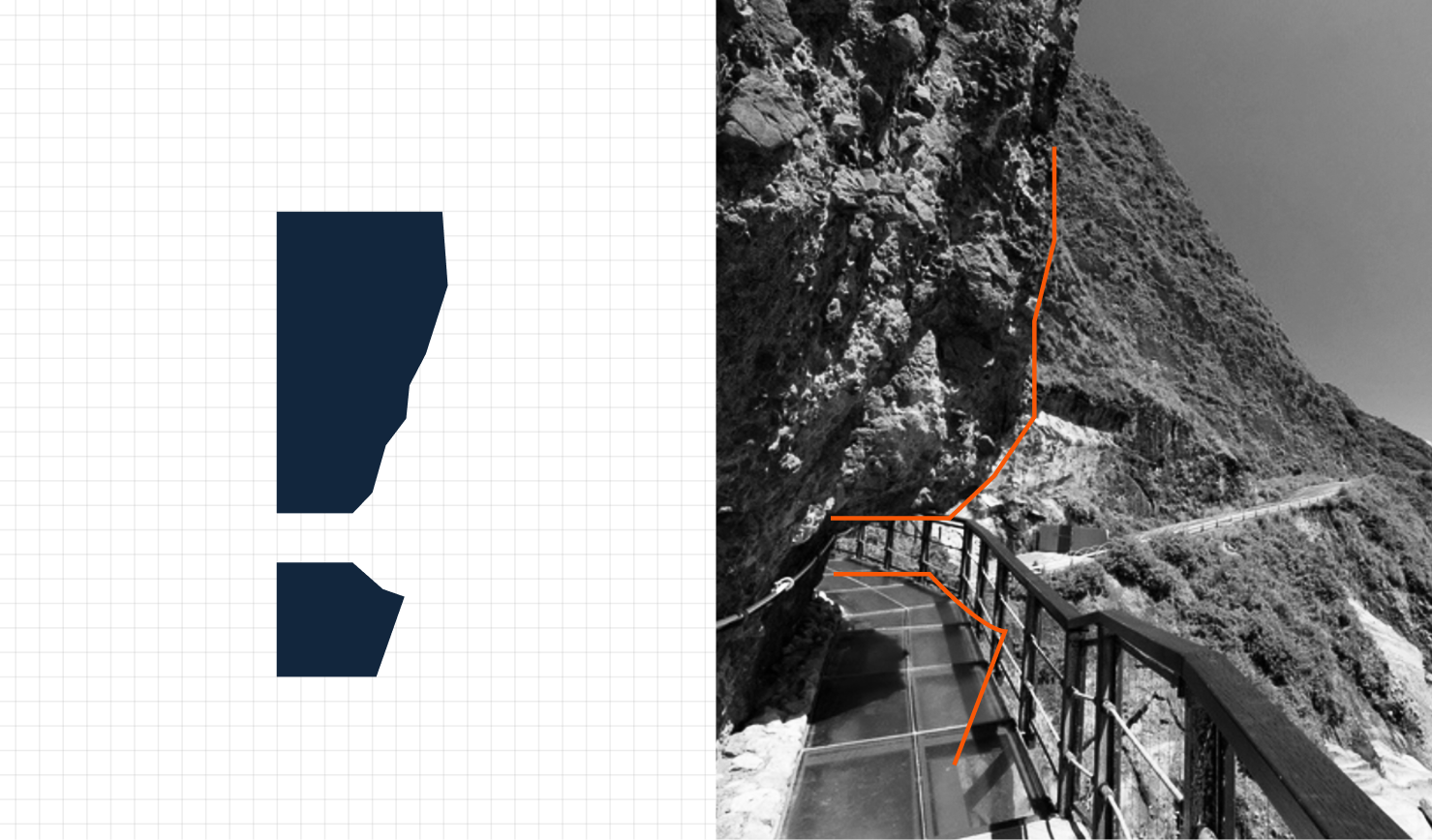
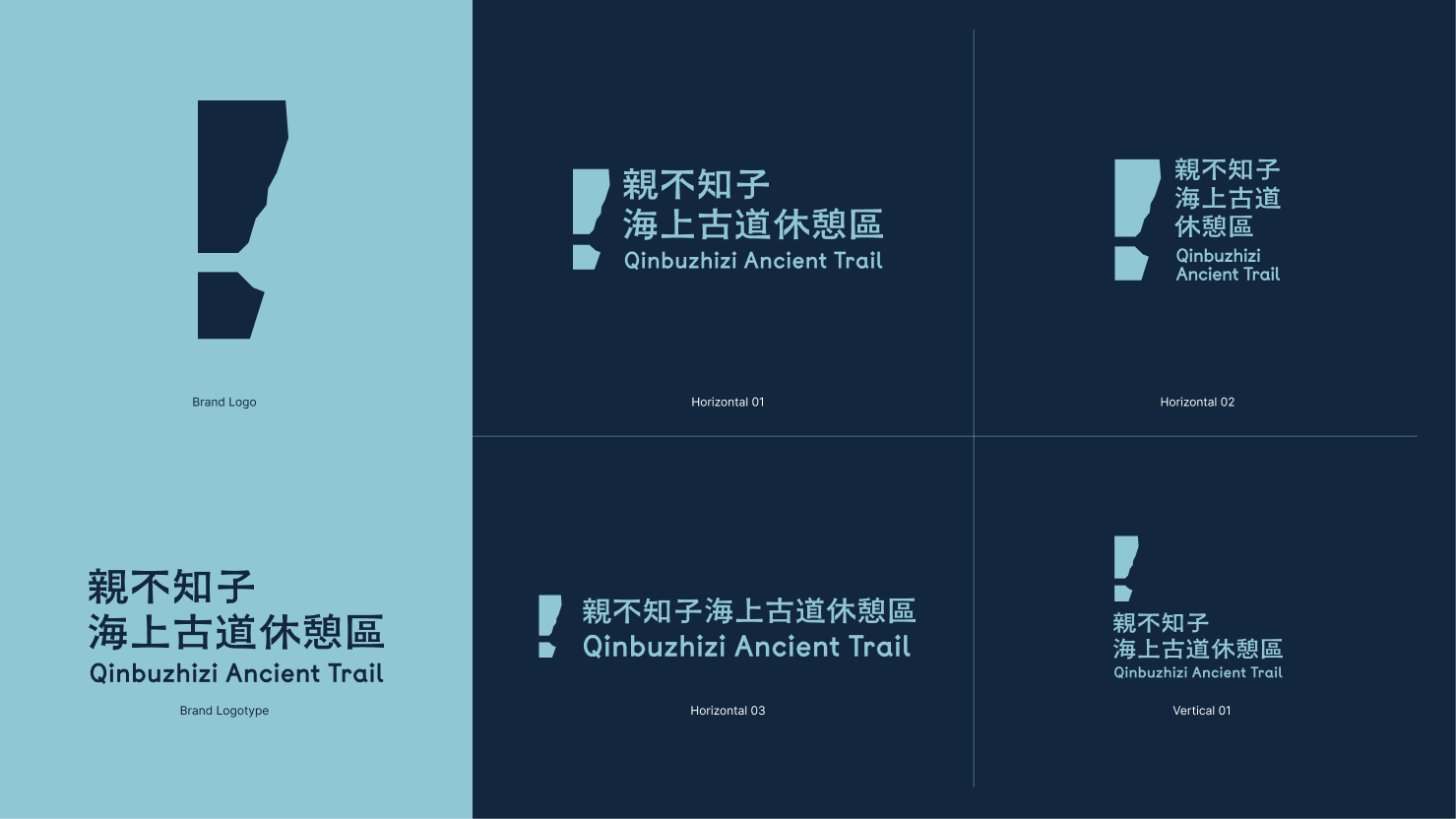
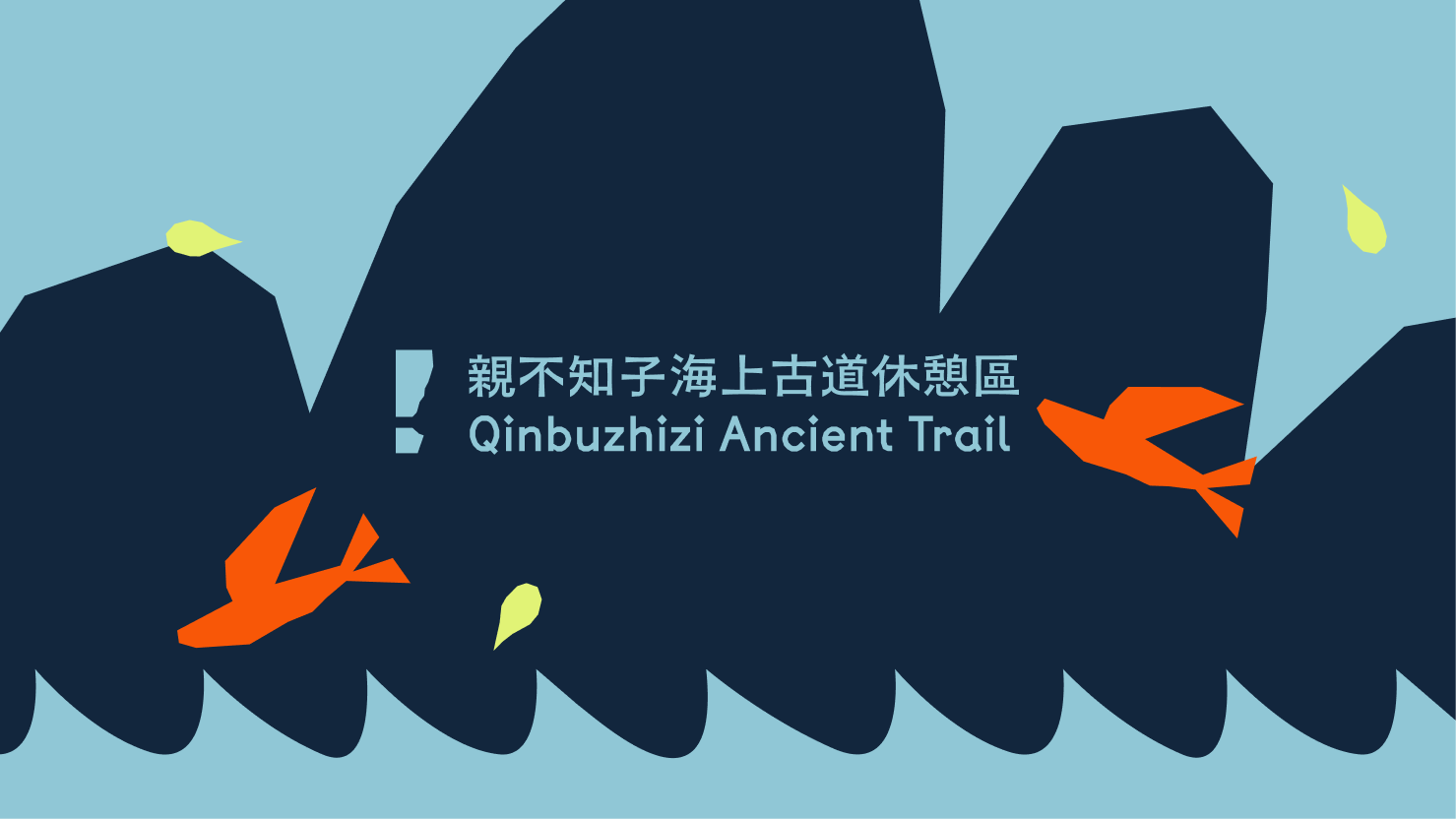
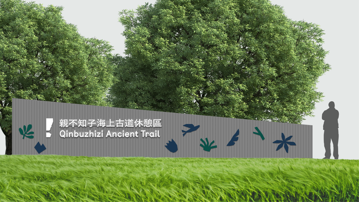
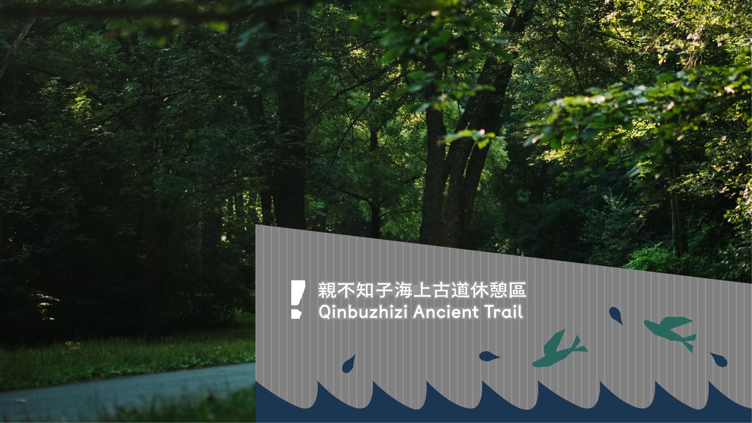
品牌標誌
品牌標誌以簡潔直覺的視覺形式為核心,透過極簡化的線條詮釋親不知子峭壁的地景輪廓,將地點的地理特徵轉化為品牌識別符號。設計的雙重意義在於:一方面延續「注意」的視覺功能,提醒遊客環境的險峻性;另一方面將「危險」這個原本負面的敘事轉化為品牌的視覺記憶點。透過這個簡潔的圖形,使遊客能夠快速辨識該休憩區,同時感受到地景的獨特性。
警示中的地景切片
Brand Logo
The brand logo employs a concise and intuitive visual form at its core, using simplified line work to interpret the landscape contours of the Qinbuzhizi Cliffs, transforming the site's geographical characteristics into a brand identification symbol. The design carries a dual significance: on one hand, it sustains the visual function of "caution," reminding visitors of the environment's treacherous nature; on the other hand, it transforms "danger"—originally a negative narrative—into a visual brand memory point. Through this minimalist graphic form, visitors can quickly recognize the rest area while simultaneously experiencing the landscape's distinctive character.
Landscape Slice Within Warning
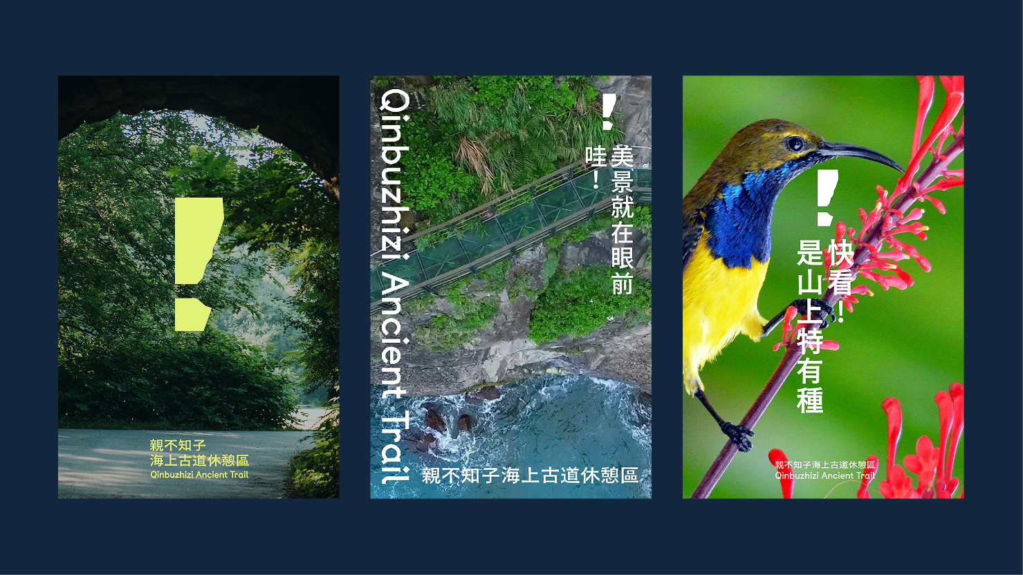

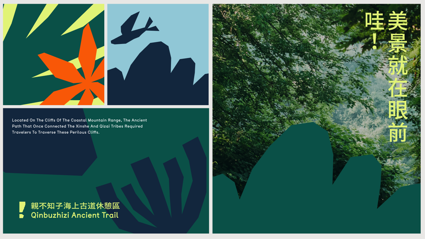
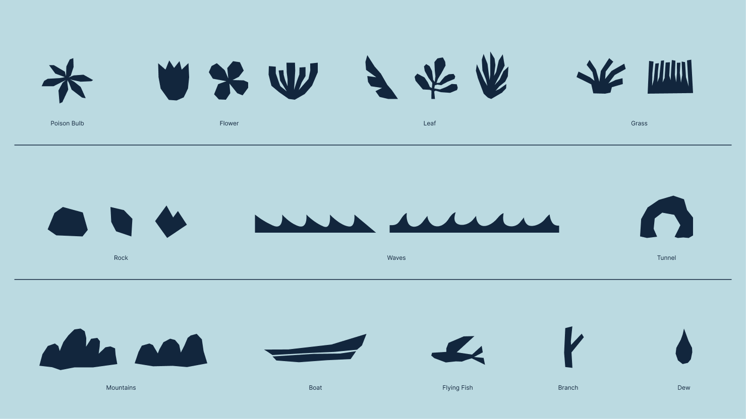
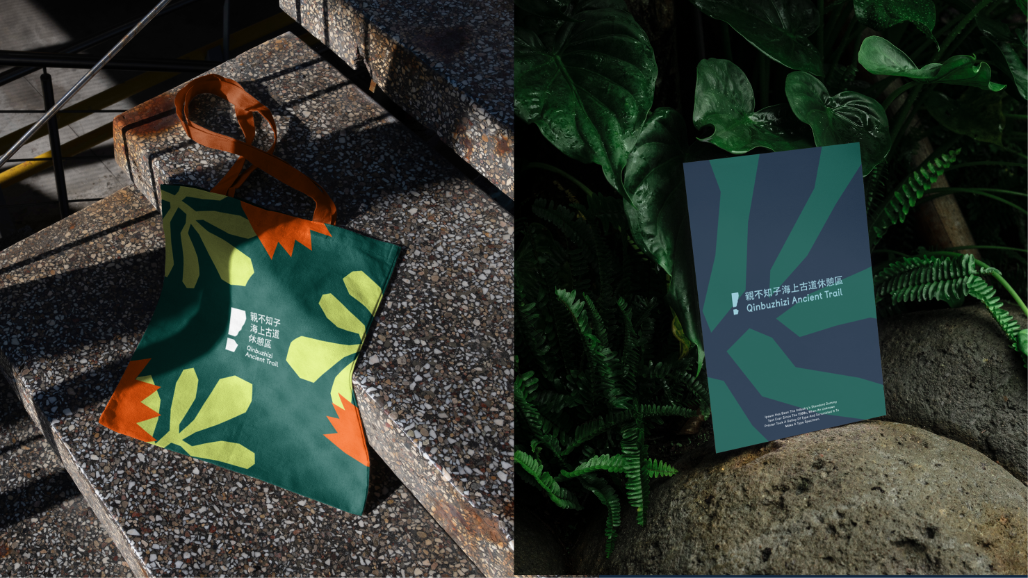
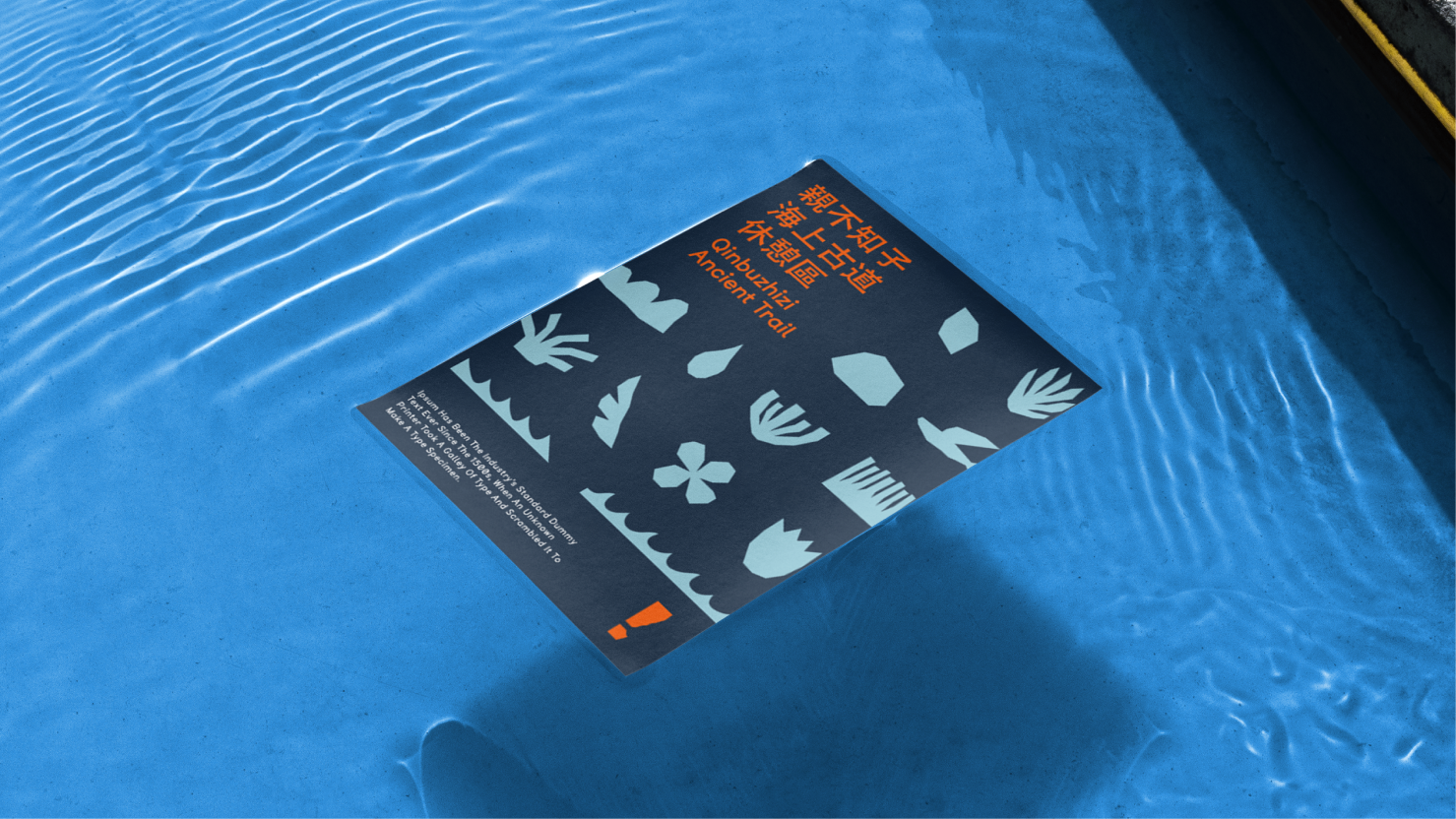
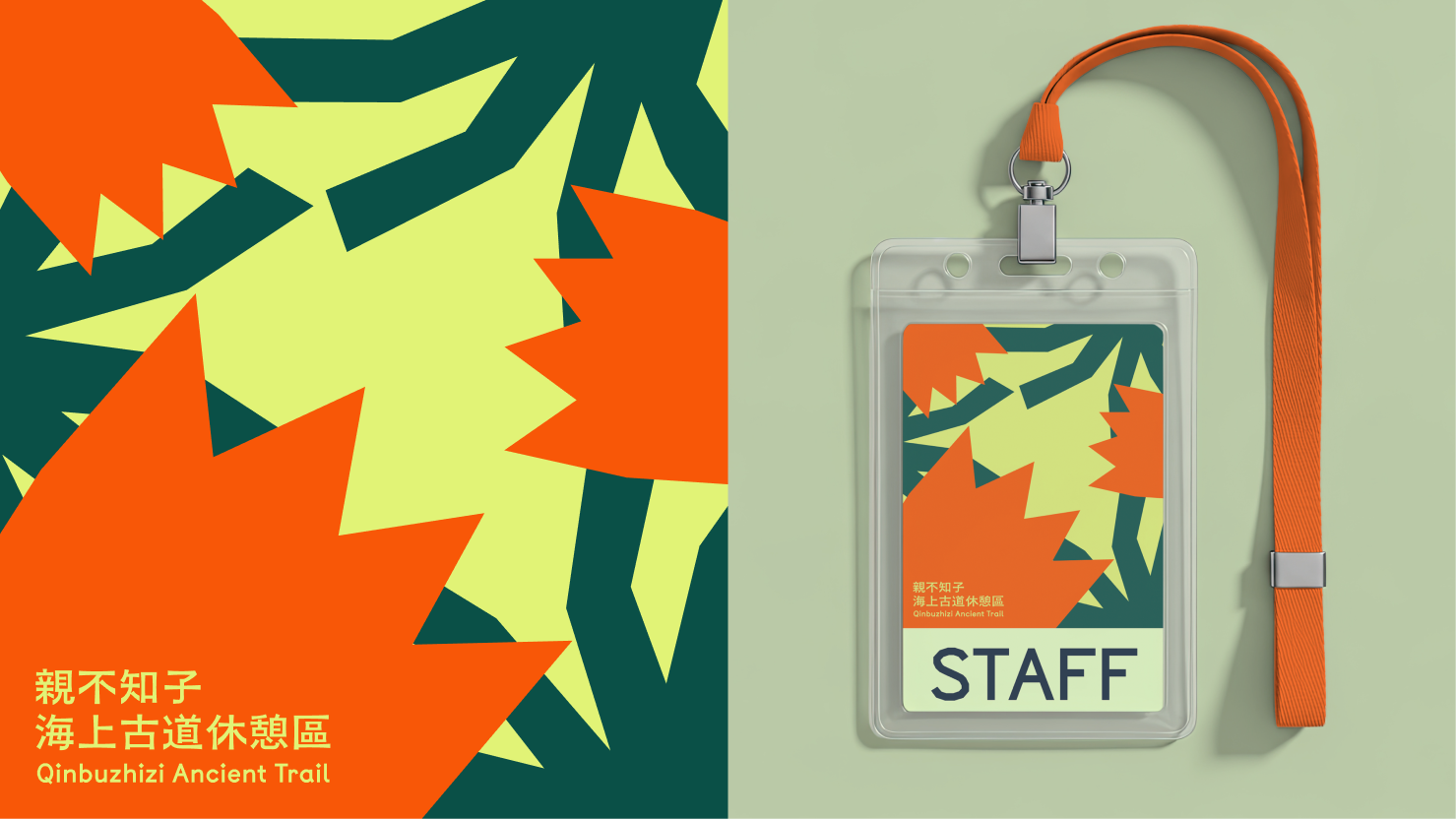
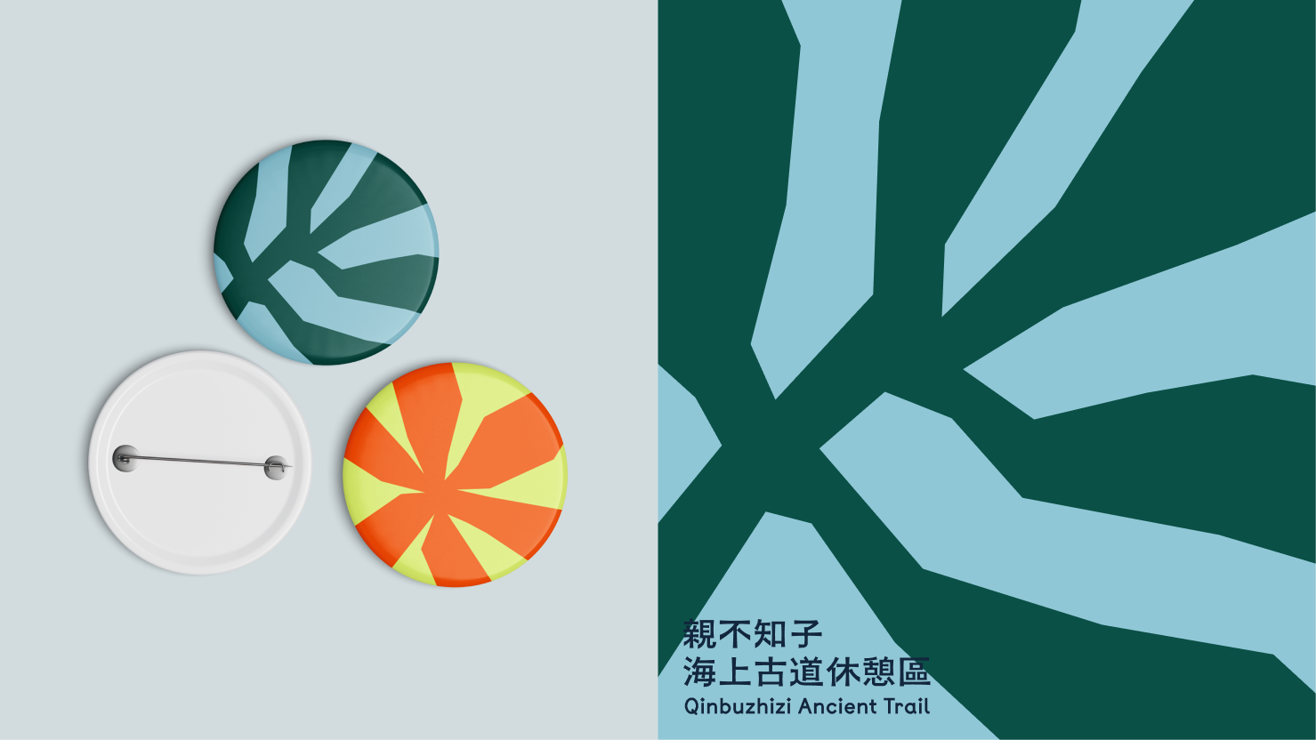
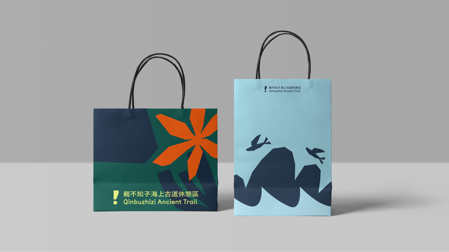
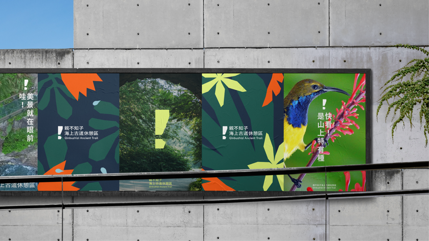
品牌插圖
品牌輔助插圖系統借鑒當地部落壁畫風格進而延伸,透過地景特色與原住民文化元素的結合,開發具有在地辨識度的視覺語言。插圖涵蓋文族圖、花卉、葉子、草堆、岩石、海浪、隱道、山巒、船隻、飛魚、樹枝與露珠等自然生態與景觀元素,每一個圖騰都對應親不知子古道周邊的真實環境與部落文化特徵。
文化圖騰的視覺語言系統
The brand auxiliary illustration system draws inspiration from local tribal wall-painting styles and extends through the integration of landscape features and indigenous cultural elements, developing a visual language with strong local identity. The illustration library encompasses tribal patterns, flowers, leaves, grasses, rocks, ocean waves, caves, mountains, boats, flying fish, branches, and dewdrops—natural ecological and landscape elements that correspond to the authentic environment and tribal cultural characteristics surrounding the Qinbuzhizi Ancient Trail.
Visual Language System of Cultural Iconography
Brand illustration


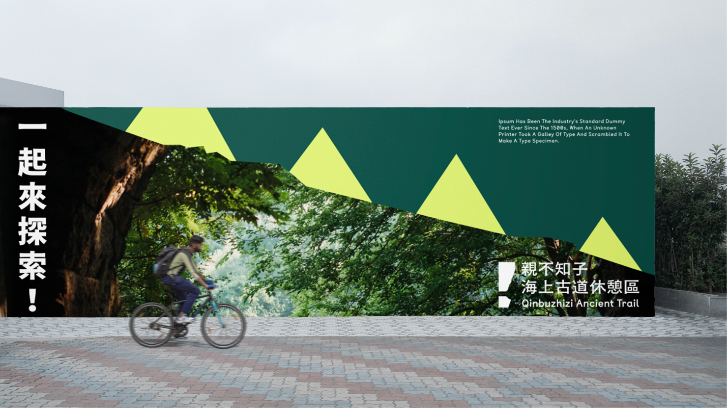
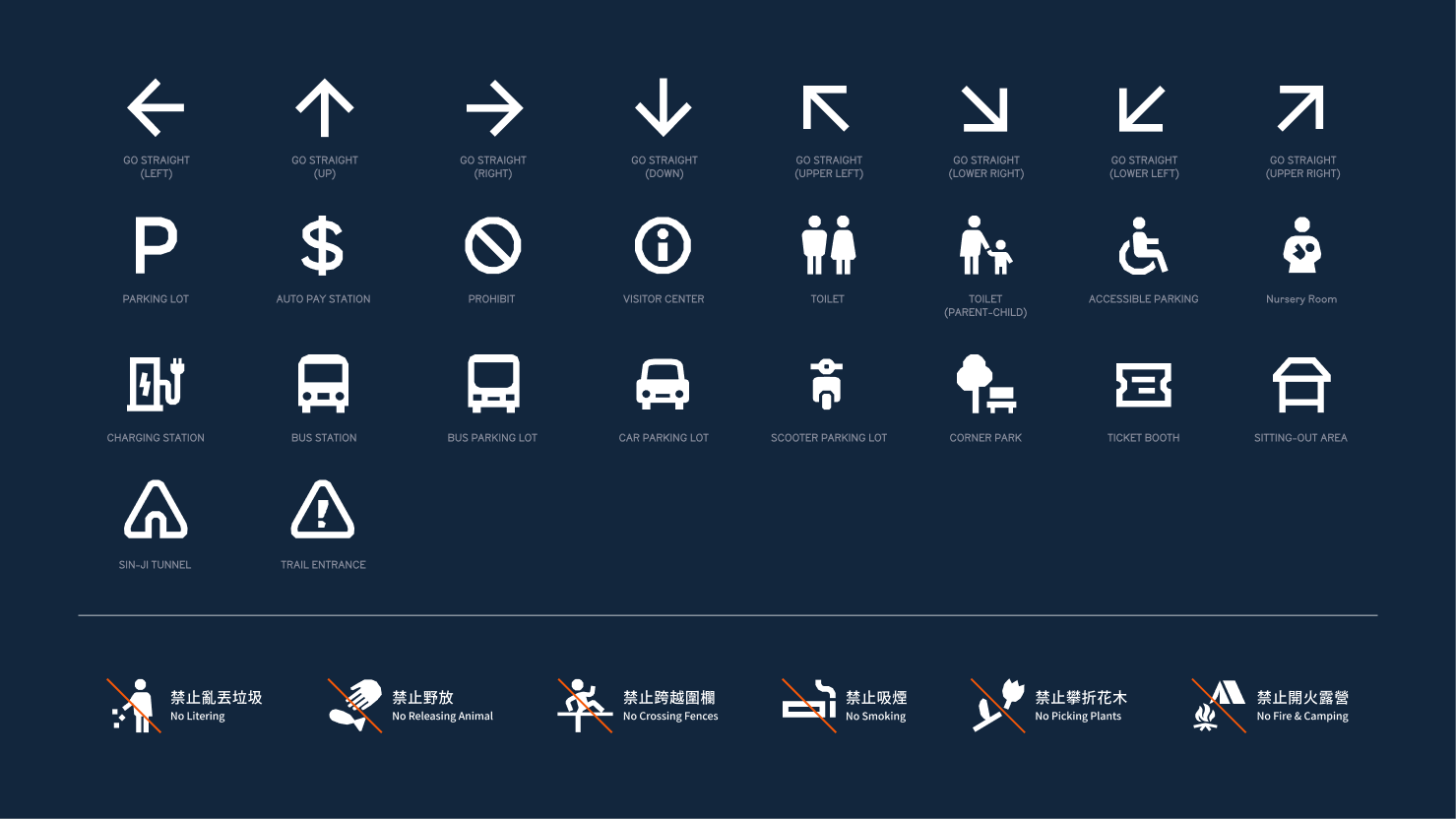
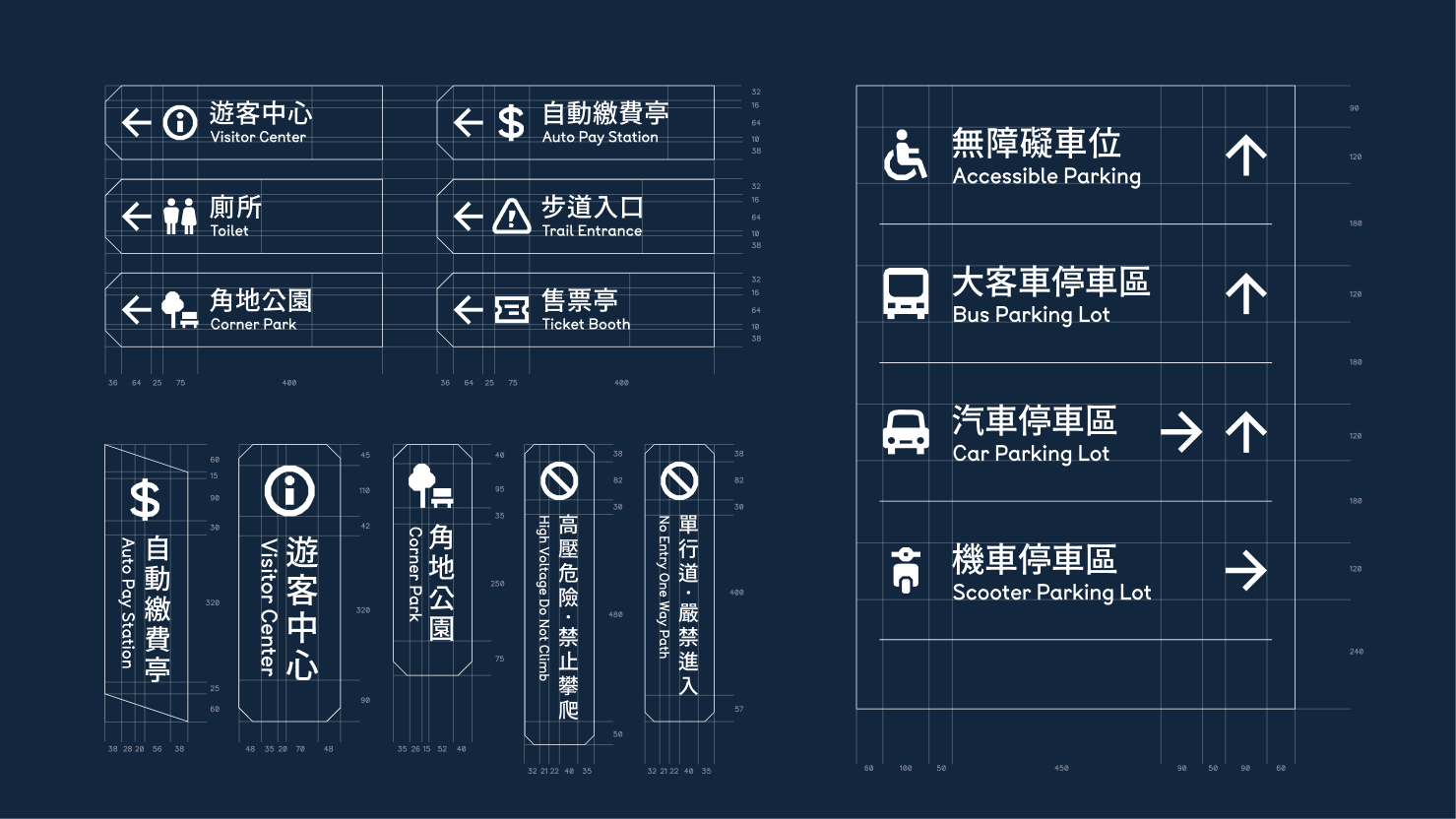
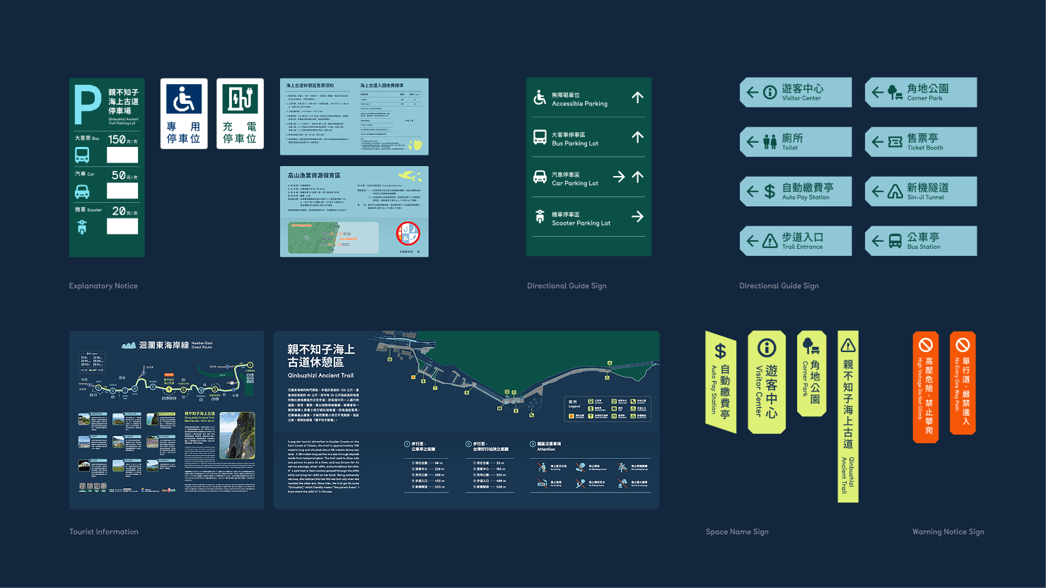
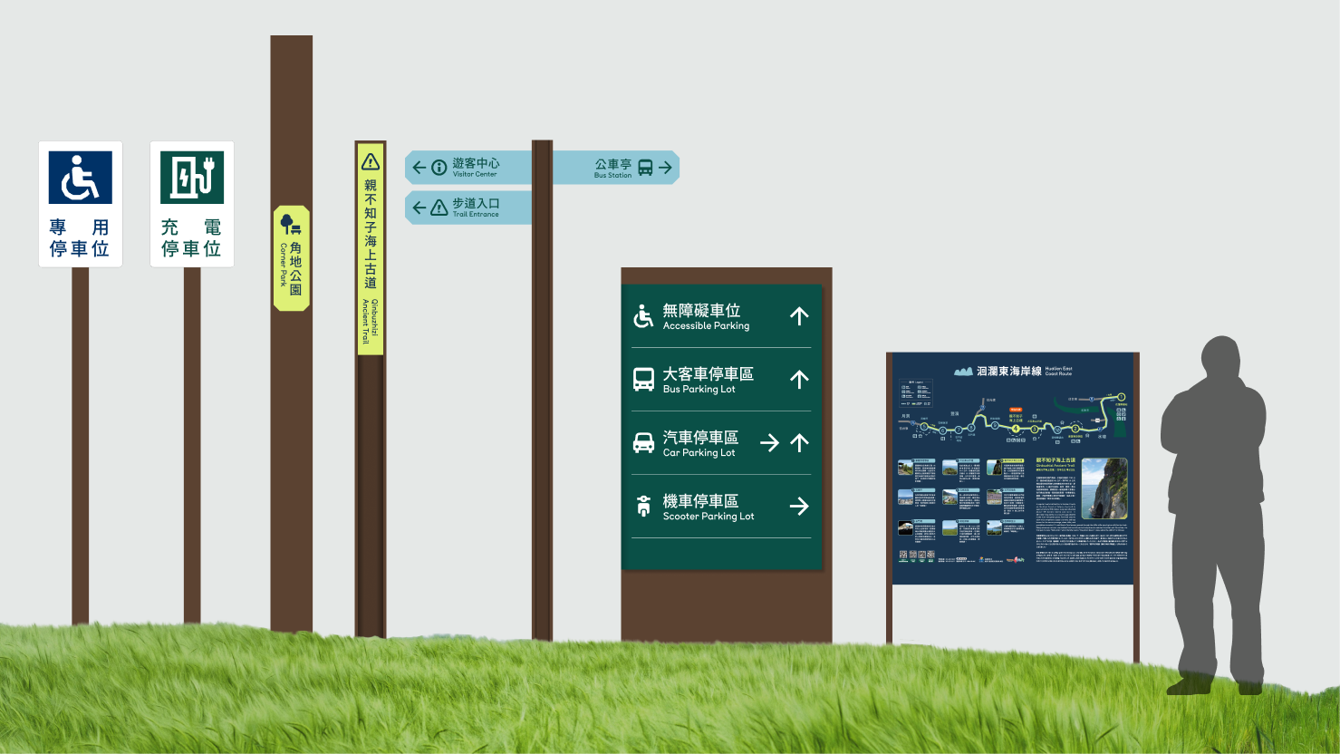
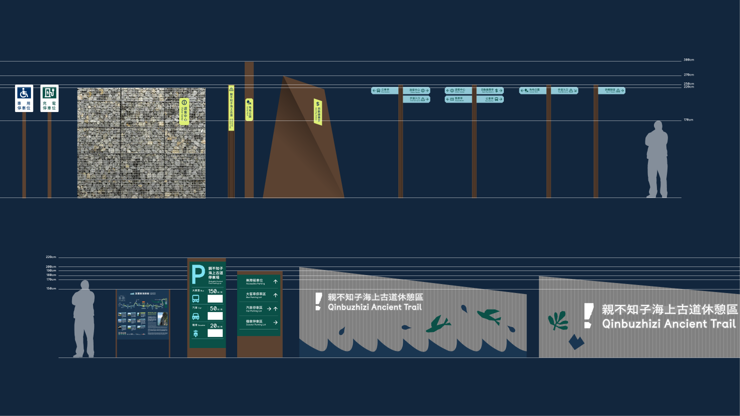
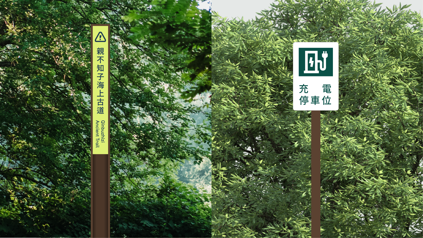
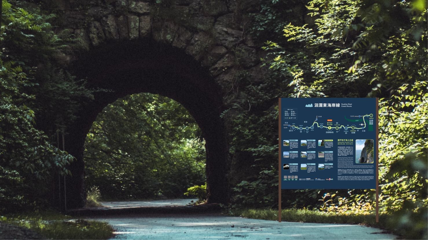
指標設計
指標系統設計以使用者友善為核心考量,透過清晰的視覺層級與直覺的圖形符號,引導遊客在休憩區內的動線體驗,讓遊客在探索地景的同時也能安心地在環境中移動,打造兼具美感與安全的品牌服務。
親切動線中的視覺引導
The wayfinding system design prioritizes user-friendliness as its core consideration, guiding visitors through the rest area experience via clear visual hierarchy and intuitive graphical symbols. As visitors explore the landscape, they can confidently navigate the environment, creating a brand service experience that seamlessly combines aesthetic appeal with safety.
Visual Guidance Within Welcoming Circulation
Wayfinding Design


台11-親不知子海上古道品牌重塑
Qinbuzhizi Cliffs Brand Identity Renewal
Design Agency | StudioPros Design
Art Director | 李宜軒 Yi-Hsuan Li
Brand Experience Director | 張文馨 Moon Chang
Visual Design | 李宜軒 Yi-Hsuan Li、林祐新Pomelo Lin、朱冠丞 Zhu
Way-finding Syetem Designer | 林祐新Pomelo Lin
Brand Guidelines System | 林祐新Pomelo
Client | Taiwan Design Research Institute
Year | 2023