
貳輪嶼品牌重塑
Motor Island Brand Renewal
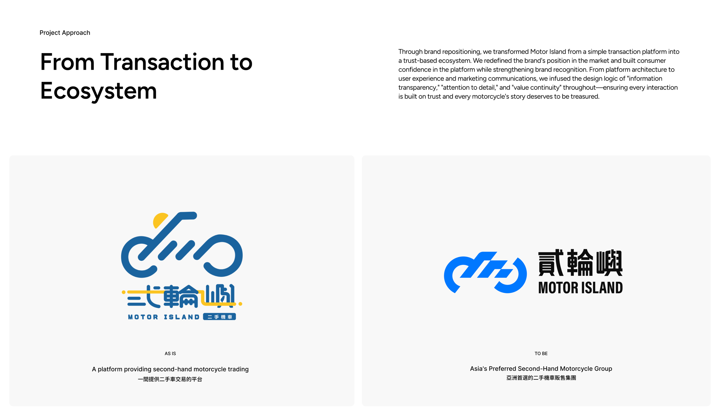
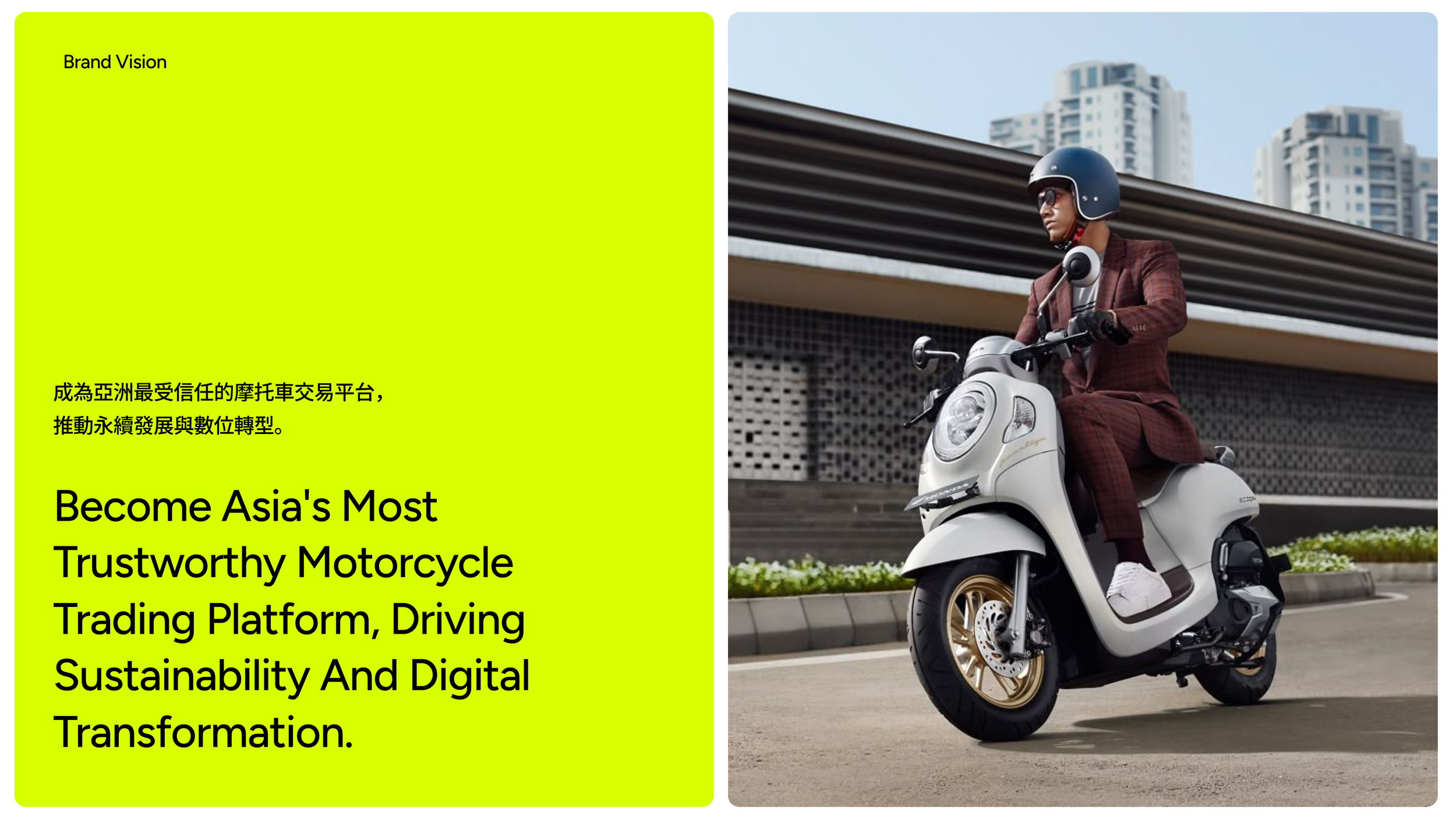
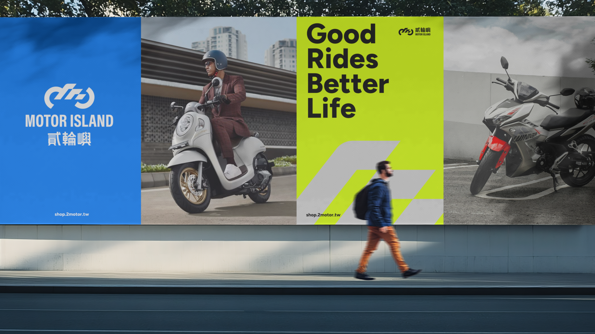
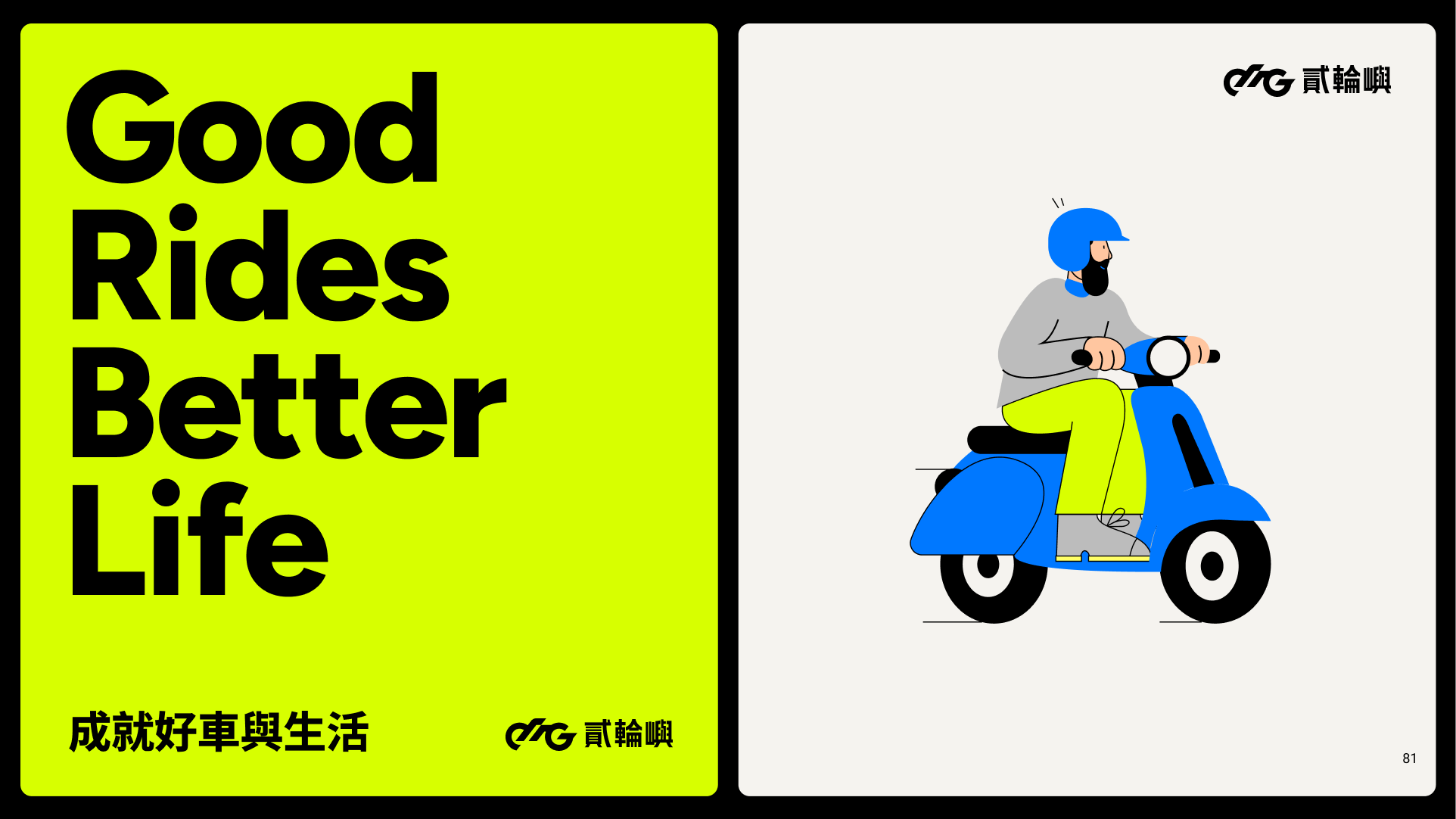
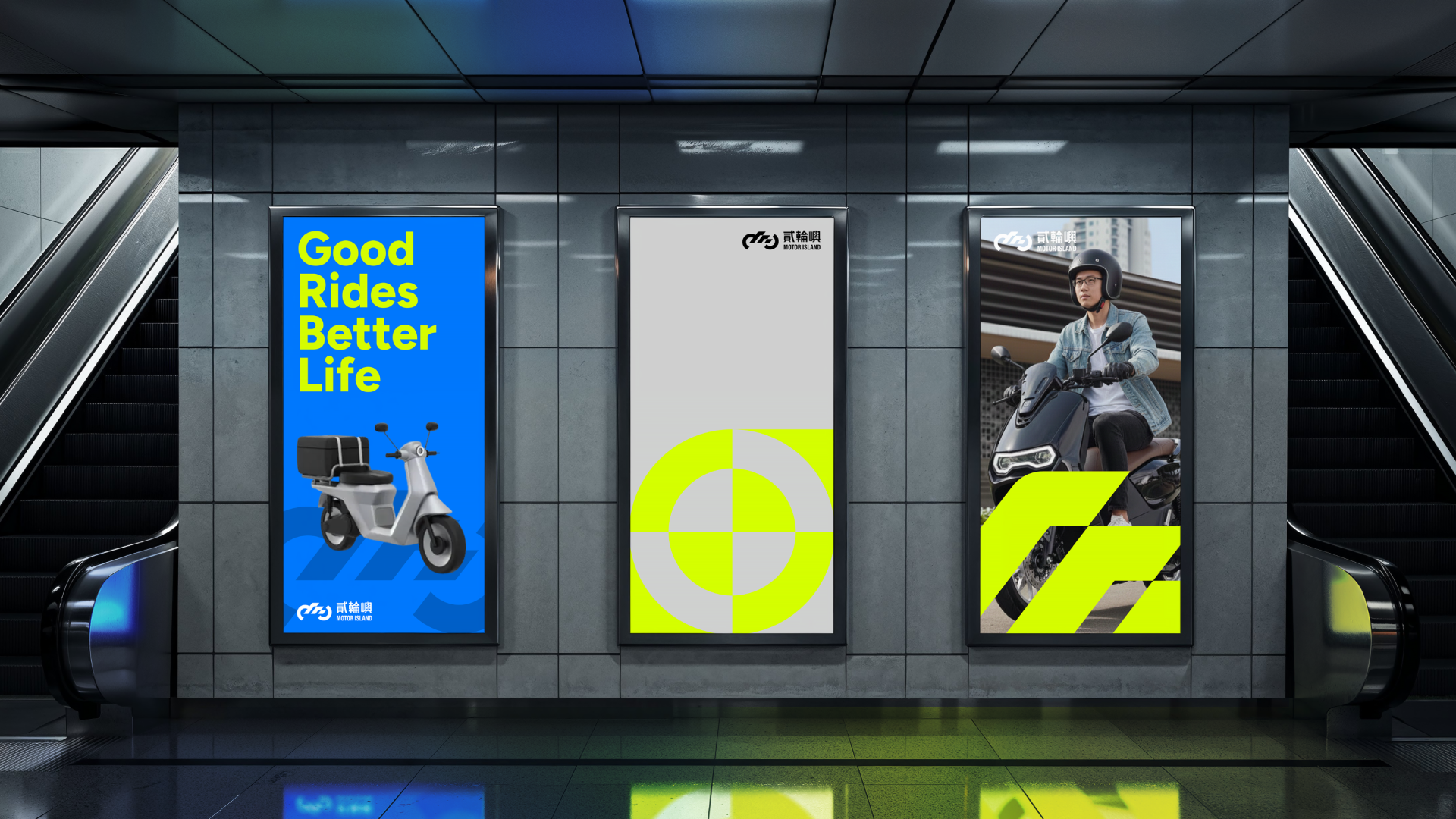
貳輪嶼是一個以專業檢測、透明定價與完善保固為核心的二手機車交易平台。致力於打造公平透明、專業可信的交易環境,讓每台好車再生,讓用戶安心。平台的核心使命是打造公平透明、專業可信的二手機車交易環境,視覺設計上,運用亮黃綠色搭配藍黑對比,透過圓角方形的幾何形狀與現代清晰的排版,呈現「公平透明 Fair」、「專業安心 Professional」、「永續循環 Sustainable」的品牌價值,讓資訊公開成為交流的起點,用對細節負責的態度傳遞專業信任,讓每輛車的故事與價值得以延續。
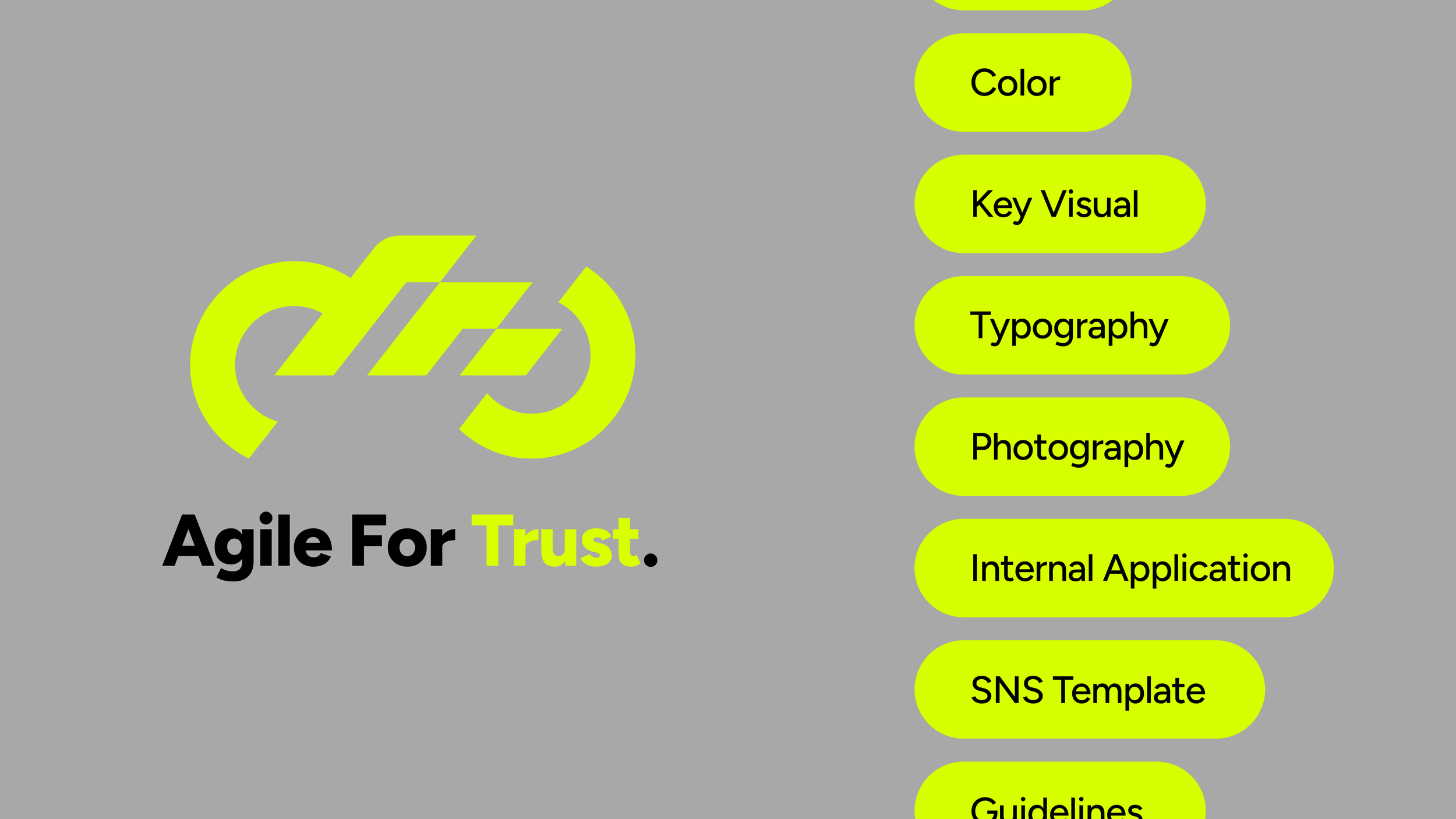
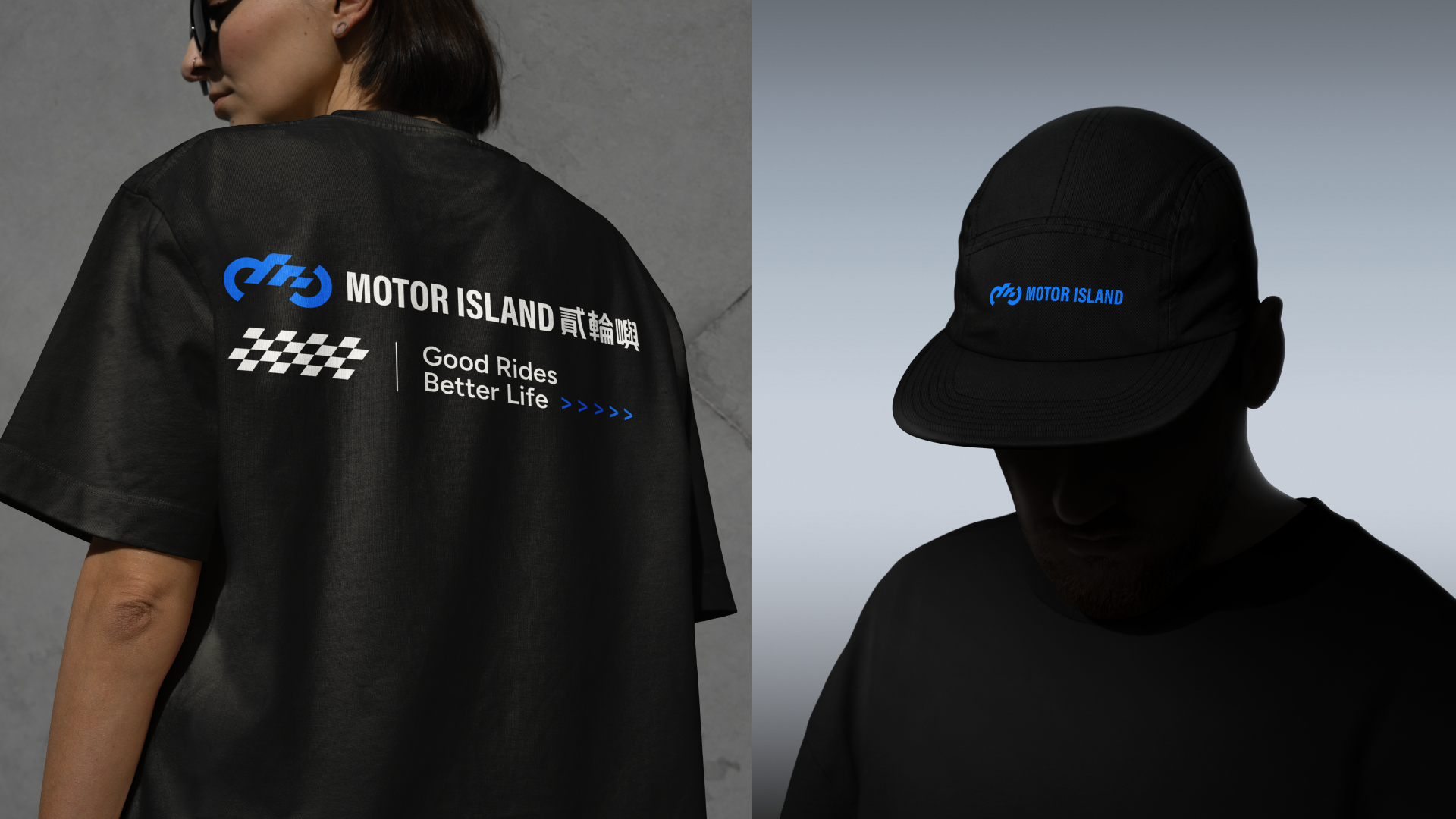
Agile for trust 流暢為信任而生
Motor Island is a second-hand motorcycle trading platform built on professional inspection, transparent pricing, and comprehensive after-sales protection. It is dedicated to creating a fair, transparent, and trustworthy trading environment where every quality motorcycle gets a second life and users can shop with confidence. The platform's core mission is to establish a fair, transparent, and professional trading environment. In terms of visual design, it employs bright lime green paired with blue and black contrast, using rounded square geometric shapes and modern, clear typography to embody the brand values of "Fair," "Professional," and "Sustainable"—making information transparency the starting point of every interaction, conveying professional trust through meticulous attention to detail, and allowing every motorcycle's story and value to continue.
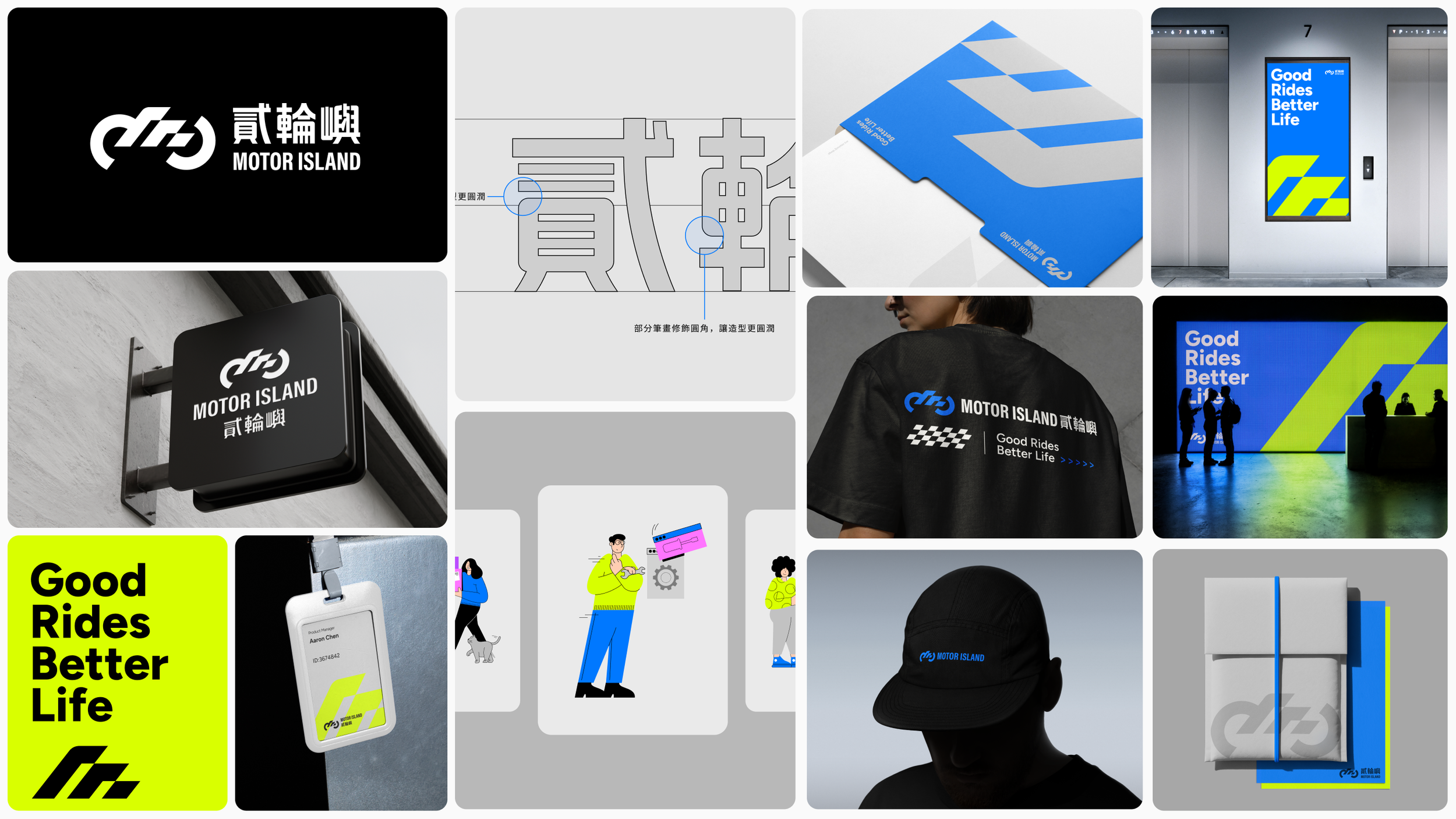

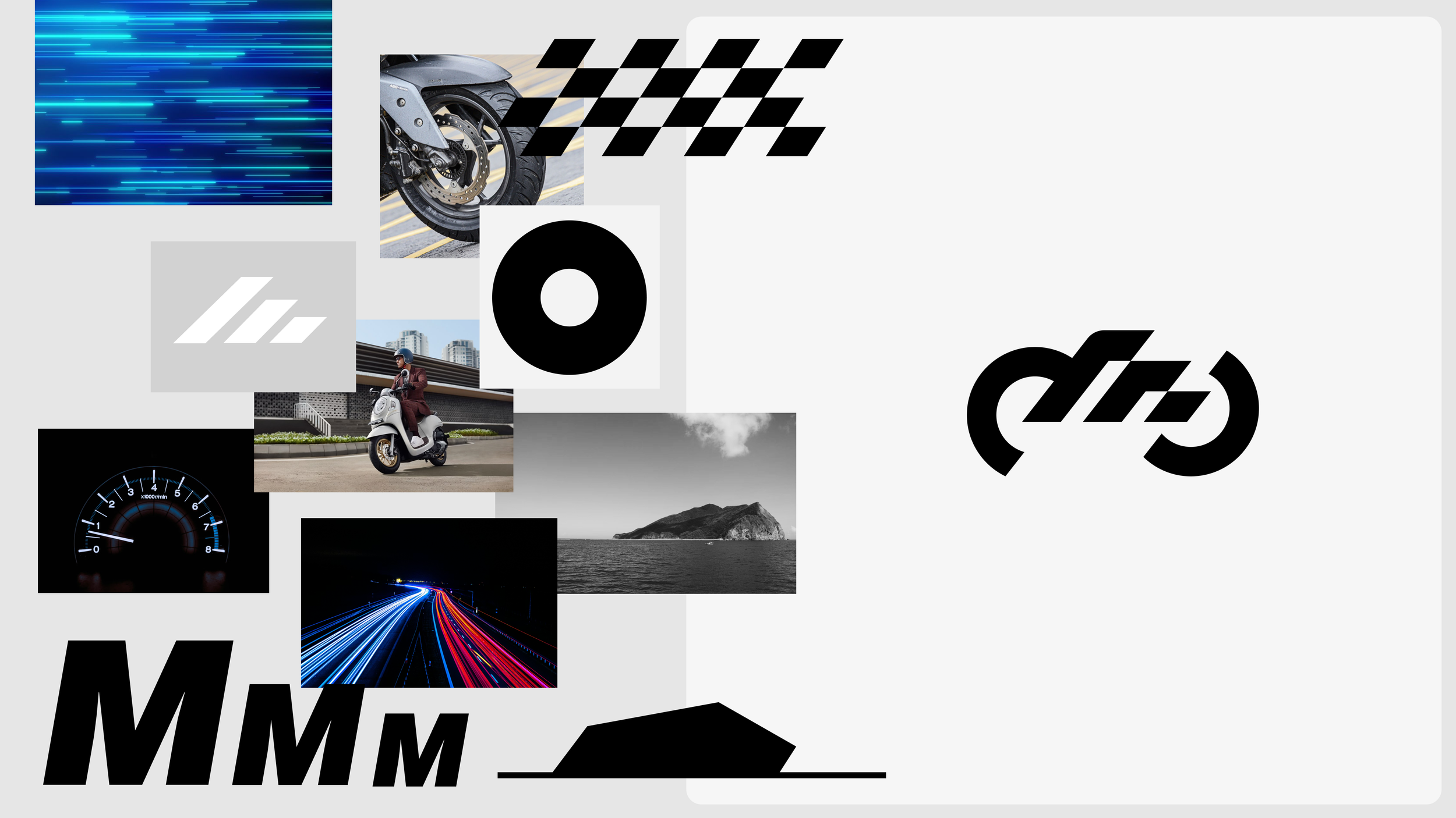
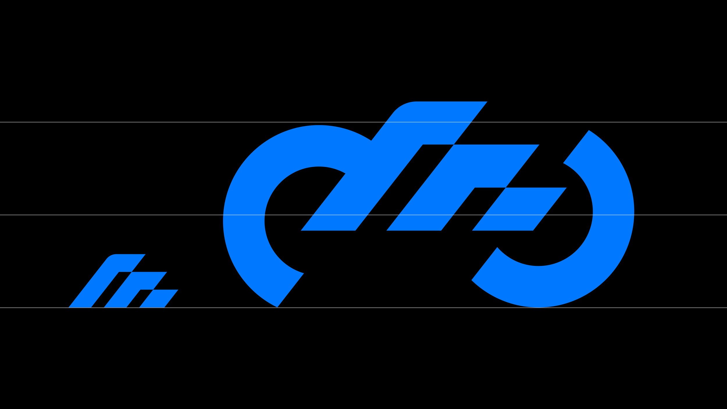
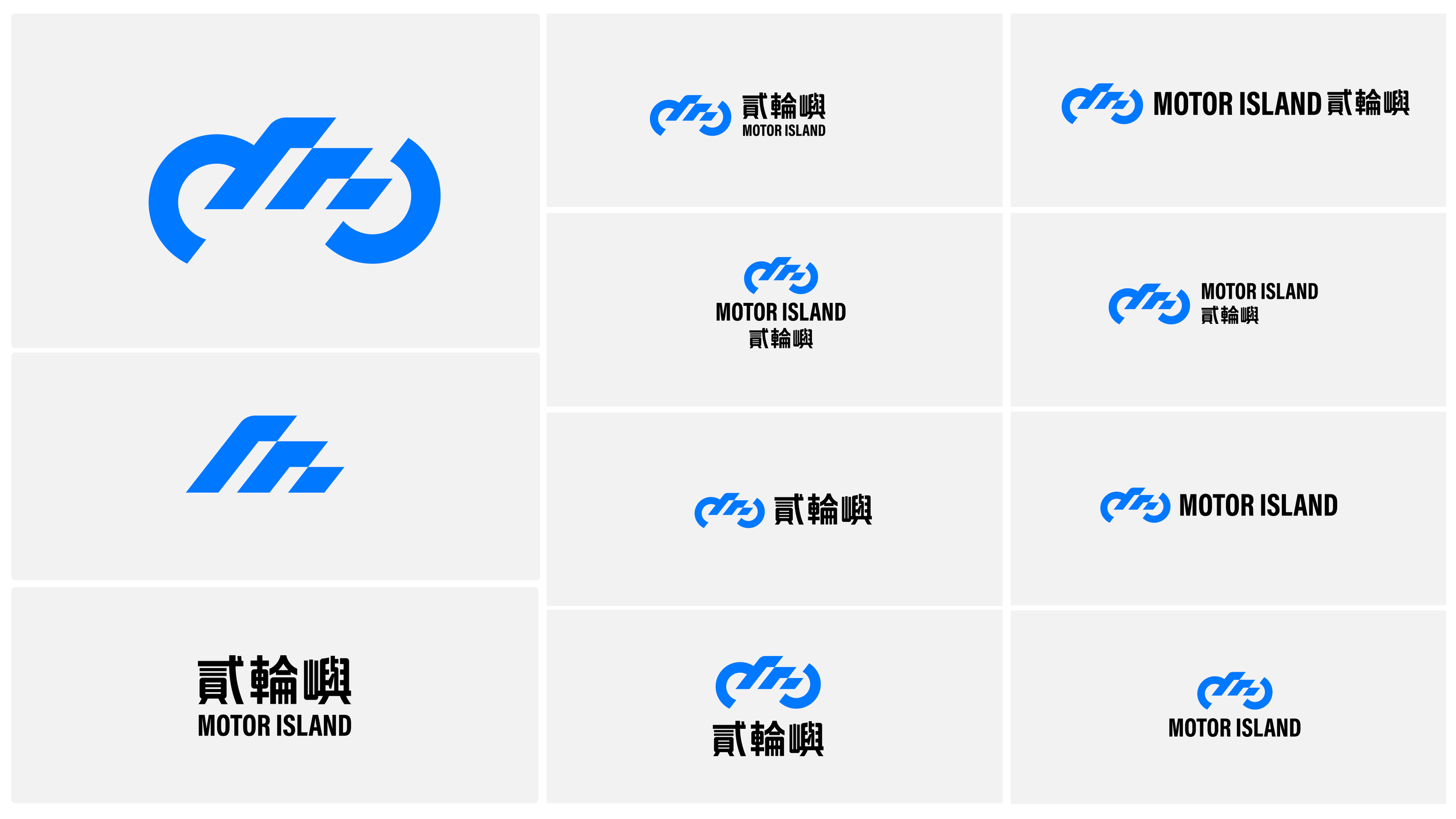
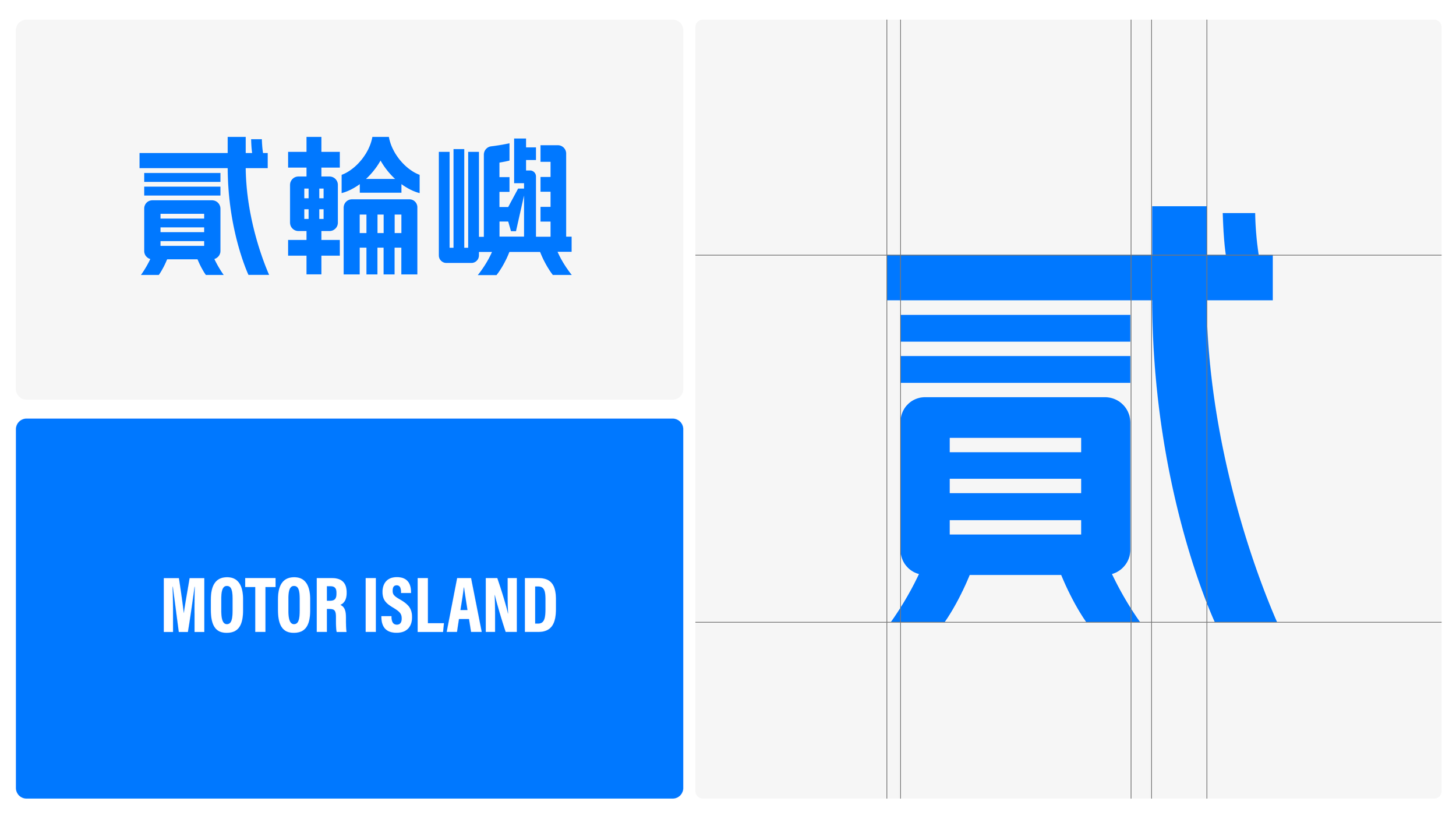
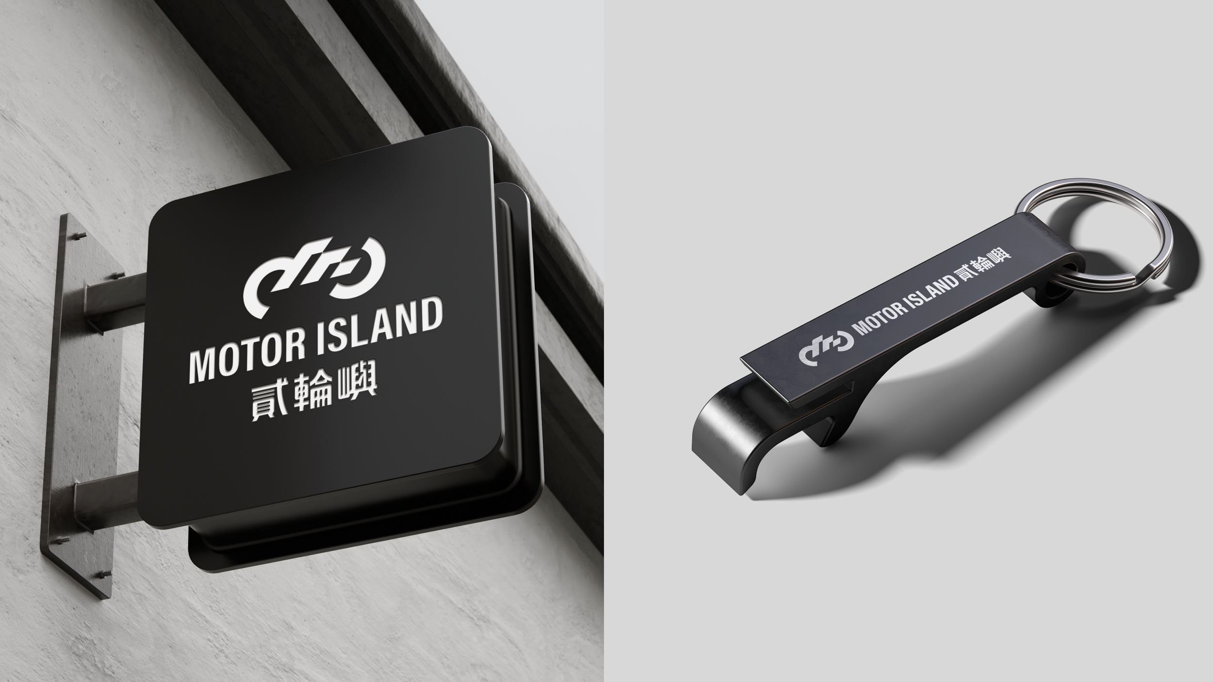
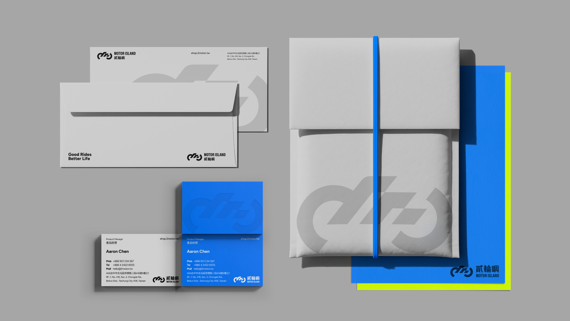
貳輪嶼的品牌標誌由機車、機車輪、速度三大元素組成,象徵我們以原始需求為基礎,進行優化與轉修,透過堅固的機械結構成就專業品質,並以迅速的交易流程展現業務與可靠性。標誌透過連結三個元素,呈現出循環流動的視覺語言,強調信任、永續、效率三位一體的品牌價值。整體設計簡潔有力,以純白線條在黑色背景中突顯,體現現代感與專業形象,讓品牌標誌成為信任、專業、永續的視覺代表。
設計策略
精準輪動
Motor Island's brand mark comprises three key elements—motorcycle, wheel, and speed—symbolizing how we take fundamental needs and refine them through optimization. The solid mechanical structure represents professional quality, while swift transaction processes demonstrate our commitment to reliability. Connected by these elements create a flowing visual narrative emphasizing trust, sustainability, and efficiency as one unified brand value. The clean, bold design of white lines against a black background conveys modernity and professionalism, making the mark a visual embodiment of trust, expertise, and sustainability.
Design Strategy
Precision in Motion

放大科技與活力的色彩張力
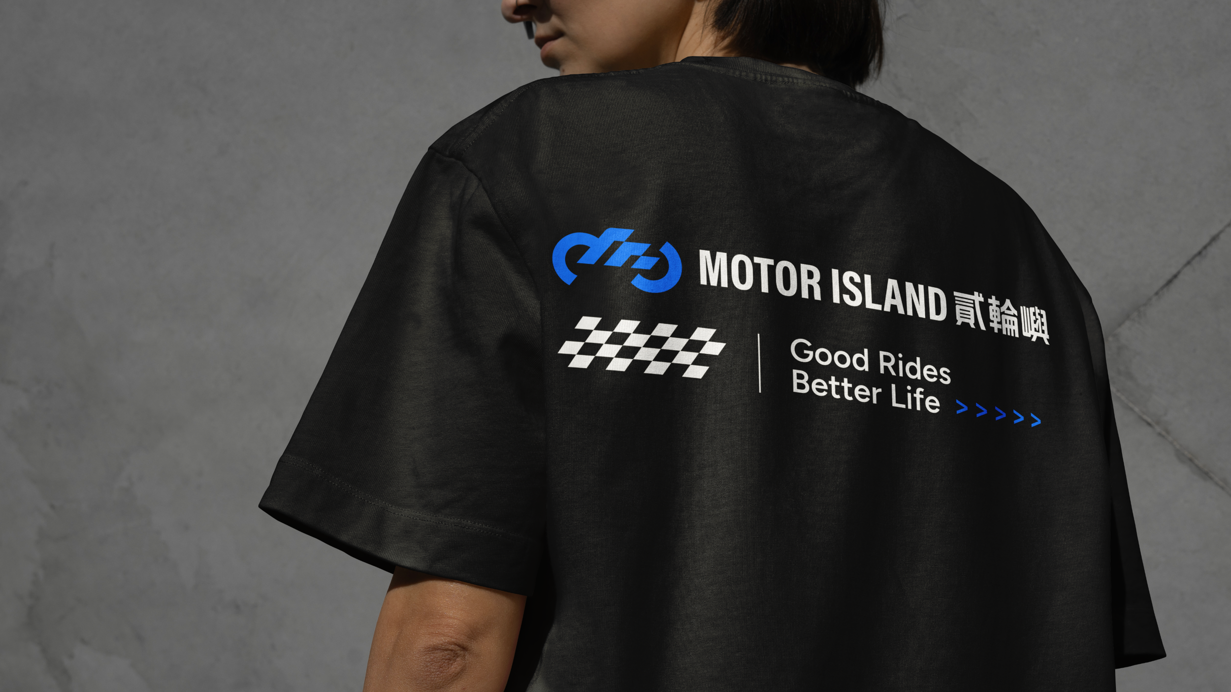
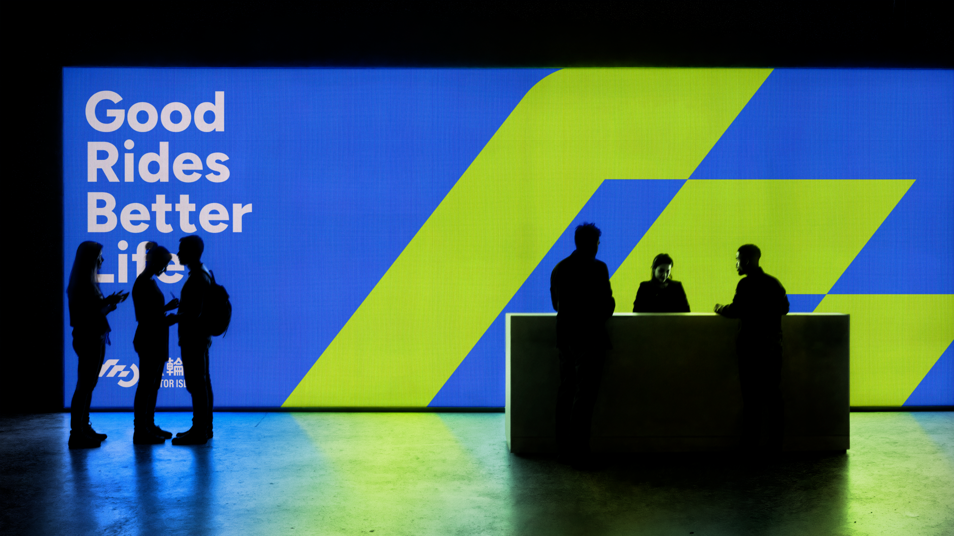
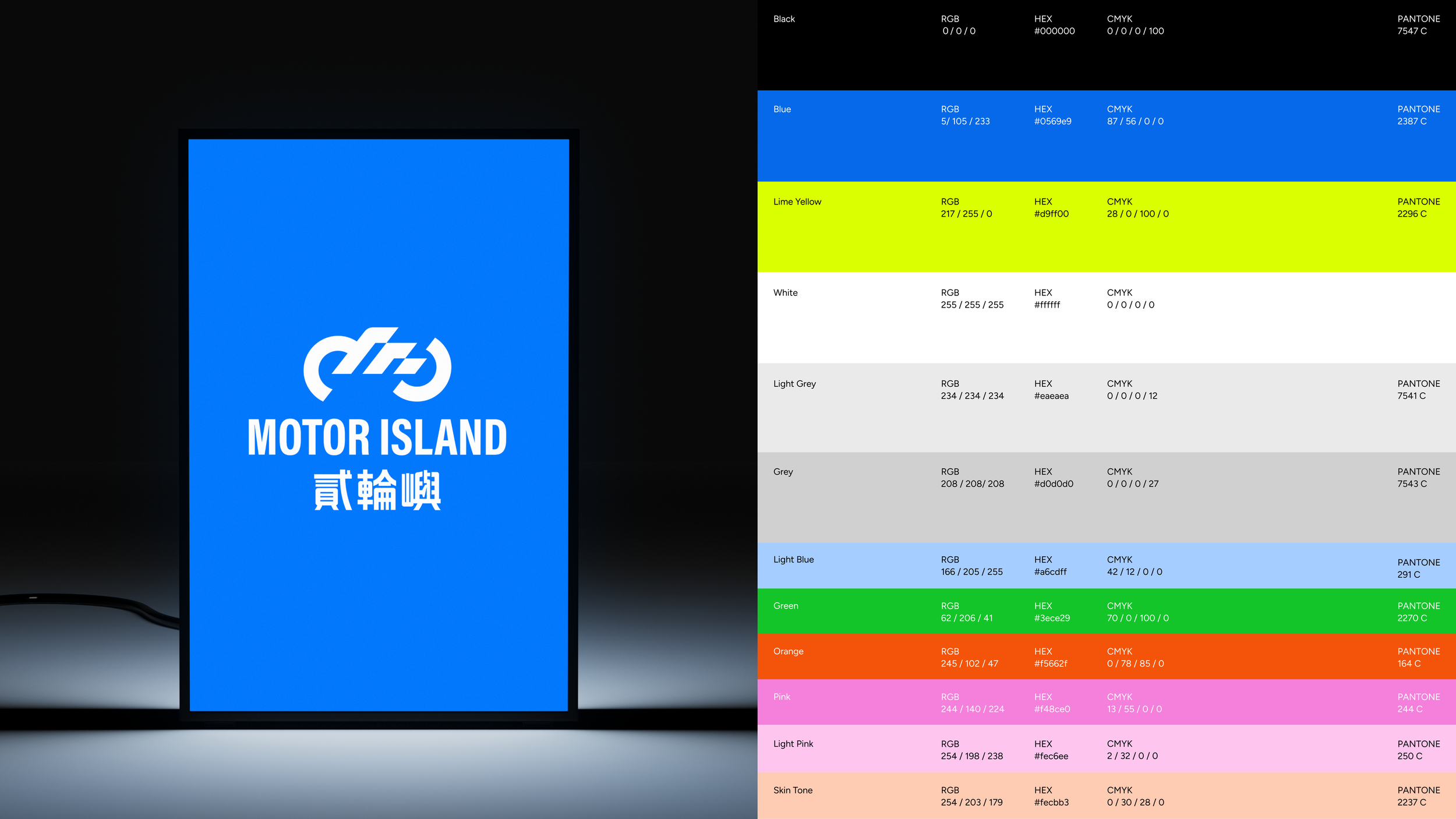
貳輪嶼的色彩系統以亮藍色為主軸,搭配鮮明的黃綠色,營造極大值的視覺張力。亮藍色傳遞理性、科技與專業的氛圍,展現未來感與精準度;鮮明黃綠色則象徵活力、信任與永續,為品牌注入溫暖與親和力。兩色對比形成強烈的視覺識別,強化品牌在市場中的辨識度,同時體現貳輪嶼作為信任生態系統的現代形象。
品牌色彩
Rationality Meets Vitality
Motor Island's color palette anchors on vibrant blue paired with striking lime green, creating maximum visual tension. The vivid blue conveys rationality, technology, and professionalism, expressing a sense of the future and precision; the striking lime green symbolizes vitality, trust, and sustainability, infusing the brand with warmth and approachability. The contrast between the two colors creates a distinctive visual identity that strengthens brand recognition in the market while embodying Motor Island's modern image as a trust-based ecosystem.
Brand Color
模組化系統延展品牌表現力
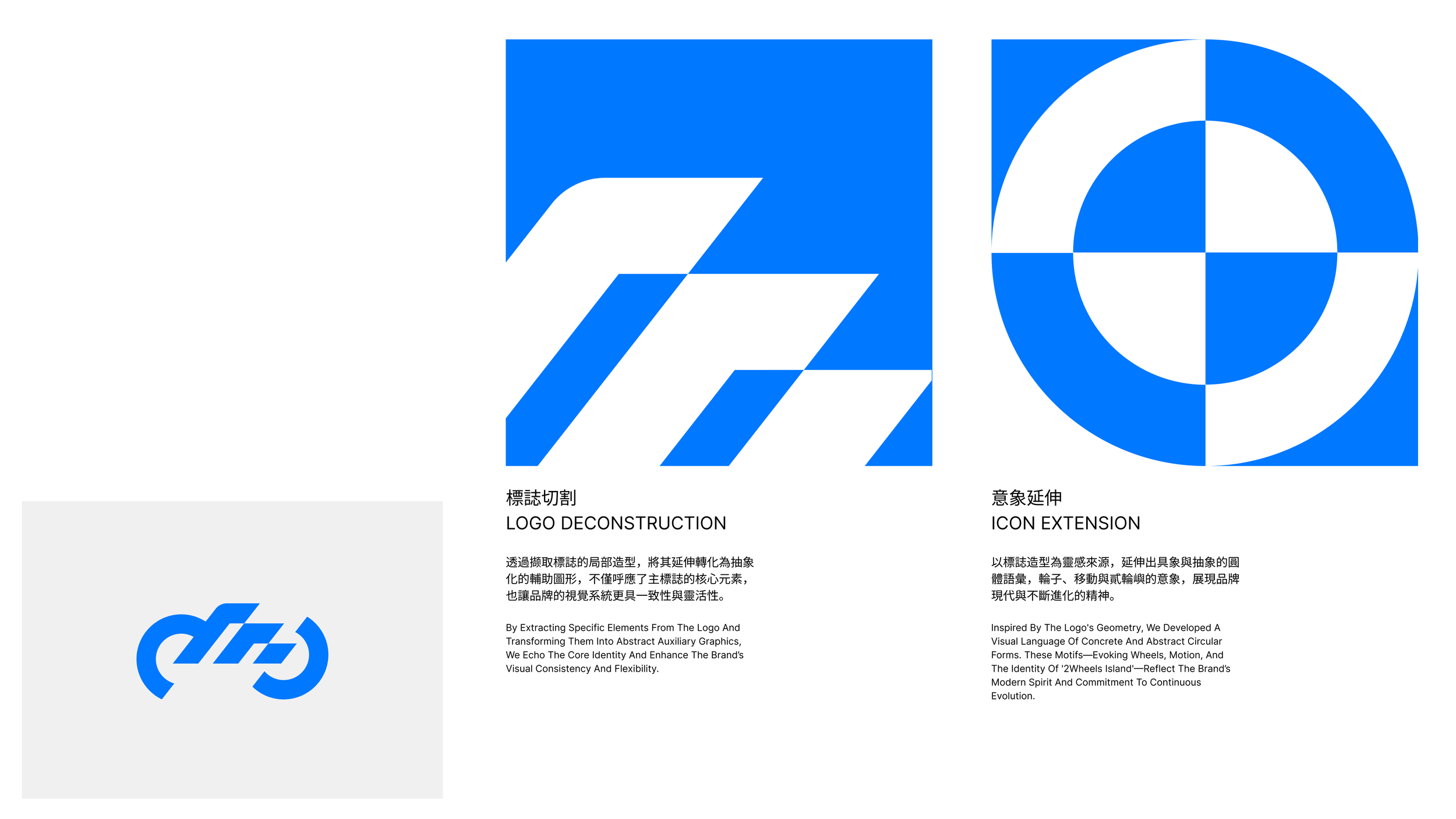
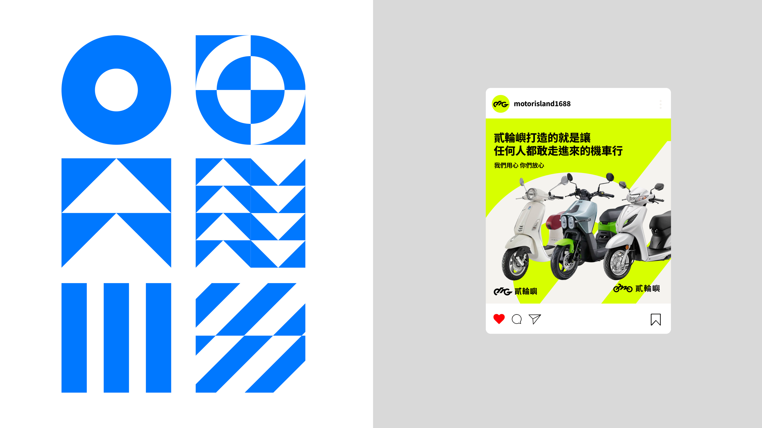
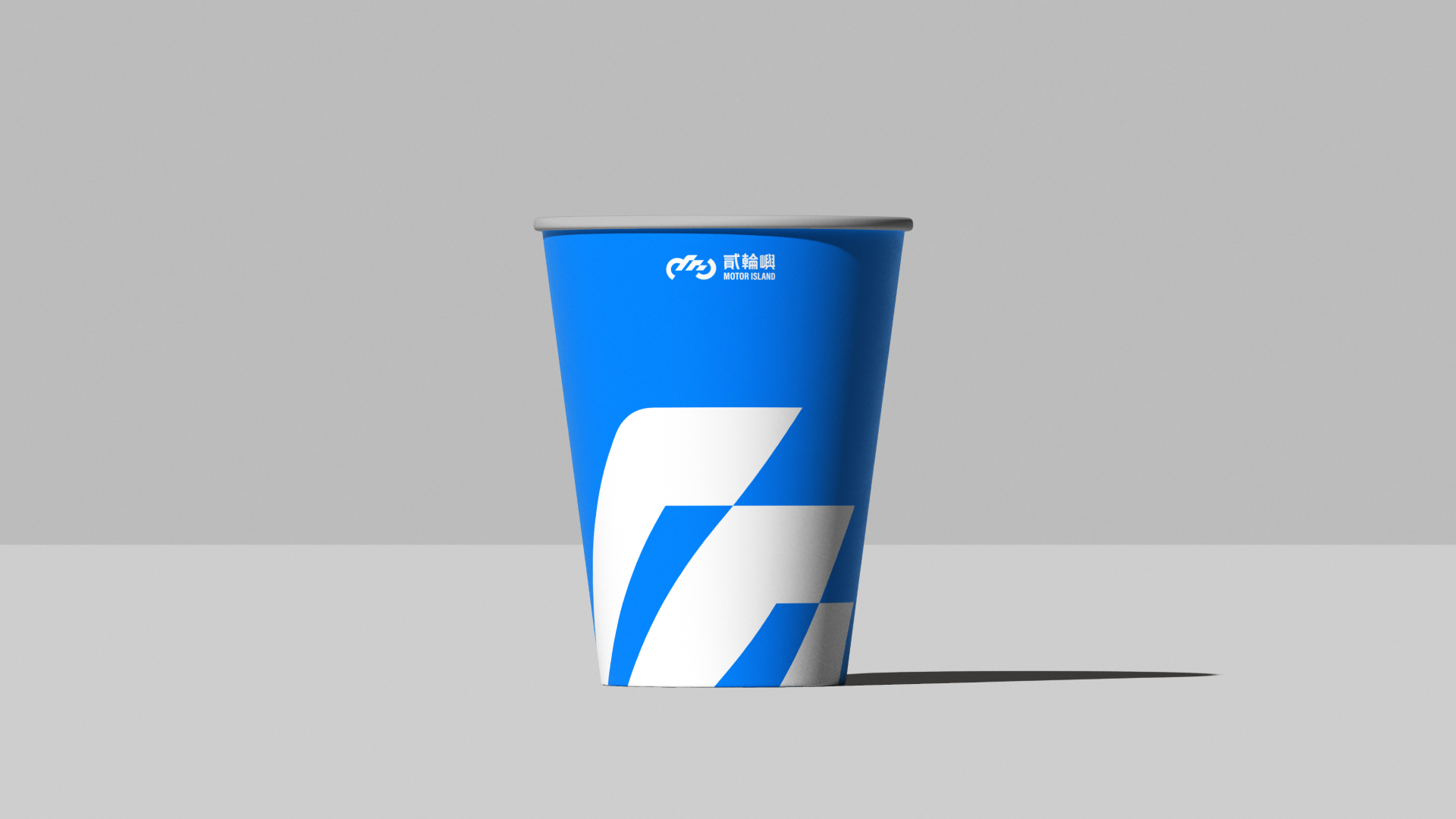
貳輪嶼的輔助圖形系統源自於品牌標誌的幾何結構,透過撷取、延伸與轉化,創造出一組靈活而統一的視覺語言。標誌切割提取了核心造型元素,將其轉化為抽象化的輔助圖形,不僅保留了主標誌的識別性,更賦予了視覺系統高度的一致性與應用彈性。意象延伸則以圓體、輪子、移動等視覺元素為語彙,詮釋貳輪嶼作為現代、進化、永續的品牌精神。
品牌輔助圖型
Modular System Expands Brand Expression
Motor Island's auxiliary graphic system originates from the geometric structure of the brand mark, creating a flexible and unified visual language through extraction, extension, and transformation. Logo deconstruction extracts core design elements and transforms them into abstract auxiliary graphics, preserving the primary mark's recognition while granting the visual system high consistency and application flexibility. Icon extension uses circular forms, wheels, and movement as visual vocabulary to express Motor Island's spirit of modernity, evolution, and sustainability.
Ancillary Graphic


貳輪嶼品牌重塑
Motor Island Brand Renewal
Design Agency | StudioPros Design
Art Director | 李宜軒 Yi-Hsuan Li
Brand Experience Director | 張文馨 Moon Chang
Visual Design | 李宜軒 Yi-Hsuan Li、鄭原傑 Yuan-Chieh Cheng
Logotype Designer | 鄭原傑 Yuan-Chieh Cheng
Brand Guidelines System | 鄭原傑 Yuan-Chieh Cheng
Client | 貳輪嶼 Motor Island
Year | 2025