光益包裝品牌重塑
IMP Packing Brand Renewal
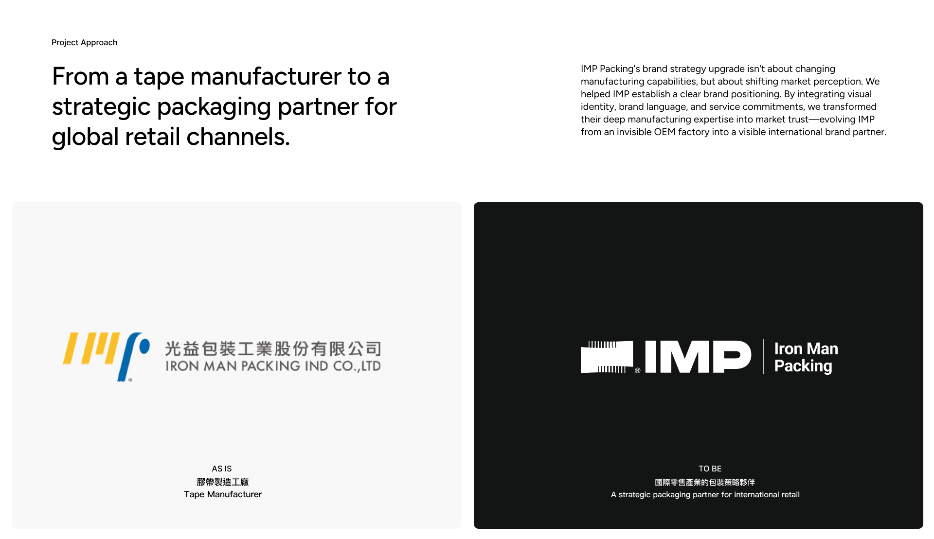
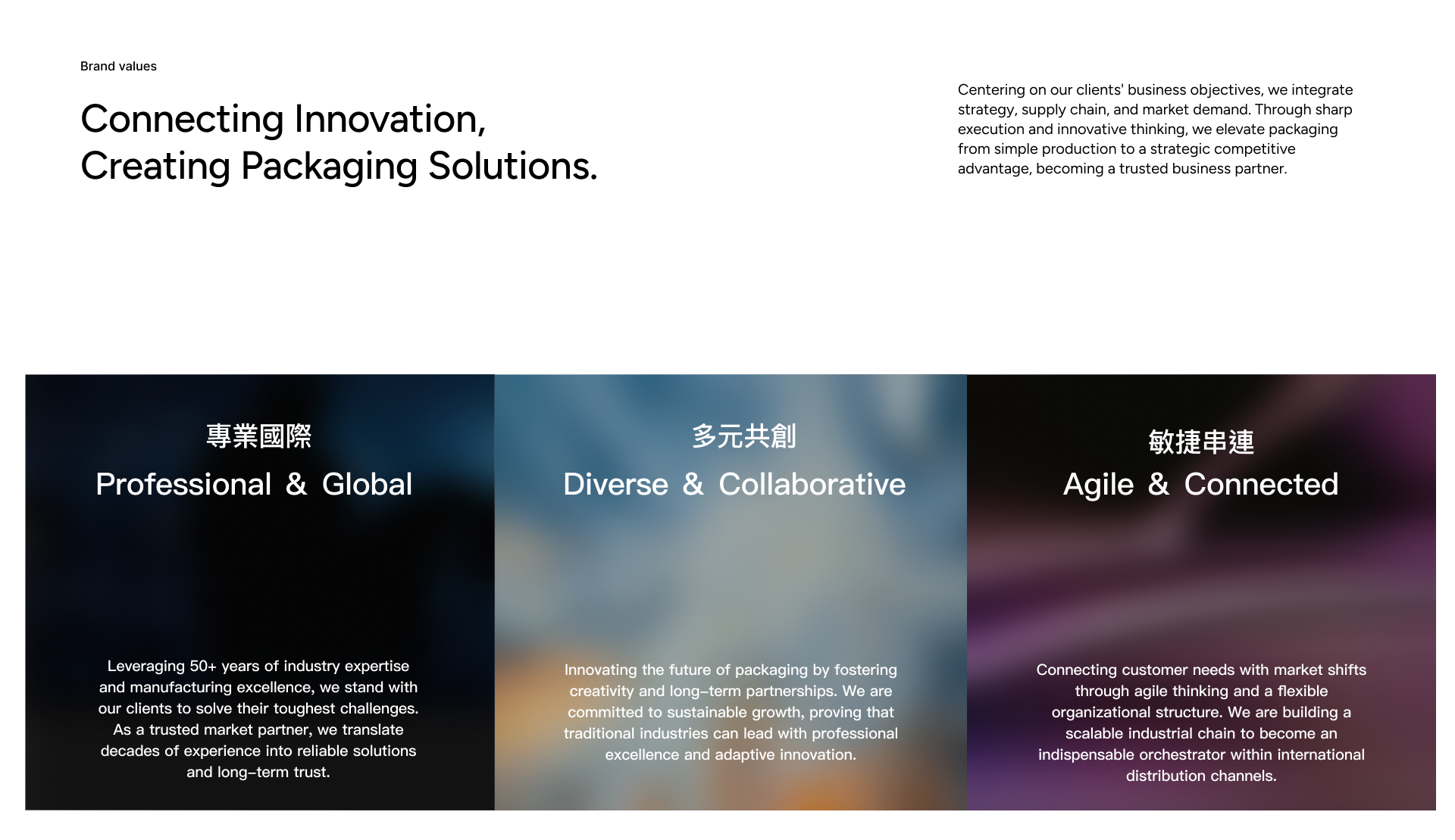
光益包裝深耕膠帶產業超過半世紀,擁有台灣、中國、越南三地生產基地,服務北美與日本等主要市場。在全球競爭加劇與客戶需求演變的時代,光益面臨核心課題:如何將深厚的製造底蘊轉化為創新服務,從產品製造商蛻變為包裝問題的解決方案提供者。 透過品牌重塑,「Tape the Idea, Shine the Future」展現出膠帶不只是黏合工具,而是連接創意與實現的媒介。
連結想法,點亮未來
Tape the Idea, Shine the Future
IMP Packaging has spent over five decades cultivating deep expertise in the tape industry, establishing production bases across Taiwan, China, and Vietnam to serve major markets in North America, Japan, and beyond. In an era of intensifying global competition and evolving customer demands, IMP faces a pivotal challenge: how to transform its profound manufacturing foundation into innovative services, evolving from a product manufacturer into a comprehensive solution provider for packaging needs.
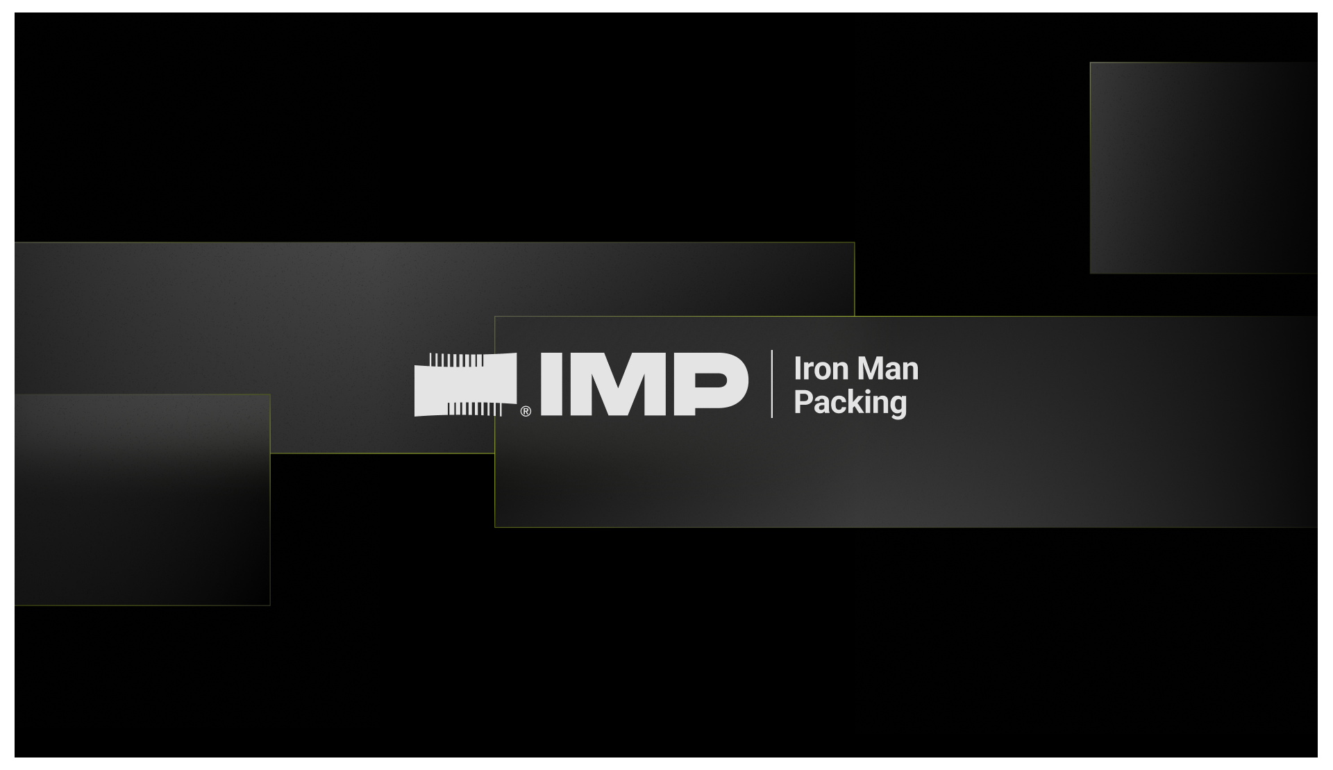
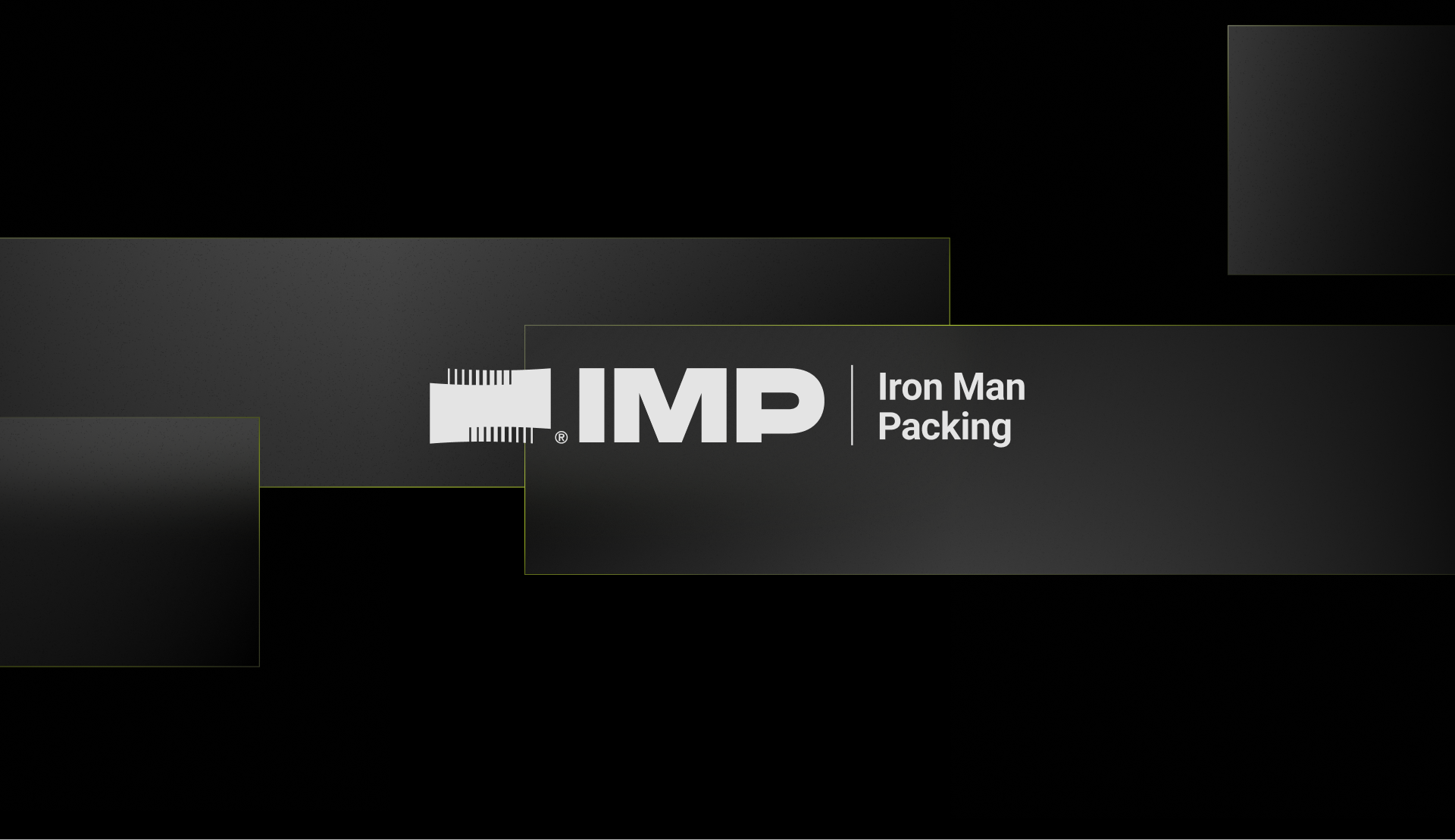
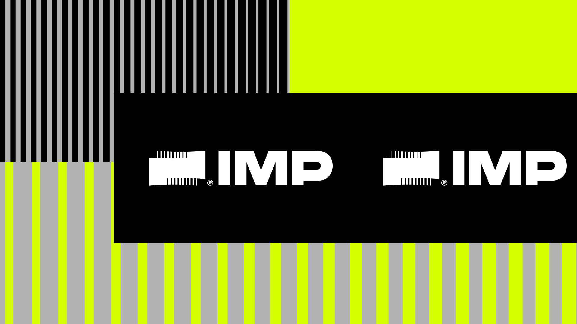
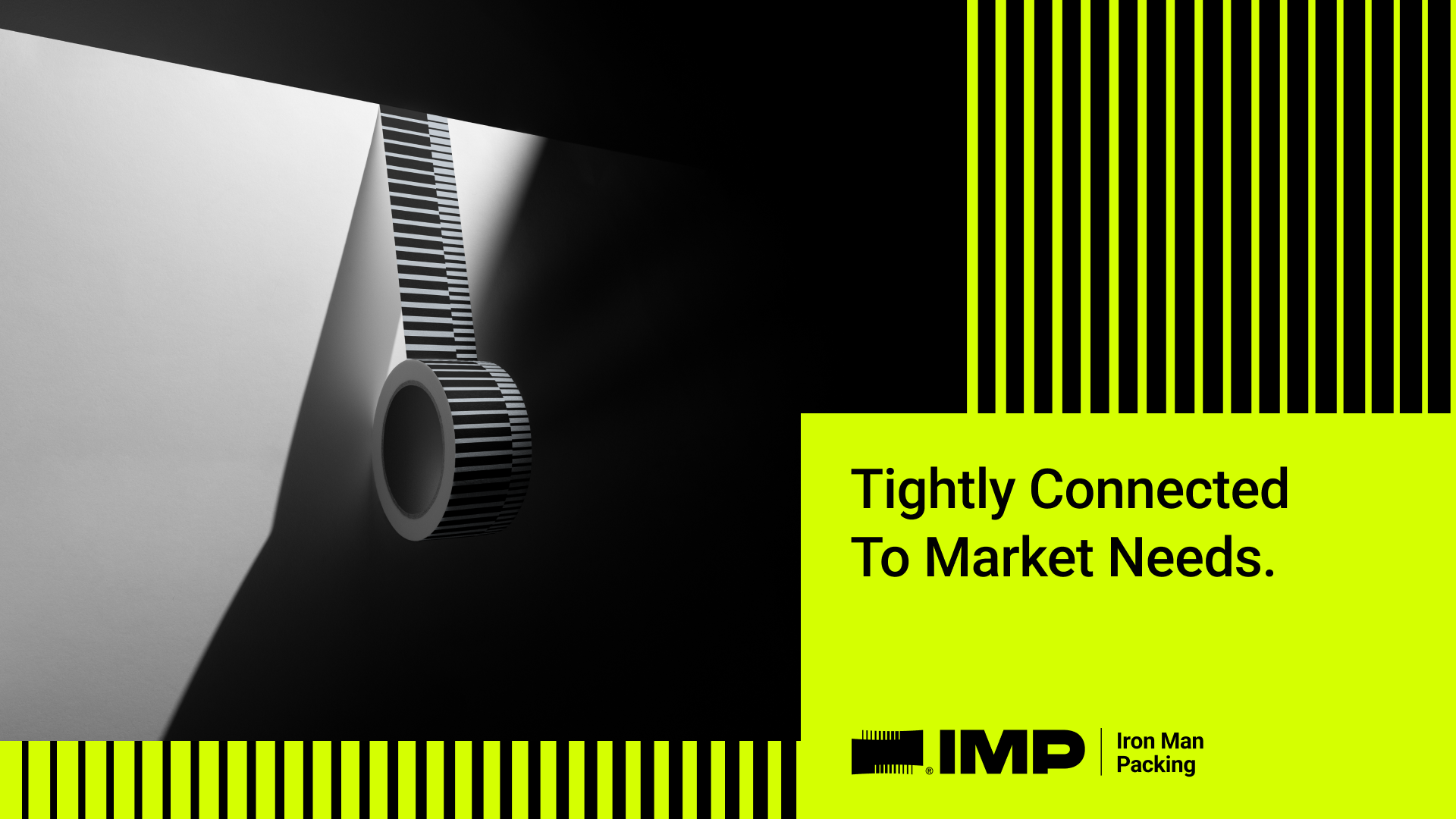
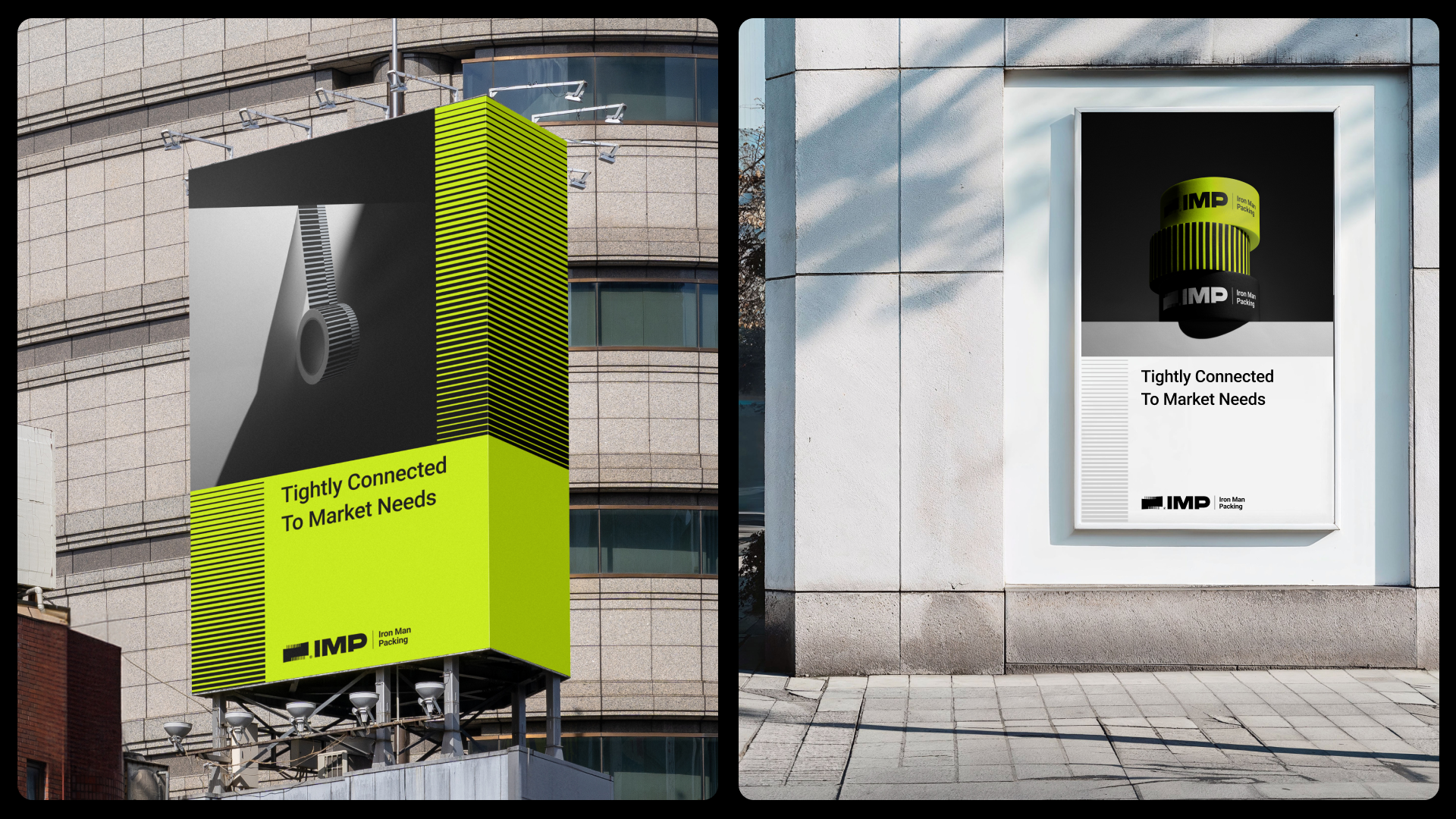
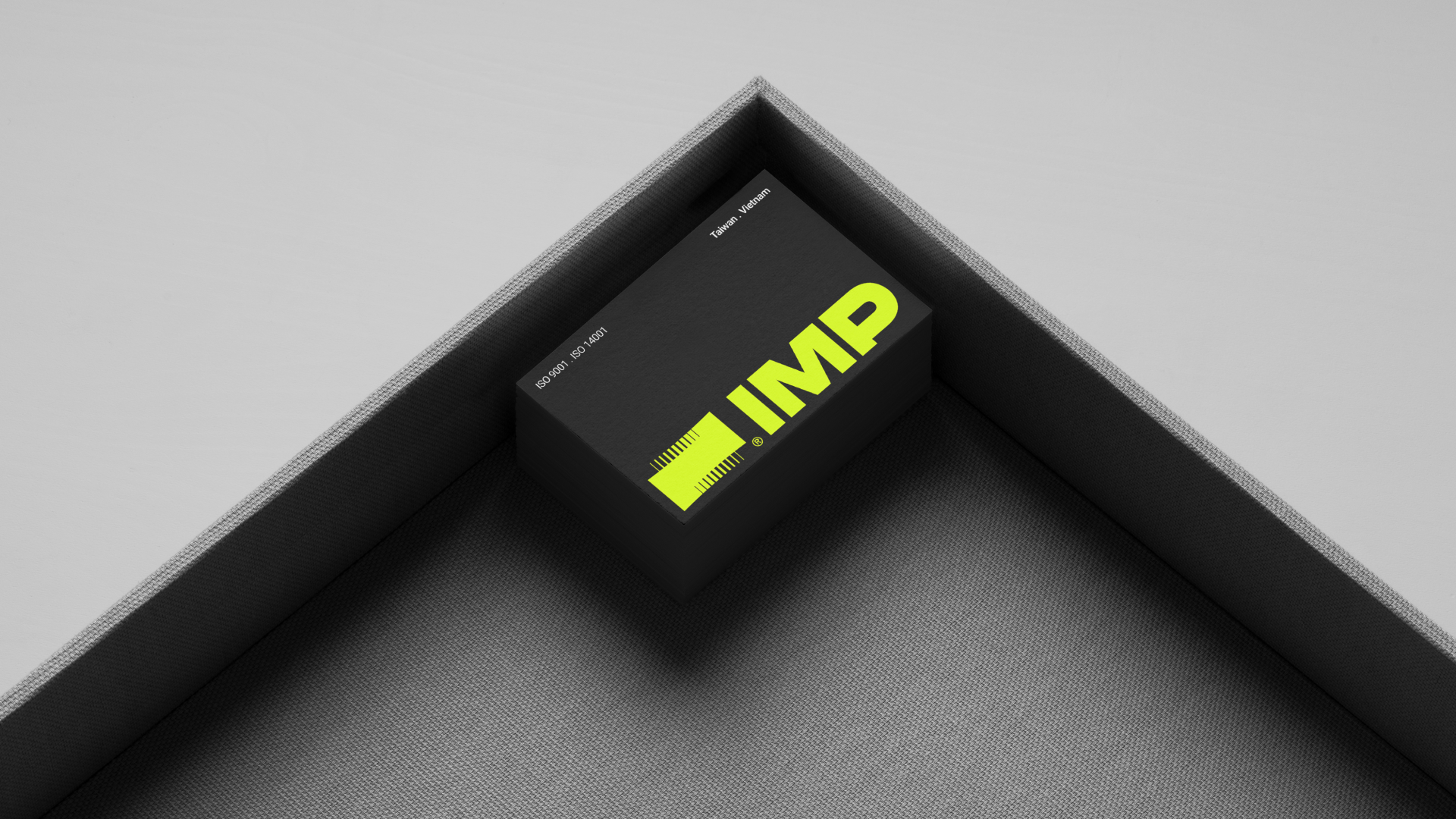
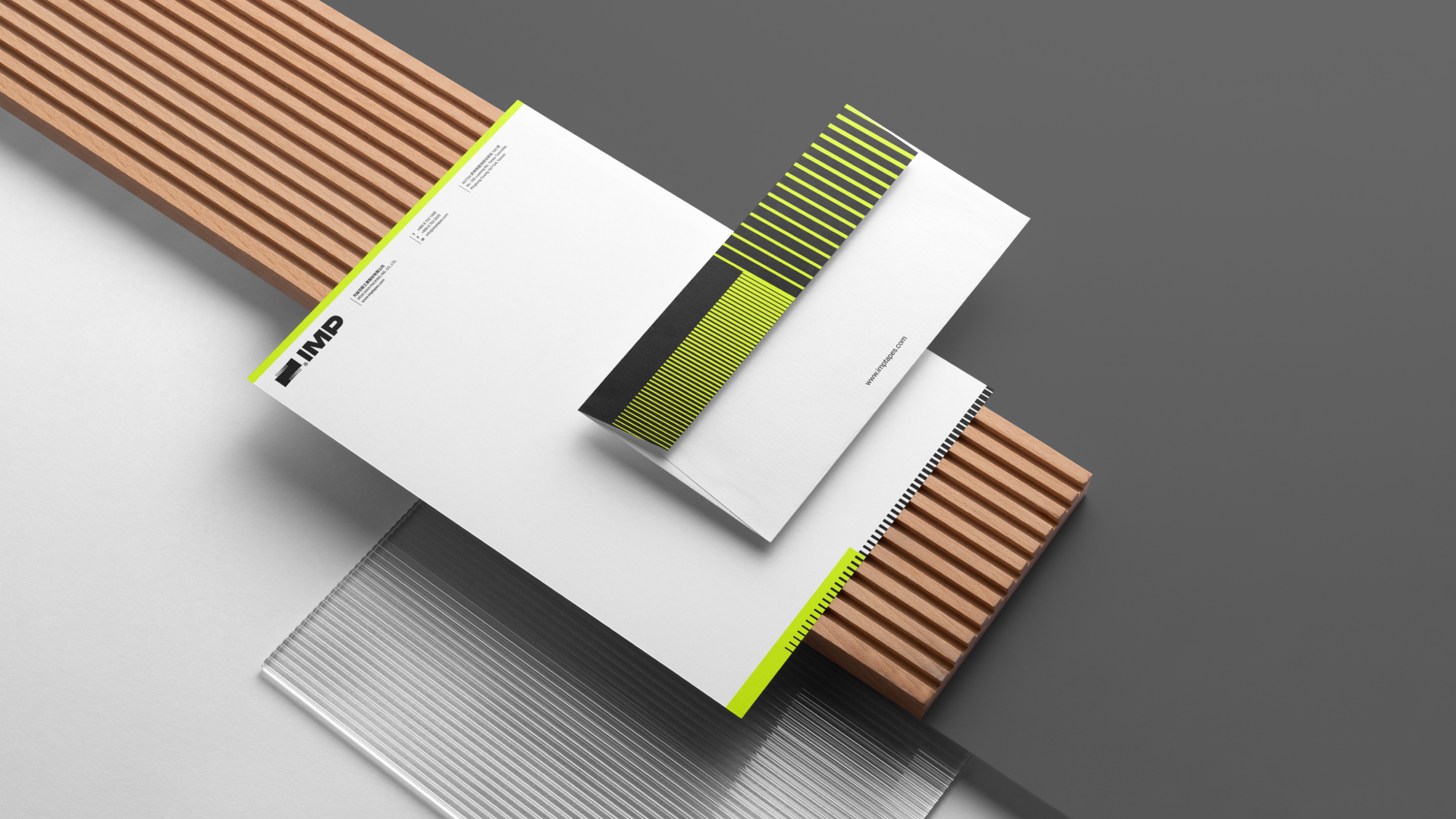
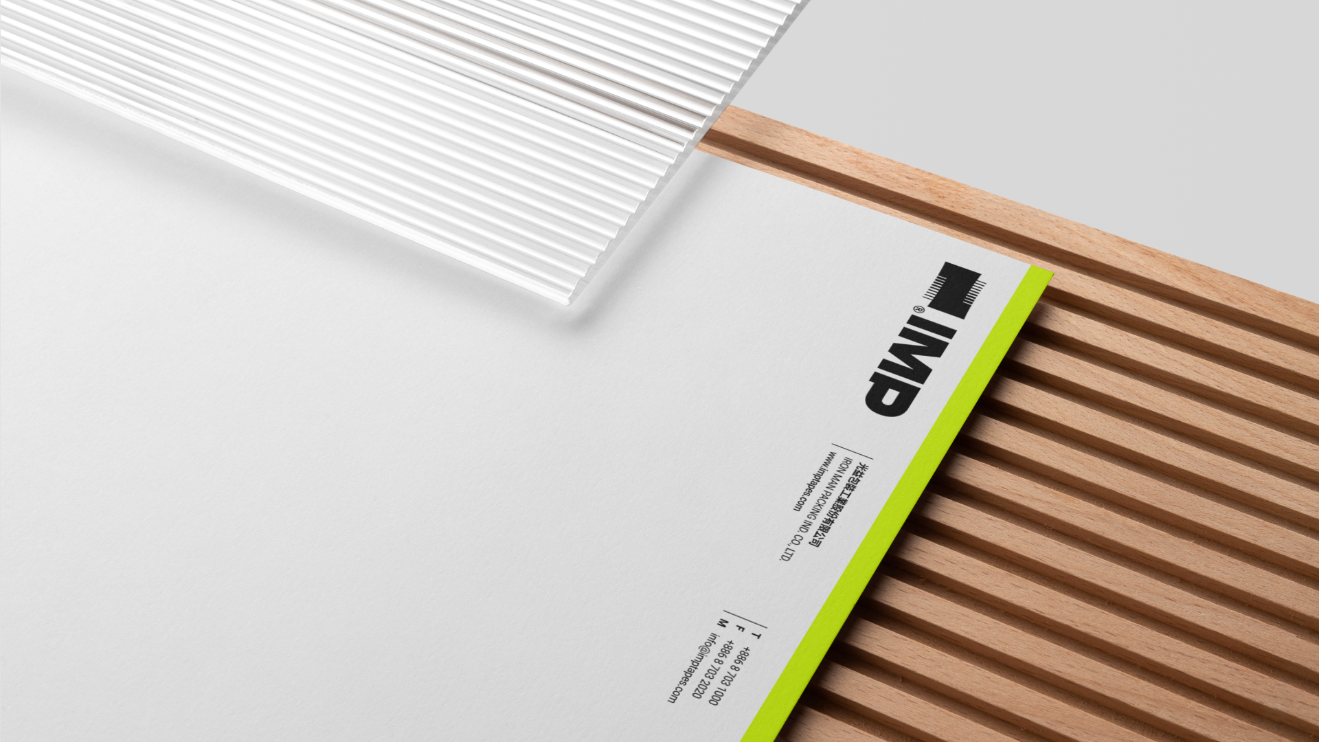
膠帶是光益的根基,垂直條紋正是其最具代表性的視覺特徵。標誌運用這些平行線條由兩側向內聚焦的方向性,象徵創意與執行力匯聚成解決方案。每一個層疊的線段都呈現出變化與動態,展現品牌的敏捷精神與提升性。搭配簡潔有力的「IMP」標準字,大寫字母設計展現國際專業形象,與膠帶條紋視覺形成強烈對比,建立清晰的視覺層級。
設計策略
串聯堆疊出創意的光譜
The logo design embodies transcendence of traditional energy limitations through upward-moving elements. Its arrow-like upward design language, combined with radiant and geometric elements, communicates unlimited potential and evolutionary momentum while expressing the brand's innovative vision.
Design Strategy
Threading Ideas into Light
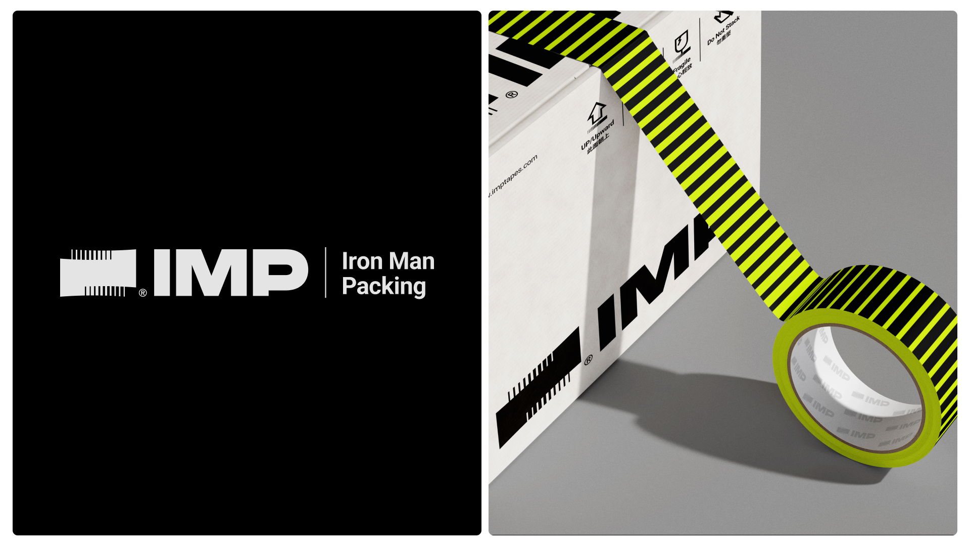
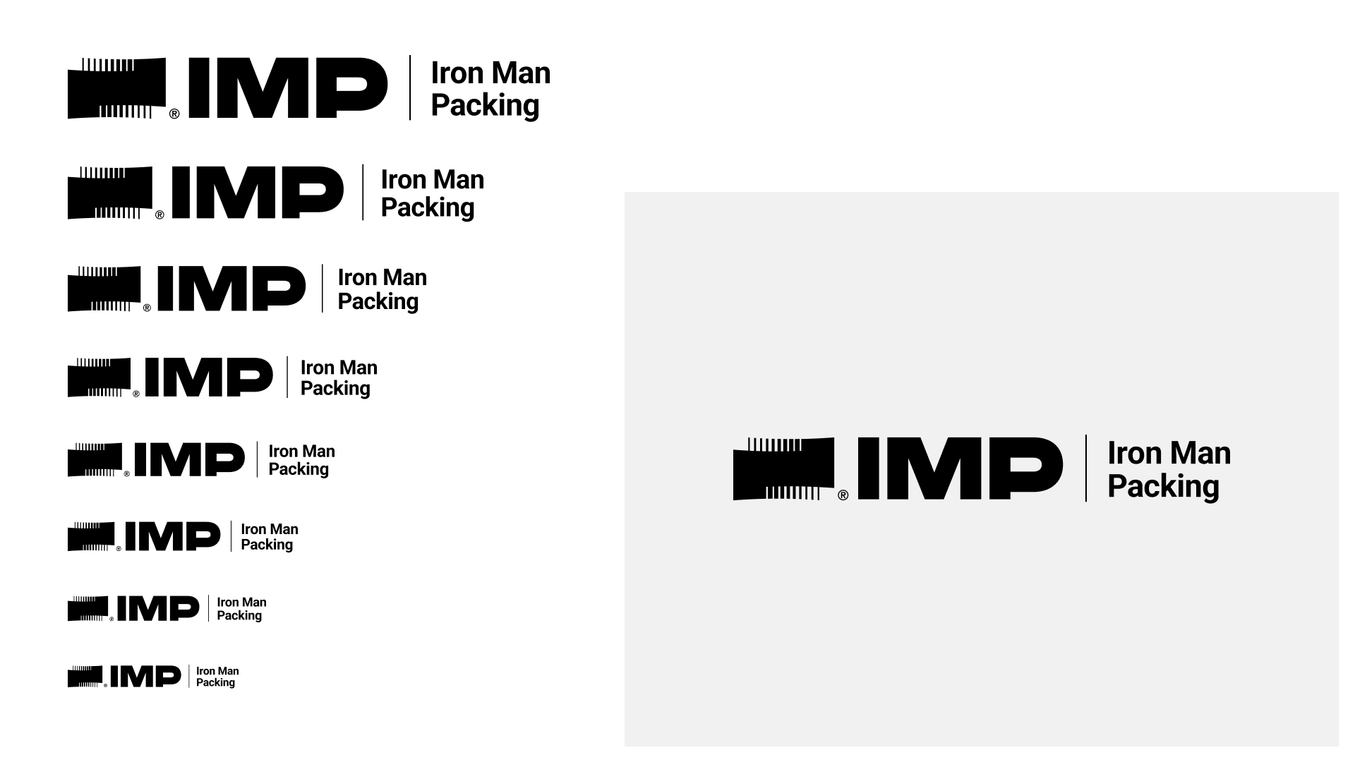
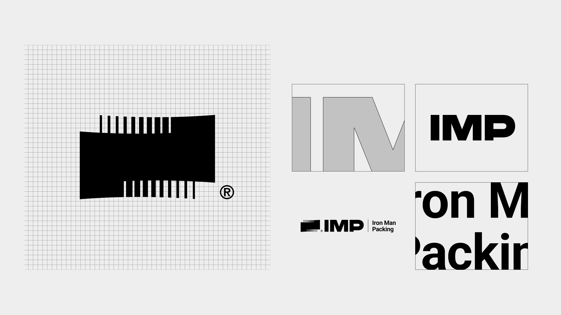
膠帶是光益的根基,垂直條紋正是其最具代表性的視覺特徵。標誌運用這些平行線條由兩側向內聚焦的方向性,象徵創意與執行力匯聚成解決方案。每一個層疊的線段都呈現出變化與動態,展現品牌的敏捷精神與提升性。搭配簡潔有力的「IMP」標準字,大寫字母設計展現國際專業形象,與膠帶條紋視覺形成強烈對比,建立清晰的視覺層級。
品牌系統
透過品牌系統,展現創意與專業的交匯
With an agile mindset and a flexible organizational structure, IMP Packing seamlessly connects customer needs with shifting market dynamics. We are dedicated to crafting a scalable industrial chain, positioning ourselves as an indispensable orchestrator within world-class distribution channels.
Identity System
Ideas Meets Professionalism
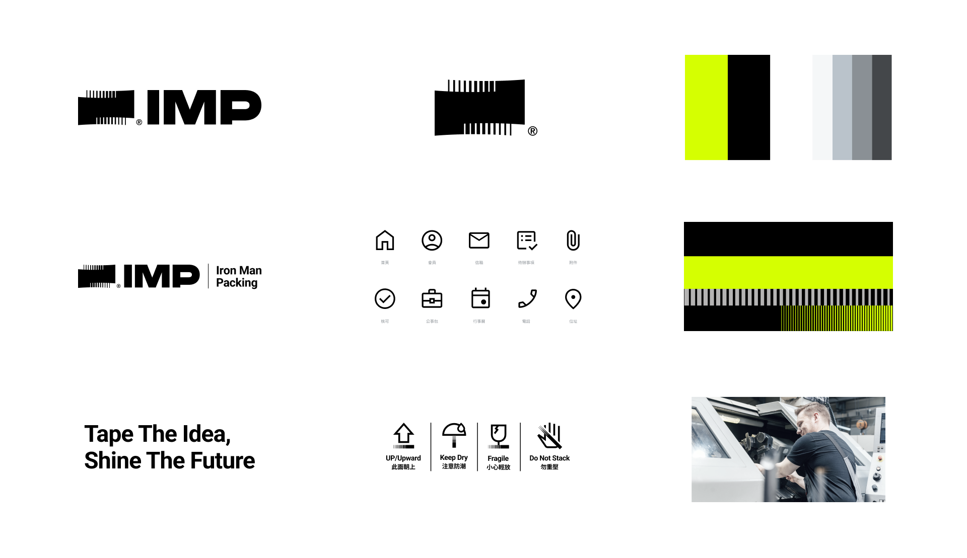

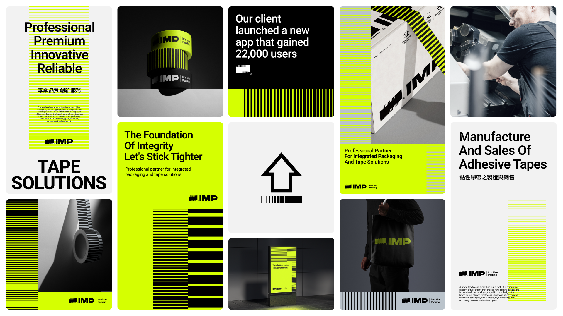
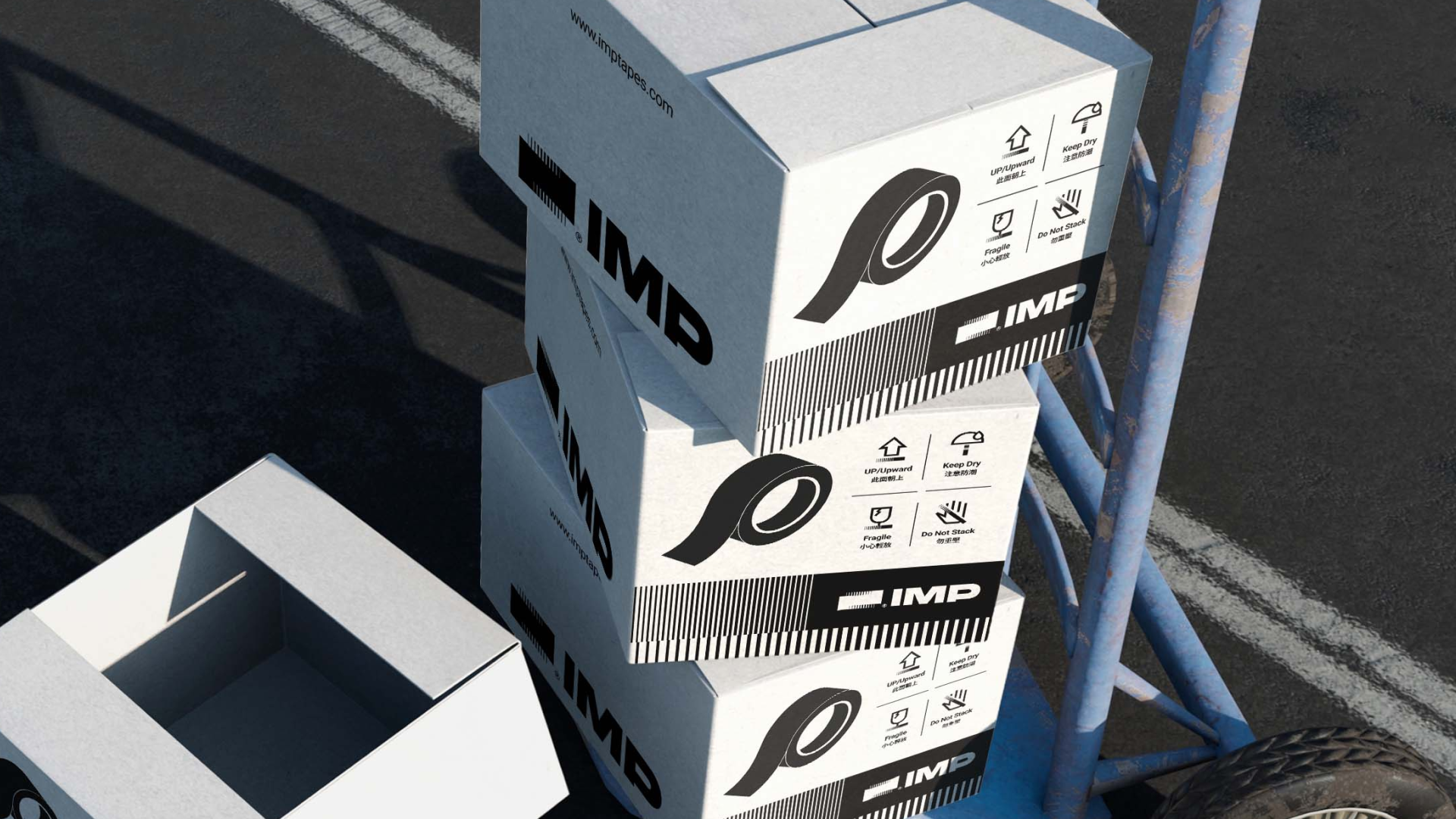
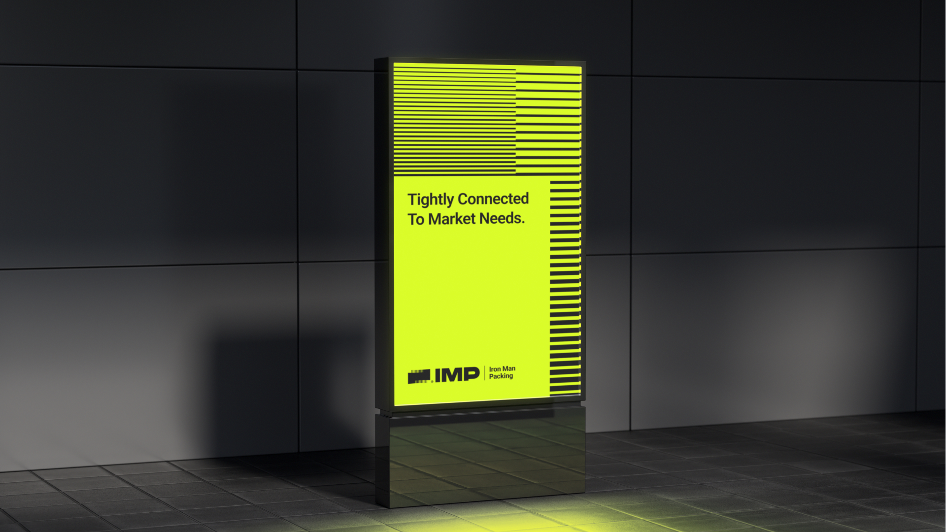
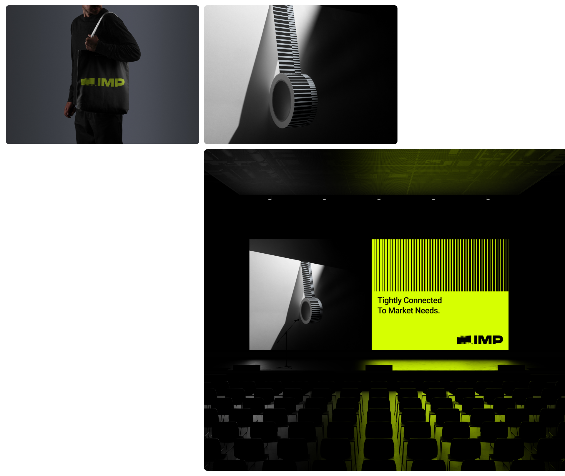
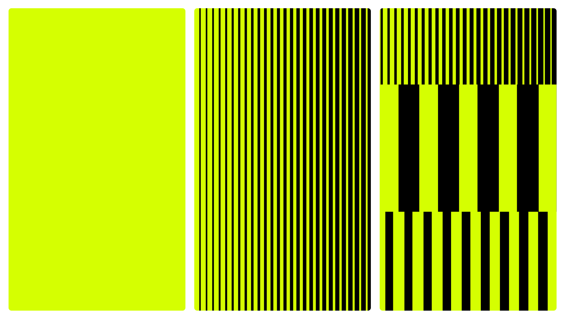
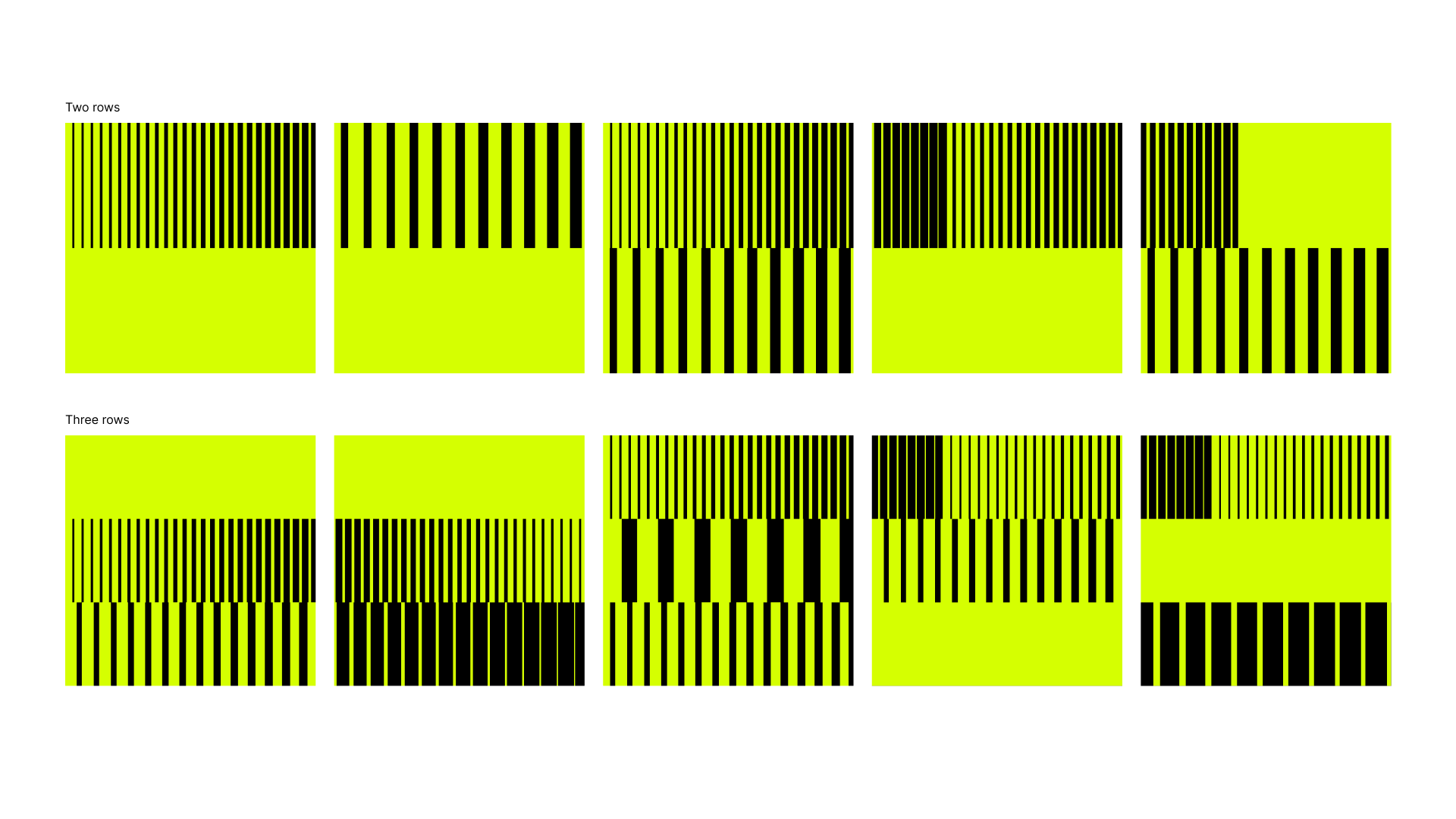
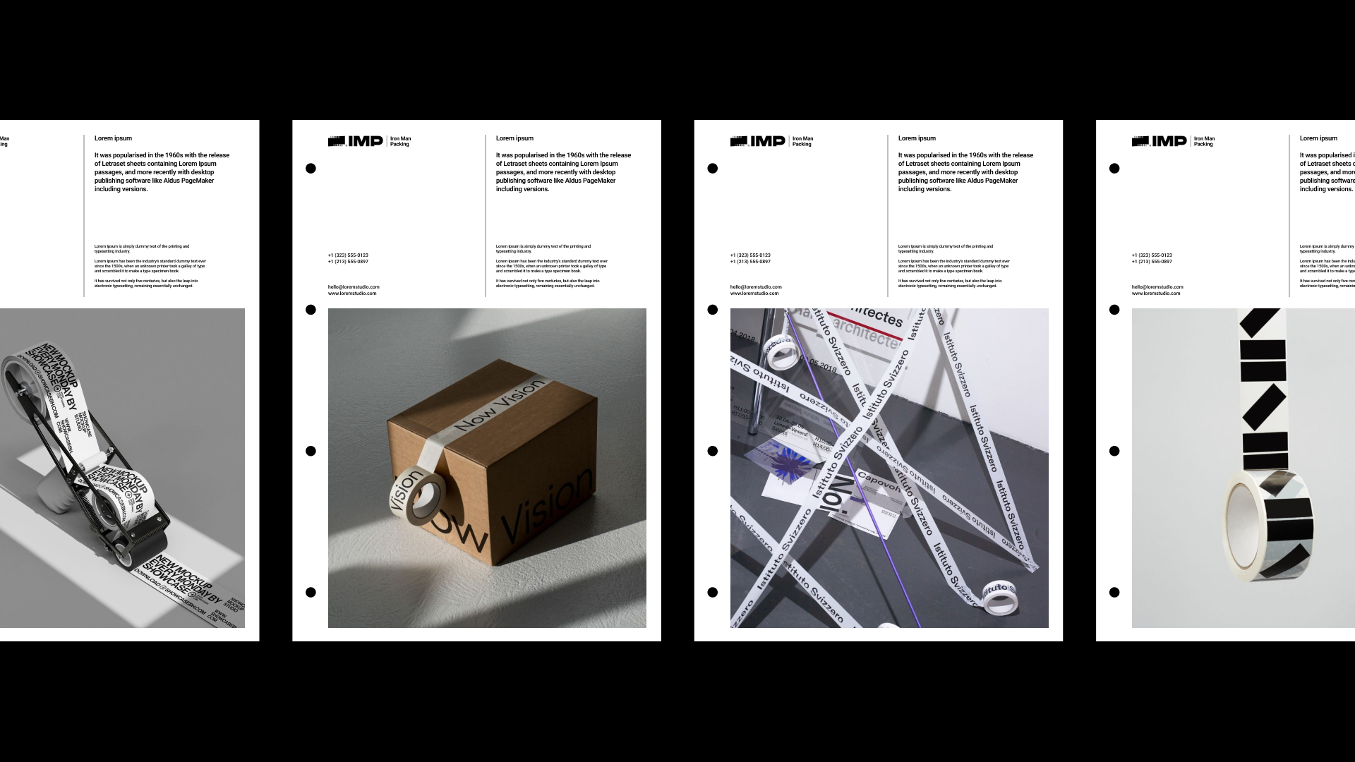
光益包裝的品牌輔助圖形透過結構化的條紋設計,建立品牌視覺的延伸語言,能夠靈活應用於各種品牌內容中。
以標誌造型為基礎,延展出有「穩定基底」、「光感折射」、「交織節奏」三種表現形式,每一種都呈現不同的視覺動態,展現光益從製造到創新的多元應用可能。
品牌輔助圖型
一個標誌,無限層次
IMP Packing supporting graphics utilize a structured linear design to establish an extended visual language that adapts seamlessly across diverse brand touchpoints. Based on the core logo geometry, the patterns evolve into three distinct expressions: 'Stable Foundation,' 'Light Refraction,' and 'Interwoven Rhythm.' Each form delivers a unique visual dynamic, showcasing IMP Packing’s multifaceted capabilities—from traditional manufacturing to modern innovation.
Ancillary Graphic
One Mark, Infinite Expression

光益包裝品牌重塑
IMP Packing Brand Renewal
Design Agency | StudioPros Design
Art Director | 李宜軒 Yi-Hsuan Li
Brand Experience Director | 張文馨 Moon Chang
Visual Design | 李宜軒 Yi-Hsuan Li、鄭原傑 Yuan-Chieh Cheng
Logotype Designer | 鄭原傑 Yuan-Chieh Cheng
Brand Guidelines System | 鄭原傑 Yuan-Chieh Cheng
Client | IMP Packing
Year | 2025